By clicking Accept, you agree to the storing of cookies on your device to enhance site navigation, analyze site usage, and assist in our marketing efforts. View our Privacy Policy or manage preferences.
Oops! Something went wrong while submitting the form.
or continue with
Rock MCP is here. You can now connect Rock to the AI tools you already use. Create a token in Rock, paste it into Claude, Cursor, or another client, and the assistant works inside your spaces as you, across all of them at once.
From earlier calls this month we learned that a lot of our active teams live in tools like Claude and Cursor now, and you would rather they reach into Rock than have you copy things back and forth. We work the same way.
Rock MCP is that connection: your AI assistant reads and updates your spaces directly, making it easier to stay up to date and manage projects across team members.
A few things worth knowing:
It works today with Claude Desktop, Claude Code, Codex, Cursor, VS Code, and Claude Cowork. A one-click connector for Claude on the web and mobile is coming next.
The token acts as you, read and write, across all your spaces. Treat it like a password, and revoke it any time.
It is on every plan, including Free.
Easiest setup: just ask Cowork
Claude Cowork can help you end-to-end with the setup. Share the prompt below and generate a new token, Claude will guide you through all steps.
Keep your token safe, never share in chat.
zsh
Works in coding environments
Add Rock MCP to Claude Code, Codex, Cursor, VS Code, or right from the terminal.
You will find it under your avatar, in a settings panel called Rock MCP. Full setup for every client is in the help guide.
What we use it for
A few of the things we ask it every day:
Search across your whole account. One question searches tasks, notes, and chat messages in every space you belong to. Try "where did we land on the Q3 pricing change?" or "find the onboarding brief and summarize it."
Turn a transcript or doc into tasks. Paste a meeting transcript or point it at a document, and ask it to create the tasks, with owners, due dates, and descriptions already filled in.
Push updates in. Drop your latest growth numbers, funnel metrics, or a status note straight into the right space, so the team sees it where they already work.
Run your to-do list from the chat. Ask "what is my most urgent task?", work on it together, then mark it done or update it without opening the app.
Plus, recent fixes
Since our last update, we also shipped:
Cleaner notifications and unread counts. Unread dots clear correctly for archived spaces and after "Mark all as read," and counts update the moment you open an item.
DMs in custom folders no longer disappear from your sidebar.
Chat threads stay in the right space now, with no more cross-space mix-up when you open one.
Add Spaces picker now targets the correct workspace inside embeds.
A lot of the writing about AI for project management comes from the tools that profit from it. The pitch is usually the same: AI will plan your projects, predict your risks, and free your team. What I have seen in practice is quieter, and more useful, than that.
AI is good at the boring admin that eats your week. It is not much help with the part of the job that actually matters. So this is the practical version: where AI genuinely helps, where it falls flat, and how to use it without buying an AI-stuffed platform you may not need.
Quick answer
AI for project management means using AI to handle the routine parts of running projects. That covers drafting status updates, turning meetings into action items, summarizing long threads, flagging schedule risks, and chasing follow-ups. It is genuinely useful for that admin work, and it frees you for the judgment, people, and priority calls it cannot make for you. You do not need an AI-heavy project tool to get these wins. A simple workspace plus a few AI assistants pointed at your work covers most of it. Start with one task, not a platform.
What AI for project management actually means
AI for project management is the use of artificial intelligence, mostly generative AI, to automate the routine work around a project: writing updates, summarizing discussions, extracting tasks, drafting plans, and surfacing risks from your project data.
It is worth noticing what that definition leaves out. It does not say AI runs the project. AI writes the status update; it does not decide whether the project is really on track. That line is easy to blur, and it matters.
The useful mental model is an assistant, not an autopilot. AI takes the repetitive work off your plate so you spend your hours on the decisions only a person can make.
Where AI actually helps
The wins are unglamorous, but in my experience they are the ones that hold up. These are the tasks where AI has saved me genuine time without creating new problems.
Task
Helps?
What it does well
Status updates and reports
Strongly
Drafts a clear update from your tasks and messages in seconds.
Meeting notes to action items
Strongly
Turns a call into a summary and a clean task list.
Summarizing long threads
Strongly
Catches you up on a noisy channel or document fast.
Drafting briefs and plans
Well
Gives you a solid first draft to edit, not start from blank.
Schedule and risk flags
Partly
Spots slipping dates and gaps, but you judge what matters.
Estimating effort
Weakly
Offers a guess, but real estimates need your context.
The pattern is clear. AI is strongest where the input is text you already have and the output is more text. The further a task moves from that, into judgment or estimation, the less you should trust it.
The single biggest win for most teams is the meeting-to-tasks loop. A good AI meeting assistant captures the call, and the action items become real tasks instead of notes nobody reads again.
Where AI falls short
This is the part most guides skip, because it does not sell software. But project managers who have used these tools tend to land in the same place: AI handles information, not people. It cannot read the politics of a stalled approval or decide which deadline to defend.
It helps to be honest about the split. Hand AI the work it is good at, and keep the rest with the person running the project.
Let AI handle
You still own
Writing the status update
Deciding if the project is really on track
Listing the risks in the data
Choosing which risk to act on first
Drafting the plan
Committing the team to it
Summarizing the stakeholder call
Managing the stakeholder
It helps to treat AI output like a draft from a fast, eager junior. It is a strong starting point, rarely the final word, and the accountability stays with you.
How to use AI in your project workflow
The value of AI shows up when it connects to the tools where your work already lives.
A single AI chat window helps a little. The real gain comes when AI connects to the tools where your work lives, so it can read your tasks and write updates back without you copying anything by hand.
This is where AI agents come in. An agent is a program you point at a job, like "summarize this call and create the tasks," and it runs the steps for you. Modern assistants such as Claude or ChatGPT can now connect to work tools through a shared standard called MCP, short for Model Context Protocol. In plain terms, MCP lets the AI safely reach into your workspace and act on it.
Here is the loop I actually run. After a client call, my meeting assistant drafts the notes. An agent then turns the action items into tasks in our workspace, assigns owners, and posts a short summary in the project channel. I read it over and fix what is wrong. What used to be twenty minutes of copy-paste is now two minutes of review.
The point is the workflow, not the chatbot. Pick one repetitive handoff in your week and wire AI into it end to end. Then add the next one.
You don't need an AI-bloated PM tool
Most project tools now ship an AI copilot and charge more for it. Many of those features come down to a summarize button you might click twice and forget. Paying a premium for AI you do not use is a common and easy mistake.
The setup that works is simpler: a clean workspace for your tasks, chat, and notes, plus a couple of AI assistants pointed at it. The workspace stays easy for the whole team to use. The AI does the admin around the edges.
This is how we work at Rock, and it is part of why Rock stays deliberately light on AI. It keeps chat, tasks, notes, and meetings simple, and it exposes an MCP connection so an AI agent can act on them when you want it to. For most small teams, a simple workspace plus an agent tends to work better than a feature-stuffed AI platform, because everyone can actually use the first one.
A realistic first week
Start with one task and a clear before-and-after, not a platform migration.
Day 1: Pick one task. Choose the admin job you dread most, usually the weekly status update or post-meeting notes. Leave everything else alone for now.
Day 2 to 3: Run it in parallel. Let AI draft it, then compare against how you normally do it. Keep what is better, fix what is wrong, and learn where it slips.
Day 4 to 5: Wire it in. Connect the AI to the tool where that work lives so the output lands as a real task or a posted update, not a copy-paste. Pair it with a clear meeting agenda and your usual project management method, since AI works best on top of a process that already makes sense.
By Friday you have one loop that saves real time and adds no new complexity for the team. That is the pattern worth repeating. Add the next loop once this one sticks.
FAQ
Can AI replace a project manager?
No. AI handles the admin around a project, like updates, summaries, and task lists. It does not own judgment, stakeholder relationships, priorities, or risk decisions, which is most of the actual job.
What is the best AI for project management?
There is no single best tool. The wins come from the workflow, not one product. Start with an AI assistant for the meeting-to-tasks loop, then connect it to the workspace your team already uses.
Is generative AI useful for project managers?
Yes, mostly for drafting and summarizing. It writes a strong first version of an update, brief, or recap that you then edit. Treat it as a fast junior, not a decision-maker.
How do I start using AI for project management?
Pick one repetitive task, such as status updates or meeting notes. Run AI on it for a week, then wire it into your tools so the output lands where work happens. Add the next task after that.
Do I need a special AI project management tool?
Usually not. A simple workspace plus a couple of AI assistants covers most of what small teams need, without paying a premium for AI features you will rarely open.
I have run most of the tools on this list through real calls, and the thing nobody tells you is that the recording part is basically solved. Every assistant here transcribes well enough. What actually separates them is whether a bot crashes your call, where your data lives, and whether the notes ever reach the place your team works.
So this is not another spec dump. It is a ranked, tested look at nine AI meeting assistants, with real screenshots and honest trade-offs. I will tell you which one fits which job, and where each one quietly annoyed me.
Quick answer
The best AI meeting assistant depends on how you work. For bot-free notes that keep your call clean, Granola or Krisp lead. For the most generous free plan, Fathom gives you unlimited recording. For wide language coverage and integrations, Fireflies wins, and for European data storage, tl;dv. If your team already lives in Google Meet, Google's built-in notes work well, as long as you pay for Business Standard. Recording quality is now a commodity across all of these tools. The real choice comes down to three things: the bot, your data, and where the notes land.
What is an AI meeting assistant?
An AI meeting assistant is software that records or listens to your meetings, turns the audio into text, and uses AI to summarize the conversation, pull out action items, and make the discussion searchable afterward.
Some join your video call as a participant. Others listen quietly from your laptop without a bot. After the meeting, they hand you a summary, a list of tasks, and a transcript you can search. The good ones also push that output into the tools you already use.
Do you actually need one?
If you sit in two or more meetings a day and keep losing decisions to bad notes, yes. An assistant frees you to listen instead of typing, and it gives you a record you can search later.
If you meet rarely, or your calls are sensitive enough that a transcript is a liability, you may want to skip it or pick a bot-less, privacy-first option. The tool you choose should match how much you meet and how careful you need to be with the audio.
How I tested them
I judged each tool on five things: how it captures a call (bot or no bot), how it handles your data, how many languages it covers, how cleanly the notes leave the tool, and what the free plan and entry price really get you. Prices come from each company's own pricing page, checked in June 2026. Where a vendor does not state something, I say so rather than guess.
The nine tools at a glance
Start here, then jump to the section you care about. Prices are the cheapest paid plan per user.
Tool
Best for
Free tier
From (per user)
Granola
Bot-haters who take notes solo
Yes, limited history
$14/mo
Fathom
The most generous free plan
Yes, unlimited
$16/mo annual
Fireflies
Languages and integrations
Yes, 400 min storage
$10/mo annual
Krisp
Call audio quality, no bot
No, 7-day trial
$8/mo annual
Otter
Searchable team knowledge
Yes, 300 min/mo
$8.33/mo annual
Read
Search across meetings and email
Yes, 5 transcripts/mo
$15/mo annual
tl;dv
EU data residency, privacy
Yes, unlimited recording
~$18/mo annual
Avoma
Sales and revenue teams
No, 14-day trial
$19/mo annual
Google (Gemini)
Teams already in Google Meet
In Workspace
$14/mo (Standard)
The bot problem (and your data)
Here is the gap most roundups skip. When an assistant joins your call, it appears as an extra participant, a bot sitting in on a human conversation. On a client call that can feel intrusive and pull focus, even when everyone knows it is there. To be clear, you should always tell people a meeting is being recorded. Going bot-less is about a calmer call, not a quieter recording.
Bot-less tools avoid this. They listen from your computer's audio instead of joining the meeting. I switched to a bot-less tool for exactly this reason, the call feels normal and nobody reacts to a robot in the room. The trade-off is consent: a visible bot makes recording obvious, which some teams prefer.
The second half of this is your data. Most of these tools store everything in the cloud, usually in the United States. A few let you opt out of model training, and one keeps your data in the European Union. If your meetings touch client secrets, this column matters more than any AI feature.
Tool
Joins as a bot?
Where data lives
Trains on your data?
Granola
No, listens locally
US cloud, audio not kept
No third-party training; opt-out
Fathom
Bot or bot-free (beta)
US cloud
No third-party; opt-out internal
Fireflies
Yes, a bot joins
US cloud
No, by default
Krisp
No, captures locally
US cloud
No
Otter
Bot or bot-free desktop
US cloud
De-identified data only
Read
Yes, a bot joins
US cloud
Personalized only; opt-out
tl;dv
No (bot optional)
EU cloud
No
Avoma
Yes, a bot joins
US cloud
Limited; opt-out scope
Google (Gemini)
No, built into Meet
Google Drive
Not without permission
The nine tools, reviewed
Granola: the bot-less notepad
Granola positions itself as an AI notepad that works without a meeting bot.
Granola is the one I moved to. It does not join your call. It listens from your Mac or PC, then turns your rough notes into a clean summary the moment the meeting ends. It supports 17 languages and connects to Claude and ChatGPT through MCP.
One myth to clear up, since I believed it too: Granola does not keep your notes on your machine. They sit in Granola's US cloud. What it does avoid is storing the audio, and it never puts a bot in your call. That is the real privacy win, not local storage.
Best for. Solo operators and managers in back-to-back calls who hate the bot.
Watch out. The free plan limits history, and the workspace is a little closed. I still end up copying notes into other tools by hand.
Fathom: the best free plan
Fathom offers unlimited recording and summaries on a genuinely free plan.
Fathom has the most generous free tier here: unlimited recordings, transcripts, and summaries at no cost. Paid plans start at $16 per user per month billed annually. It works across Zoom, Google Meet, and Microsoft Teams, and now offers a bot-free capture option in beta.
It pushes action items into Slack, HubSpot, Salesforce, and Asana, and connects to Claude and ChatGPT. Summaries land after the call, not live, which is fine for most people.
Best for. Anyone who wants a real tool without paying, especially sales and customer success.
Watch out. Bot-free mode is still in beta, and data is US-hosted only.
Fireflies: languages and integrations
Fireflies leans on broad language support and a long integration list.
Fireflies sends a bot named Fred into your meeting. In return you get transcription in over 100 languages, a claimed 95% accuracy, and one of the widest integration lists in this group. The free plan is real, though storage is capped; paid starts at $10 per user per month billed annually.
On privacy it is strong: a zero-day retention option and no model training by default. It also exposes an MCP server and a public API, so notes can flow almost anywhere.
Best for. Multilingual teams and anyone who needs the assistant wired into many tools.
Watch out. The bot always joins, so the awkward-participant problem stays.
Krisp: call quality without a bot
Krisp pairs bot-less notes with its well-known noise cancellation.
Krisp started as noise-cancellation software, and that heritage shows. It captures audio locally with no bot, cleans it up, and claims 96% transcription accuracy across 16-plus languages. There is no free tier, only a 7-day trial; paid starts at $8 per user per month billed annually.
True on-device transcription exists but only on the Enterprise plan. For everyone else, notes still sync to Krisp's cloud.
Best for. Noisy environments and people who care about clean call audio.
Watch out. No free plan, and local-only processing is gated to Enterprise.
Otter: searchable team knowledge
Otter turns meetings into a searchable knowledge base for teams.
Otter is one of the oldest names here, and it shows in the polish. It can join as a bot or record bot-free from the desktop app, and its chat feature lets you ask questions across past meetings. The free plan gives 300 minutes a month; paid starts at $8.33 per user per month billed annually.
The catch is language coverage. Otter supports only six languages today, which is thin next to Fireflies or Avoma.
Best for. English-first teams that want a mature, searchable record.
Watch out. Only six languages, and monthly minute caps on lower plans.
Read: search across more than meetings
Read AI extends its search across meetings, email, and messages.
Read AI wants to be a copilot for everything, not just calls. It joins meetings as a bot, then ties that record together with your email and messages for one search box. It covers 20-plus languages; paid starts at $15 per user per month billed annually.
It connects widely, including Slack, Teams, Notion, CRMs, Zapier, an API, and MCP. The free plan is thin at five transcripts a month.
Best for. People drowning across meetings, inbox, and chat who want one search.
Watch out. The bot always joins, and the free tier runs out fast.
tl;dv: the privacy-first pick
tl;dv keeps data in the EU and markets itself for team collaboration.
tl;dv has the strongest data story in this list. Your data is hosted and stored in the European Union, it states it does not train AI on your content, and it is EU AI Act compliant. It captures without a bot, supports 30-plus languages, and offers a generous free plan with unlimited recording. Paid starts around $18 per user per month billed annually.
It also carries thousands of integrations plus an API, webhooks, and MCP on paid plans, with heavy CRM logging for sales teams.
Best for. European teams, or anyone who puts data residency first.
Watch out. AI features are capped on the free plan, and prices show in euros by region.
Avoma: built for sales teams
Avoma bundles notes with scheduling, coaching, and revenue intelligence.
Avoma is less a notepad and more a sales platform. It joins as a bot, then layers on scheduling, coaching, forecasting, and deep CRM logging. There is no free tier, only a 14-day trial; base plans start at $19 per user per month billed annually, with intelligence add-ons priced on top.
It supports 40-plus languages and connects to Salesforce, HubSpot, Pipedrive, Slack, Zapier, and an API with MCP.
Best for. Sales and revenue teams that live in a CRM.
Watch out. No free plan, and the add-ons stack up. It is overkill for simple note-taking.
Google (Gemini in Meet): if you already live in Google Meet
Google's "Take notes for me" feature is built into Google Meet, so no bot joins and there is nothing to install. Notes save straight to a Google Doc in Drive and attach to the calendar event. It covers eight languages and delivers the summary after the call.
The catch is the one I keep hitting: it is not on the cheapest plan. AI notes require Business Standard at $14 per user per month, not the $7 Business Starter plan. It also only works inside Google Meet, not Zoom or Teams.
Best for. Teams already paying for Google Workspace Business Standard or higher.
Watch out. Gated above the cheapest plan, and Meet-only.
Where your notes actually land
This is the part the roundups gloss over, and it is where most of these tools quietly fail. A perfect summary is useless if it dies inside the meeting app. The real question is whether your action items show up where your team already works.
That is also my main frustration with bot-less notepads. The notes are great, but the environment is closed, so I copy tasks into another tool by hand after every call. The tools that handle this well push action items into your agenda, your tasks, and your team chat automatically.
Almost every tool here now exposes an MCP server, a standard that lets an AI assistant move data in and out of it. That cuts both ways. If your workspace also speaks MCP, an AI agent can take the action items from your meeting assistant and drop them straight into your team's tasks and chat, with no copy-paste. The assistant captures, the workspace holds the follow-through.
At Rock, we work this way ourselves. We connect a meeting assistant to our workspace over MCP, so the action items from a call land as tasks in the right project the moment the meeting ends. That is why a focused assistant plus an open workspace beats a closed all-in-one for most teams, the capture and the follow-through stay connected without anyone re-typing notes.
How to choose
Your situation
Best pick
You live in Google Meet
Google's built-in notes, if you are on Business Standard or higher.
You hate the bot
Granola or Krisp, or the bot-free modes in Fathom and Otter.
You want the best free plan
Fathom, with unlimited recording at no cost.
You need many languages or integrations
Fireflies, over 100 languages and wide integrations.
Data residency comes first
tl;dv, everything stored in the EU with no training on your content.
You run a sales team
Avoma, with notes tied to coaching and your CRM.
You search across more than meetings
Read AI, which pulls email and messages into one place.
Whatever you pick, decide first how much the bot, your data, and the handoff matter to you. Those three beat any feature checklist. For the meetings themselves, a tight virtual meeting habit and a clear minutes template do more than any AI summary.
FAQ
What is the best AI meeting assistant overall?
There is no single winner. Granola is best if you want bot-less notes, Fathom for a free plan, Fireflies for languages, and tl;dv for privacy. Match the tool to how you meet.
Is there a free AI meeting assistant?
Yes. Fathom offers unlimited recording for free, and Otter, Fireflies, Read, and tl;dv all have free tiers with limits. Krisp and Avoma offer trials only.
Can an AI meeting assistant join without a bot?
Yes. Granola and Krisp capture audio locally with no bot, and Fathom and Otter offer bot-free modes. Google's notes are built into Meet, so no bot joins either.
Do AI meeting assistants train on my data?
Most do not train third-party models on your meetings, and several let you opt out of internal training. tl;dv and Fireflies have the clearest no-training stance. Always check the current policy.
How do I get the meeting notes into my other tools?
Look for native integrations or an MCP server and API. The cleanest setups push action items straight into your team's tasks and chat, so nobody re-types them.
Rock MCP is here. You can now connect Rock to the AI tools you already use. Create a token in Rock, paste it into Claude, Cursor, or another client, and the assistant works inside your spaces as you, across all of them at once.
From earlier calls this month we learned that a lot of our active teams live in tools like Claude and Cursor now, and you would rather they reach into Rock than have you copy things back and forth. We work the same way.
Rock MCP is that connection: your AI assistant reads and updates your spaces directly, making it easier to stay up to date and manage projects across team members.
A few things worth knowing:
It works today with Claude Desktop, Claude Code, Codex, Cursor, VS Code, and Claude Cowork. A one-click connector for Claude on the web and mobile is coming next.
The token acts as you, read and write, across all your spaces. Treat it like a password, and revoke it any time.
It is on every plan, including Free.
Easiest setup: just ask Cowork
Claude Cowork can help you end-to-end with the setup. Share the prompt below and generate a new token, Claude will guide you through all steps.
Keep your token safe, never share in chat.
zsh
Works in coding environments
Add Rock MCP to Claude Code, Codex, Cursor, VS Code, or right from the terminal.
You will find it under your avatar, in a settings panel called Rock MCP. Full setup for every client is in the help guide.
What we use it for
A few of the things we ask it every day:
Search across your whole account. One question searches tasks, notes, and chat messages in every space you belong to. Try "where did we land on the Q3 pricing change?" or "find the onboarding brief and summarize it."
Turn a transcript or doc into tasks. Paste a meeting transcript or point it at a document, and ask it to create the tasks, with owners, due dates, and descriptions already filled in.
Push updates in. Drop your latest growth numbers, funnel metrics, or a status note straight into the right space, so the team sees it where they already work.
Run your to-do list from the chat. Ask "what is my most urgent task?", work on it together, then mark it done or update it without opening the app.
Plus, recent fixes
Since our last update, we also shipped:
Cleaner notifications and unread counts. Unread dots clear correctly for archived spaces and after "Mark all as read," and counts update the moment you open an item.
DMs in custom folders no longer disappear from your sidebar.
Chat threads stay in the right space now, with no more cross-space mix-up when you open one.
Add Spaces picker now targets the correct workspace inside embeds.
Remote teams live and die by their tools. When everyone shares an office, a quick turn of the head keeps work moving. When the team is spread across cities and time zones, that ambient awareness is gone, and the tool has to carry it instead.
Most project management software was built for co-located teams that still talk in a room. It tracks tasks well and carries communication badly. The gaps that hurt a distributed team are the ones general roundups skip: communication next to the work, async updates that survive time zones, and pricing that does not punish hiring across the map.
This guide covers eight tools remote teams use in 2026, grouped by the job they do best, with the honest trade-offs for each. For the wider field, see our general project management software roundup.
Quick Answer
The best project management tool for a remote team is the one that keeps communication next to the work, so updates do not get lost between apps across time zones. Rock leads when you want chat and tasks in one flat-priced workspace, and Basecamp suits calm, async-first teams that want a flat price at scale.
Monday.com and Asana fit teams that need visual structure and reporting. ClickUp and Notion work when you want to consolidate apps or lean on a shared knowledge base, and Teamwork fits client-facing delivery. Start with your biggest gap, then test two or three before you commit.
One pricing angle worth naming up front. Remote teams rarely look like a clean list of full-time seats. There are contractors, part-timers, and people who dip in for one project. Per-user pricing makes you pay the full rate for everyone, or quietly lock some out. For a team shaped like that, a flat price usually lines up better with how the work actually flows.
What Remote Teams Actually Need in a Tool
A tool that works in an office can still fail a distributed team. Three things separate a remote-ready tool from a generic one, and one shift changes how you weigh them.
Built-in communication: does the tool carry the conversation, or do you still run Slack, email, and the tool in three windows?
Async-friendly updates: can someone catch up on what changed overnight without a live meeting to explain it?
Time-zone visibility: is it clear who is online, when work is due in local time, and what is waiting on whom?
Integrations: does it connect to the calendar, docs, and video tools the team already lives in?
Pricing model: per-seat pricing punishes you for hiring across borders. Flat pricing does not.
What changes when the team is remote. In an office, status updates happen in hallways and the tool is a backup. Remote flips that. The tool becomes the single source of truth, so anything that lives only in someone head, a chat thread, or a meeting nobody recorded simply disappears. That is why communication-in-the-tool matters more for remote teams than for any other group.
Remote work does not fail because people stop working. It fails when the update lives in a tool nobody opened that day, and the rest of the team finds out two time zones too late.
The cost of that fragmentation is measurable. Harvard Business Review found that workers toggle between apps around 1,200 times a day, and the seconds add up to weeks per year. For a distributed team juggling chat, tasks, and docs in separate windows, that tax runs heavier.
"Difficulties with collaboration and communication, and loneliness, remain among the biggest struggles with remote work, year after year." - Buffer, State of Remote Work
No tool wins on all of these. The right pick depends on which gap your team feels most. The quiz below narrows it in about 30 seconds.
Which tool fits your remote team?
Answer 4 questions. Takes 30 seconds.
1. What matters most to your team?
Select all that apply
Built-in communication
Visual boards
Docs and knowledge base
Time tracking and client access
Async and time-zone friendly
Simplicity over features
2. How many people will use it?
1-5
6-15
16-30
30+
3. Do external people (clients, contractors) need access?
1. Rock - Best for remote teams that want communication and tasks together
Rock keeps chat, tasks, notes, and files together in every space.
Most tools on this list manage tasks and leave communication to a separate app. Rock closes that gap, which is exactly the gap that hurts remote teams most. Every project space includes its own chat, task board, notes, and files, so the update about a task sits right next to the task.
For a distributed team, that matters. The overnight change is visible in the same place as the work, not buried in a chat thread a teammate two time zones away never opened. Clients and contractors join spaces directly at no extra cost. Pricing is flat at $89 per month for unlimited users, so hiring across borders does not change the bill.
Pricing: Free plan (3 group spaces, 50 tasks/space). Unlimited plan: $89/mo flat.
Best for: Distributed teams that want chat and tasks in one workspace without per-seat cost. See the agency and creative-team guides for those angles.
Skip this if: You need deep Gantt charts, resource leveling, or built-in billing. Rock keeps project management simple.
2. Basecamp - Best for calm, async-first teams
Basecamp keeps message boards, to-dos, and chat in one calm project.
Basecamp is built around the idea that distributed work should be calm. Each project gets a message board, to-dos, a schedule, file storage, and the Campfire chat room. The message-board format rewards thoughtful written updates over rapid-fire chat, which suits a team that rarely shares working hours.
The flat Pro Unlimited price ($299/mo for unlimited users) makes it one of the cheapest options for larger distributed teams. The trade-off is depth: no Gantt charts, no dependencies, no resource views.
Pricing: Free plan (1 project). Plus: $15/user/mo. Pro Unlimited: $299/mo flat.
Skip this if: You need visual boards, automations, or detailed reporting across projects.
Best for Visual Work Across Time Zones
3. Monday.com - Best for shared visibility at a glance
Monday.com makes status easy to read with color-coded boards.
Monday.com makes distributed status easy to read without a live meeting. Color-coded boards, timelines, and calendars show what is on track and what is slipping, and dashboards pull several projects into one view.
For a remote team, that at-a-glance clarity replaces the hallway check-in. The catch is cost: paid plans start at three seats, pricing has crept up, and useful features sit on higher tiers.
Pricing: Free plan (2 seats). Standard: $12/user/mo. Pro: $20/user/mo.
Skip this if: You are scaling past 15 people on a budget, or you want built-in chat rather than a separate app.
4. Trello - Best for simple visual boards
Trello runs work on simple, visual drag-and-drop boards.
Trello is the fastest tool to onboard a new remote hire. Cards move across columns, and anyone understands it within minutes, with no training call required. For a small team or a single workflow, that simplicity is often enough.
Power-Ups add calendar views and automation, though the free plan caps you at one per board. Trello strains once projects involve dependencies or reporting.
Best for: Small remote teams that want a simple visual board. See the Trello alternatives for when you outgrow it.
Skip this if: You manage dependencies, need reporting, or want communication built in.
Best for All-in-One and Async Docs
5. ClickUp - Best for teams that want to consolidate apps
ClickUp packs tasks, docs, and multiple views into one platform.
ClickUp packs tasks, docs, whiteboards, goals, and time tracking into one platform. For a remote team tired of juggling five apps, consolidating into one cuts the switching tax that hits distributed work hardest.
The customization is the strength and the weakness. You can shape it to almost any workflow, but setup takes hours and the interface can feel crowded.
Pricing: Free plan (generous). Unlimited: $7/user/mo. Business: $12/user/mo.
Best for: Remote teams willing to invest setup time for one flexible hub. See the Rock vs ClickUp comparison.
Skip this if: You value simplicity. If your team avoids fiddly setup, ClickUp will frustrate them.
6. Notion - Best for async knowledge bases
Notion blends docs, wikis, and tasks in one flexible workspace.
Notion blends documents, databases, and task boards into one flexible system. For a distributed team, its real strength is async: a teammate can catch up on context, decisions, and docs without a call, which matters when working hours barely overlap.
The flexibility is the catch. Notion does not work as a structured project manager out of the box, and there is no real time tracking or built-in chat.
Pricing: Free plan (generous for small teams). Plus: $10/user/mo. Business: $18/user/mo.
Best for: Documentation-heavy remote teams that want a wiki and tasks in one workspace.
Skip this if: You want structured project management or client access out of the box.
Best for Structured and Client-Facing Remote Work
7. Asana - Best for structured cross-functional teams
Asana structures work into tasks, projects, portfolios, and goals.
Asana gives distributed teams structure: timelines, custom fields, dependencies, and portfolio dashboards that keep ownership clear across locations. It scales from a small team to a large department.
The familiar trade-offs apply. There is no built-in chat, so Slack stays open, and per-seat pricing climbs as you add people across borders.
Pricing: Free plan (basic, up to 10 users). Starter: $10.99/user/mo. Advanced: $24.99/user/mo.
Skip this if: You want chat in the same tool, or you are watching per-seat costs.
8. Teamwork - Best for client-facing remote teams
Teamwork is built for distributed teams that deliver client work. Time tracking, billing, and client access are native, so external collaborators see progress without exposing internal detail, and billable hours stay visible across time zones.
The downside is that the interface carries a lot of features, and internal-only teams may find it more structure than they want.
Pricing: Free plan (limited). Deliver: $13.99/user/mo. Grow: $25.99/user/mo.
Best for: Remote teams that bill clients and want time tracking in the same tool.
Skip this if: You do not bill hourly, or you want a lighter tool with communication built in.
Keep the update where the work lives.
Rock puts chat, tasks, notes, and files in one space, for one flat price. Unlimited users across any time zone, no per-seat scaling.
Slack: Great chat, but not a project manager. Most remote teams pair it with one of the tools above rather than run it alone.
Jira: Built for software development. Overkill for general remote teams. (Jira alternatives)
Wrike: Strong for enterprise approvals and proofing, but heavy for a small distributed team.
Hive: Capable, but a smaller integration ecosystem than the tools above, which matters more when remote teams lean on integrations.
How to Choose the Right Tool for Your Remote Team
Start with your biggest gap. If updates keep getting lost between chat and tasks, lean toward a tool with built-in communication, like Rock or Basecamp. If the problem is shared visibility, Monday.com or Asana fit better.
Next, weigh how your hours overlap. Teams that rarely share working hours should lean async-first, where written updates and a knowledge base carry the context a meeting would. Teams with strong real-time overlap have more flexibility.
Then do the per-seat math at your real size. A tool that looks cheap at five people changes once you hire across three countries. Flat pricing protects a growing distributed team from that climb.
Most of these tools offer free plans or trials. Pick two or three, run a real project through each for a sprint, and let the team decide. The quiz near the top gives you a starting shortlist.
Frequently Asked Questions
What is the best project management tool for remote teams?
There is no single best, but for distributed teams the deciding factor is usually communication. A tool that keeps chat and tasks together, like Rock, prevents updates from getting lost between apps across time zones. If you need rich structure, Asana or Monday.com fit; if you want calm async work, Basecamp does. Match the tool to your biggest gap.
What is the cheapest project management tool for a large remote team?
Flat-rate tools win at scale. Rock is $89 per month for unlimited users, and Basecamp Pro Unlimited is $299 per month flat, so neither charges more when you hire across borders. Per-seat tools like Asana or Monday.com keep climbing with every new remote hire, so run the per-seat math at your real size first.
Which remote tools work best for async, across-time-zone teams?
Async-first teams do best with tools that carry written context. Rock keeps the conversation next to the work, Basecamp rewards thoughtful message-board updates over live chat, and Notion holds a knowledge base teammates can catch up on without a call. Tools built around real-time dashboards matter less when working hours rarely overlap.
Do remote teams need built-in chat in their PM tool?
It helps more than for co-located teams. Without an office, the tool is the single source of truth, so updates that live only in a separate chat app or a meeting tend to disappear. Rock, Basecamp, and ClickUp include messaging; Asana, Monday.com, Trello, and Notion do not, so most teams run Slack alongside them.
Want one place for your distributed team to talk, share files, and track work, for a flat price? Try Rock free and see if it fits your remote team.
For consultants, the project management tool is not a side system. It runs the delivery operation: the billable hours that become invoices, the utilization that decides whether the month was profitable, and the client relationship that decides whether there is a next engagement.
That is why the best pick depends less on features and more on the size and shape of your practice. A 60-person firm needs professional services automation. A solo consultant needs to look professional and get paid without drowning in software. The same tool rarely serves both.
This guide covers eight tools, grouped by the kind of consulting practice they fit, with the honest trade-offs for each. For the wider field, see our general project management software roundup.
Quick Answer
The best project management software for consultants depends on firm size. Mid-size and larger firms that bill by the hour need professional services automation. Scoro, Productive, or BigTime handle utilization, margins, and invoicing in one place.
Solo and boutique consultants who mainly need client collaboration and simple delivery do better with lighter tools: Bonsai for built-in contracts and invoicing, Rock for client communication and tasks at a flat price, Notion for docs. Monday.com and ClickUp sit in the flexible middle. Name your real bottleneck first, financial visibility or client delivery. Then trial two tools before you commit.
Here is the part I run into as someone working across several clients at once. Per-user pricing quietly punishes that setup. Should each client pay extra just to add me, or do I work out of five different tools? Neither is great. The cleaner answer is a flat price where you bring the people the work needs, without counting heads every time.
What Consultants Actually Need in a Tool
Generic task managers miss what makes consulting work different. A consulting tool has to connect the work to the money and the client, not just track to-dos.
Billable hours and invoicing: can you capture time and turn it into an invoice without a second system?
Utilization and margins: can you see who is billable, who is on the bench, and which projects actually make money?
Client collaboration: can clients see progress and approve work without a confusing setup or a paid seat?
Multiple billing models: does it handle fixed-fee, time-and-materials, and retainer work side by side?
Right-sized cost: a solo consultant should not pay for a PSA platform, and a 50-person firm should not run on sticky notes.
The dominant guides on this query are written for mid-size and enterprise firms, and they admit it. The solo and boutique consultant gets thin coverage. This guide tiers the field by firm size so each reader lands in the right place.
"Most non-specialized tools lack project-focused features like task dependencies, resource allocation, or time tracking. Teams end up using several apps, raising admin work and the odds of error." - Gartner Digital Markets
Gartner names the trap, and Harvard Business Review puts a number on it: workers toggle between apps around 1,200 times a day. For a consultant, running time tracking, invoicing, and project status in three disconnected apps is exactly where margin leaks and billing disputes start.
For a consultant, the tool is the business. If it cannot show what is billable and let the client see progress, it is not a project tool. It is just another inbox.
No tool wins on all of these. The right pick depends on your firm size and where the money leaks. The quiz below narrows it in about 30 seconds.
If you bill by the hour and live or die on utilization and margins, you need PSA: tools that connect time, projects, and money in one place. These three lead.
1. Scoro - Best for end-to-end financial control
Scoro brings project planning, time tracking, quoting, invoicing, and financial reporting into one system. For a consulting firm that wants to see budget burn, margins, and billing without exporting to spreadsheets, it is hard to beat.
The trade-off is weight and cost. There is no free plan, the setup takes real time, and it is far more tool than a solo consultant needs.
Pricing: No free plan. Paid from around $26/user/mo.
Best for: Established firms that want projects and financials in one system.
Skip this if: You are a solo or very small practice. The cost and complexity will outweigh the benefit.
2. Productive - Best for multi-client resource planning
Productive pairs project management with resource planning, utilization tracking, budgets, and profitability reporting. For a firm juggling several clients and trying to keep everyone billable, the resource and margin views are the draw.
Like Scoro, it is built for firms, not individuals. No free plan, and a learning curve that a one-person practice will not want.
Pricing: No free plan. Paid from around $11/user/mo, with higher tiers for financial features.
Best for: Growing firms that need utilization and profitability alongside project management.
Skip this if: You mainly need client communication and simple delivery. This is overkill for that.
3. BigTime - Best for billable hours and utilization
BigTime is professional services automation built around the billable hour. Time capture, approval workflows, utilization dashboards, and invoicing connect directly, which is exactly what an accounting, engineering, or IT consultancy needs to protect margin.
It is purpose-built for firms with formal billing, so a solo consultant or a delivery-first practice will find it heavier than the job requires.
Pricing: No free plan. Paid from around $20/user/mo.
Best for: Firms whose whole model runs on billable hours and utilization reporting.
Skip this if: You do not bill hourly, or you want a light tool focused on client delivery.
Best for Solo and Boutique Consultants
The big PSA roundups skip this reader. If you are a solo consultant or a small practice, you need to look professional, keep clients in the loop, and get paid, without paying for an enterprise platform.
4. Bonsai - Best all-in-one for solo consultants
Bonsai bundles proposals, contracts, time tracking, invoicing, and a client CRM into one tool built for independents. For a solo consultant, it covers the whole business-of-one in a single subscription, so logged time becomes an invoice without a second app.
The trade-off is depth. As you grow past a handful of people, Bonsai runs out of room for resource planning and firm-level financials.
Pricing: No free plan. Paid from around $25/mo.
Best for: Independent consultants who want contracts, invoicing, and light project tracking in one place.
Skip this if: You are a growing firm that needs utilization and margin reporting across a team.
5. Rock - Best for client collaboration at a flat price
Rock is the honest pick when your bottleneck is delivery and communication, not financials. Every space holds chat, tasks, notes, and files, and clients join directly at no extra cost, so feedback and approvals happen where the work lives instead of across scattered email.
Be clear about the limit. Rock does not track utilization or send invoices, so consultants who live on billable reporting should pair it with a billing tool or pick a PSA platform above. For client communication and tasks at a flat $89 per month, it is simple and cheap.
Pricing: Free plan (3 group spaces, 50 tasks/space). Unlimited plan: $89/mo flat.
Skip this if: You need billable-hour tracking, invoicing, or utilization reporting in the tool itself.
6. Notion - Best for docs-led solo practices
Notion holds proposals, deliverables, meeting notes, and a client wiki in one flexible workspace. For a consultant whose product is documents and frameworks, it keeps everything in one searchable place, and the free plan covers a solo practice.
The catch is that Notion is not a billing or delivery system. There is no time tracking or invoicing, so you will invoice elsewhere.
Pricing: Free plan (generous for individuals). Plus: $10/user/mo. Business: $18/user/mo.
Best for: Docs-heavy solo consultants who want proposals, deliverables, and notes in one workspace.
Skip this if: You need structured project management, time tracking, or invoicing out of the box.
Best Flexible Middle Options
7. Monday.com - Best for flexible visual tracking
Monday.com gives a consulting practice flexible, visual project tracking with light client-facing views and automations. When your workflows are unusual and you value adaptability over deep financials, its customizable boards fit well.
The catch is the consulting-specific depth. Time tracking and financials sit on higher tiers or rely on integrations, and per-seat pricing adds up as the team grows.
Pricing: Free plan (2 seats). Standard: $12/user/mo. Pro: $20/user/mo.
Skip this if: Billable utilization and margins are your core need. A PSA tool fits better.
8. ClickUp - Best flexible all-in-one on a budget
ClickUp consolidates tasks, docs, whiteboards, and time tracking into one customizable platform with a useful free tier. For a budget-conscious practice that wants to avoid stitching tools together, it covers a lot of ground.
The customization is the strength and the weakness. Shaping it to a consulting workflow takes hours, and the interface can feel crowded.
Pricing: Free plan (generous). Unlimited: $7/user/mo. Business: $12/user/mo.
Rocketlane, Kantata, Certinia: Enterprise PSA for large firms (150+). Powerful, but priced and scoped well beyond a solo or boutique practice.
Plutio: A capable freelancer suite similar to Bonsai. We picked Bonsai as the representative solo all-in-one to avoid overlap.
Harvest / Toggl: Excellent time trackers, but time tracking alone, not full project management. Pair them with a tool above.
Jira: Built for software development, not consulting delivery or billing.
How to Choose the Right Tool for Your Practice
Start with firm size, because it routes most of the decision. A solo or boutique practice should look at Bonsai, Rock, or Notion first. A firm of fifteen or more that bills hourly should look at Scoro, Productive, or BigTime.
Then name your real bottleneck. If margin leaks and you cannot see utilization, the financial depth of a PSA tool pays for itself. If the problem is client delivery, scattered approvals, and looking professional, a lighter tool like Rock or Bonsai solves more for less.
Watch the per-seat math as you grow. Per-user PSA pricing climbs fast once you add associates and subcontractors, while a flat-priced delivery tool stays put. Many firms run a PSA tool for finance and a flat-priced space for client collaboration.
Most of these offer free plans or trials. Pick two that fit your tier, run a live engagement through each, and keep the one that fits how you actually bill and deliver. The quiz near the top gives you a starting shortlist.
Frequently Asked Questions
What is the best project management software for consultants?
It depends on firm size and billing. Mid-size and larger firms that bill hourly need professional services automation like Scoro, Productive, or BigTime for utilization, margins, and invoicing. Solo and boutique consultants usually do better with lighter tools: Bonsai for contracts and invoicing, Rock for client collaboration at a flat price, or Notion for docs. Match the tool to your tier.
What is the best project management tool for a solo consultant?
For a solo practice, Bonsai is the strongest all-in-one, bundling contracts, time tracking, and invoicing so you look professional and get paid from one tool. If your bottleneck is client communication rather than billing, Rock keeps chat, tasks, and files in one flat-priced space with clients included. Notion suits a docs-heavy consultant who invoices elsewhere.
Do consultants need PSA software, or is a general tool enough?
It depends on whether financial visibility is your bottleneck. If utilization, margins, and billable-hour reporting decide your profitability, a PSA platform like Scoro or BigTime earns its cost. If you mainly need to deliver work and keep clients in the loop, a general or communication-first tool like Rock or Monday.com does the job for far less.
What is the cheapest project management tool for a small consulting firm?
For a small firm that brings clients into the workspace, flat pricing wins. Rock is $89 per month for unlimited users and clients, so adding associates or client guests costs nothing extra. Per-user tools like Scoro or BigTime climb with every seat. If you need billing built in on a budget, Bonsai or a general tool with a free tier like ClickUp is worth a look.
Want one place to collaborate with clients and run delivery, at a flat price, while you invoice wherever you already do? Try Rock free and see if it fits your practice.
Marketing agencies run on a different rhythm than internal teams. You juggle five or ten clients at once, each with its own campaigns, approvals, and deadlines. The work only moves when your team, your freelancers, and your clients can all see the same plan.
Most project management tools were built for product teams with one backlog and no outside stakeholders. They handle tasks well and client communication badly. The gaps that hurt agencies are the ones general roundups skip: client access without per-seat fees, communication that lives next to the work, and pricing that does not punish you for growing.
The biggest hidden cost in agency work is not the hours. It is the rework that piles up when a client cannot see what the team is doing until it is already wrong.
This guide covers eight tools marketing agencies actually use in 2026, grouped by the job they do best. We lead with each tool's real strength and name where it falls short, including ours. For the wider field beyond agencies, see our general project management software roundup.
Quick Answer
The best project management software for a marketing agency depends on how you work with clients. If client communication is scattered, Rock leads with chat, tasks, and free client access at a flat price. Asana and Monday.com fit structured campaigns and reporting.
Productive and Teamwork suit agencies that bill by the hour and need utilization and margins. ClickUp and Trello work for lean, budget-conscious teams, and Wrike handles formal approvals at scale. Start with your biggest pain, then trial two tools before you commit.
One thing I would weigh before the list. Per-user pricing made sense when teams were fixed and everyone logged in daily. Marketing work is messier now, with freelancers, contractors, and clients moving in and out. Paying a full seat for everyone who touches a project adds up fast, and it quietly pushes you to leave people out of the tool. A flat price removes that tax and that temptation.
What Marketing Agencies Actually Need in a Tool
Before the list, it helps to know what separates an agency tool from a generic one. Not every feature matters when client work is the product.
Client access: Can clients and freelancers join without a paid seat or a confusing setup?
Built-in communication: Does the tool carry the conversation, or do you still run Slack and email on the side?
Campaign and content planning: Calendars, recurring workflows, and templates for repeatable campaign work.
Approvals: A clear path for clients to review and sign off without endless email threads.
Pricing model: Per-seat pricing gets expensive fast once you invite clients and scale the team.
Billables and profitability: For some agencies, time tracking and margin reporting are the whole point.
No tool wins on all six. The right pick depends on which of these your agency feels most. The quiz below narrows it down in about 30 seconds.
The cost of that fragmentation is measurable. Harvard Business Review found that workers toggle between apps around 1,200 times a day. For an agency juggling client chat, tasks, and files in separate tools, that tax runs heavier.
"Most non-specialized tools lack project-focused features like task dependencies, resource allocation, or time tracking. Teams end up using several apps, raising admin work and the odds of error." - Gartner Digital Markets
1. Rock - Best for agencies that want chat, tasks, and clients in one place
Rock keeps chat, tasks, notes, and files together in every space.
Most agency tools manage tasks but leave communication to a separate app. Rock takes the opposite approach. Every client space includes its own chat, task board, notes, and file storage, so the conversation sits right next to the work it is about.
The client angle is where it earns its place on this list. External clients and freelancers join spaces directly at no extra cost. They see the same chat and task updates your team sees, with no guest-seat fees or permission headaches. Old client spaces stay open, so you can pick a retainer back up months later as if nothing changed.
Pricing is flat at $89 per month for unlimited users and spaces. For a 15-person agency that is under $6 per person. For a per-seat tool, that same team plus a dozen invited clients climbs fast.
Pricing: Free plan (3 group spaces, 50 tasks/space). Unlimited plan: $89/mo flat.
Skip this if: You need built-in time tracking, billing, or margin reporting. Rock keeps project management simple and leaves financials to dedicated tools.
Best for Campaign and Cross-Functional Work
2. Asana - Best for cross-functional campaign teams
Asana structures work into tasks, projects, portfolios, and goals.
Asana is the strongest general-purpose pick for agencies running structured campaigns across several people. Timeline views, custom fields, and portfolio dashboards give managers a clear read on what is on track and what is slipping.
The template library covers campaign launches, content calendars, and editorial workflows, so you are not rebuilding the same plan for every client. Rules and automations move work along without manual nudging.
The trade-offs are familiar. There is no built-in chat, so you still run Slack alongside it. Per-seat pricing adds up, and useful features like timelines sit behind higher tiers.
Pricing: Free plan (basic, up to 10 users). Starter: $10.99/user/mo. Advanced: $24.99/user/mo.
Skip this if: You want chat in the same tool, or you are watching per-seat costs as you invite clients.
3. Monday.com - Best visual workflows for small agencies
Monday.com makes status easy to read with color-coded boards.
Monday.com suits agencies that think visually. Color-coded boards, timeline and calendar views, and a strong automation builder make campaign status easy to read at a glance. The interface is approachable enough that clients can follow along.
Dashboards pull data from several boards into one view, which helps when you are tracking multiple client accounts side by side. The template gallery is deep on marketing use cases.
Cost is the catch. Paid plans start at three seats, recent pricing has crept up, and time tracking sits on higher tiers. A growing team plus client seats gets pricey.
Pricing: Free plan (2 seats). Standard: $12/user/mo. Pro: $20/user/mo.
Best for: Small agencies that want visual boards and automations, and do not mind per-seat pricing at a modest size.
Skip this if: You are scaling past 15 people, or you need built-in chat rather than a separate messaging app.
Best for Agency Operations and Profitability
4. Productive - Best for agencies that need financials with project management
Productive is built specifically for agencies, not adapted for them. It combines project management with resource planning, time tracking, budgets, and profitability reporting in one platform. For agencies that bill by the hour or run on tight margins, that financial layer is the draw.
You can see which clients are profitable, forecast team capacity, and tie delivery to budget in the same place you manage the work. That is depth most general PM tools never reach.
The trade-off is weight and price. There is no free plan, the learning curve is real, and it is more tool than a lean content team needs.
Pricing: No free plan. Paid from around $11/user/mo, with higher tiers for financial features.
Best for: Established agencies that need resource planning and margin reporting alongside project management.
Skip this if: You are a small team that just needs tasks and client communication. Productive will feel heavy and expensive.
5. Teamwork - Best for billable client delivery
Teamwork was designed for client-service businesses, and it shows. Time tracking, billing, invoicing, and workload management are native, with project templates that fit repeatable agency work. It leans hard into delivery control and profitability.
Client users can be added with limited access, so you can share progress without exposing internal detail. For agencies that live on billable hours, the tracking is genuinely useful rather than bolted on.
The downside is that the interface carries a lot of features, and smaller teams may find it more structure than they want.
Pricing: Free plan (limited). Deliver: $13.99/user/mo. Grow: $25.99/user/mo.
Best for: Agencies that bill by the hour and want time tracking, invoicing, and profitability in the PM tool itself.
Skip this if: You do not bill hourly, or you want a lighter tool with communication built in.
Best for Lean and Budget-Conscious Teams
6. ClickUp - Best all-in-one on a budget
ClickUp packs tasks, docs, and multiple views into one platform.
ClickUp packs tasks, docs, whiteboards, goals, and time tracking into one platform with a genuinely useful free tier. For a lean agency that wants to consolidate tools without paying much, it covers a lot of ground.
The customization is the strength and the weakness. You can shape it to almost any workflow, but setting it up to match how your agency works takes hours, and the interface can feel crowded.
Pricing: Free plan (generous). Unlimited: $7/user/mo. Business: $12/user/mo.
Skip this if: You value simplicity. If your team avoids fiddly setup, ClickUp will frustrate them.
7. Trello - Best for lean content teams
Trello runs work on simple, visual drag-and-drop boards.
Trello is the simplest way to run a content pipeline visually. Cards move across columns like Draft, Review, and Published, and new team members understand it in minutes. For a small content team or a single editorial calendar, that clarity is often enough.
Power-Ups add calendar views, automation, and integrations, but the free plan limits you to one Power-Up per board. Trello starts to strain once projects involve dependencies or cross-client reporting.
Best for: Lean content teams that want a simple, visual board without setup. See the Trello alternatives roundup for when you outgrow it.
Skip this if: You manage multiple clients with dependencies, approvals, or reporting needs.
Best for Creative Approvals at Scale
8. Wrike - Best for structured approvals and proofing
Wrike structures requests, approvals, and reporting at scale.
Wrike fits agencies with formal review processes. Request forms, approval workflows, and built-in proofing let clients and reviewers mark up images, video, and PDFs inside the platform instead of over email. Time tracking and resource views round it out.
That structure is the point for larger agencies handling regulated or high-volume creative work. It is also why Wrike feels heavy for a small team. The setup time is significant and the interface takes getting used to.
Pricing: Free plan (basic). Team: $10/user/mo. Business: $25/user/mo.
Best for: Mid to large agencies with formal approval chains and proofing needs across many deliverables.
Skip this if: You are a small, fast-moving team. Wrike's structure will slow you down more than it helps.
Stop paying per seat to invite your own clients.
Rock gives your team and your clients one space for chat, tasks, notes, and files, for one flat price. Unlimited users, no guest fees.
Jira: Built for software development, not campaign work. Overkill for most marketing agencies. (Jira alternatives)
Basecamp: Calm and client-friendly, but too feature-light for agencies that need campaign structure and reporting. (Basecamp alternatives)
Airtable: A flexible database with PM add-ons. Powerful for content calendars, but the build-it-yourself setup is a poor fit for teams that want a tool that works on day one.
Scoro: Strong on agency financials, but priced and structured for larger operations than most small agencies need.
How to Choose the Right Tool for Your Agency
Start with your biggest pain. If client communication is scattered across email and WhatsApp, prioritize a tool with built-in chat and free client access, like Rock. If campaign structure and reporting are the gap, Asana or Monday.com fit better.
Next, look at how you make money. Agencies that bill by the hour should weigh Productive or Teamwork for the time tracking and margin reporting. Agencies on flat retainers care more about communication and client access than billable tracking.
Then do the per-seat math at your real size, clients included. A tool that looks cheap at five internal users changes when you add freelancers and a dozen client guests. Flat-rate pricing protects you here, and scaling agencies feel it most.
Most of these tools offer free plans or trials. Pick two or three, run a live client project through each, and let the team decide. The quiz near the top of this page gives you a starting shortlist.
Frequently Asked Questions
What is the cheapest project management tool for inviting clients?
Flat-rate tools win once you add client guests. Rock charges $89 per month for unlimited users and spaces, so inviting a dozen clients costs nothing extra. Per-seat tools like Asana or Monday.com charge for every paid seat, and even their guest tiers can add up. For an agency that brings clients into the workspace regularly, flat pricing is usually the cheaper path.
Which project management software has built-in chat for agencies?
Rock is the strongest pick here, with chat, tasks, notes, and files inside every space, including for invited clients. ClickUp and Teamwork include messaging features, though they are lighter than a dedicated chat tool. Asana, Monday.com, Trello, and Wrike have no real built-in chat, so most teams run Slack or email alongside them.
Monday.com or Asana for a marketing agency?
Choose Monday.com if your team thinks visually and wants color-coded boards, calendars, and automations that clients can follow at a glance. Choose Asana if you run structured campaigns and need cross-project reporting and portfolio dashboards. Both use per-seat pricing, so factor in client and freelancer seats before deciding.
What is the best tool for agencies that bill by the hour?
Productive and Teamwork lead for billable agencies. Both have native time tracking, invoicing, and profitability reporting, so hours tie directly to client billing and margins stay visible. If you run on flat retainers instead, communication and client access matter more than billable tracking, and a tool like Rock fits better.
Want a workspace where your team and clients share the same chat and task board, for one flat price? Try Rock free and see if it fits your agency.
Creative work does not move in a straight line. A design goes through five rounds before a client signs off, a video edit waits on feedback that arrives by email, and a campaign asset lives in three folders and two inboxes. The tool that runs a creative team has to fit that mess, not fight it.
Most project management software was built for linear, ticket-based work. It tracks tasks well and handles the parts creatives actually struggle with, review, versioning, and client feedback, badly. The right tool depends on which of those hurts most, so this guide groups eight options by the job they do best, and names where each one falls short, including ours.
Creatives do not leave a tool because it lacks features. They leave because the feedback lives somewhere the work does not, so nobody can tell which version is final. That gap is the whole problem worth solving.
The best project management software for a creative team depends on your bottleneck. If feedback and version chaos slow you down, Frame.io owns review and proofing. If the team and clients talk past each other, Rock keeps chat, tasks, and client access in one flat-priced space.
Productive and Paymo fit agencies that bill by the hour, Asana and Monday.com bring visual structure, and Notion suits docs-led studios. Name the part that hurts most, then trial two tools before you commit.
What Creative Teams Actually Need in a Tool
Before the list, it helps to know what separates a tool built for creatives from a generic task tracker. Creative teams tend to feel three needs the rest of the field underrates.
Review and approval: Can people comment directly on a design or video, frame by frame, instead of describing changes in email?
Versioning: Is it obvious which file is the latest, so nobody ships round three by mistake?
Client and freelancer access: Can outside collaborators join without a paid seat or a setup hurdle?
Flexible views: Boards, calendars, and timelines for work that does not fit a rigid structure.
Resourcing and time: For agencies, who is overbooked and which projects are profitable.
No single tool nails all of these. The trick is matching the tool to the need you feel most. The quiz below points you to a starting shortlist in about 30 seconds.
The cost of that fragmentation is measurable. Harvard Business Review found that workers toggle between apps around 1,200 times a day. For a creative team whose feedback, files, and tasks live in separate tools, that tax runs heavier.
"Most non-specialized tools lack project-focused features like task dependencies, resource allocation, or time tracking. Teams end up using several apps, raising admin work and the odds of error." - Gartner Digital Markets
Best for Keeping the Team and Clients in One Place
1. Rock - Best for creative teams that want chat, tasks, and client access together
Rock keeps chat, tasks, notes, and files together in every space.
Most tools on this list solve one slice of creative work. Rock solves the coordination around it. Every project space holds its own chat, task board, notes, and files, so the conversation about a design sits next to the design itself instead of scattering across Slack and email.
For creative teams that work with clients, the access model is the draw. Clients and freelancers join spaces directly at no extra cost and see the same updates the team sees. Pricing is flat at $89 per month for unlimited users, so a growing studio is not penalized for adding people or inviting clients.
Be clear about the limit. Rock does not do frame-by-frame video proofing or built-in financials. It keeps the team aligned and the feedback in one thread, then pairs well with a dedicated review tool when you need one.
Pricing: Free plan (3 group spaces, 50 tasks/space). Unlimited plan: $89/mo flat.
Best for: Small creative teams and studios that want chat and tasks in one place with free client access. See how New Aesthetics uses Rock for deep creative work.
Skip this if: Your core need is video or image proofing, resource planning, or billable financials. Pair Rock with a specialist tool, or pick one below.
Best for Review, Proofing, and Approval
2. Frame.io - Best for video and visual proofing
Frame.io solves the single most painful part of creative work: the review loop. Reviewers leave comments pinned to an exact frame or a precise spot on an image, so feedback like "the cut feels slow here" lands on the right second instead of a vague email.
Version stacking keeps every revision in order, so the team always knows which cut is current. It is the tool of choice for video production, motion, and advertising work where stakeholders sign off on visuals.
It is not a full project manager, though. Frame.io handles review brilliantly and task planning barely, so most teams run it alongside a tool that tracks the wider project.
Pricing: Free plan (limited). Paid from around $15/user/mo.
Best for: Video and design teams that need precise, frame-accurate review and clean version control.
Skip this if: You want one tool to plan tasks and run the whole project. Frame.io is a specialist, not a hub.
Best for Creative Agency Operations
3. Productive - Best for creative agencies that need financials
Productive is built for agencies rather than adapted for them. It combines project management with resource planning, time tracking, budgets, and profitability reporting, so you can see who is overbooked and which client work actually makes money.
For a creative agency running on margins, that financial layer is the reason to choose it. The work and the budget live in the same place, which most creative tools never attempt.
The trade-off is weight and cost. There is no free plan, the setup takes time, and it is more tool than a small studio needs.
Pricing: No free plan. Paid from around $11/user/mo, with higher tiers for financial features.
Best for: Established creative agencies that need resource planning and margin reporting alongside project management.
Skip this if: You are a small team that just needs tasks, feedback, and client access. Productive will feel heavy.
4. Paymo - Best for time tracking and invoicing
Paymo sits between a task manager and a billing tool, which suits freelancers and small creative teams. Time tracking is its strength, and it flows straight into invoices, so logged hours become client bills without a second tool.
You also get task boards, basic Gantt views, and proofing on files, which covers most of a small studio's workflow in one affordable place.
It is less suited to larger teams. The collaboration and reporting depth tails off as headcount grows, and it lacks built-in chat.
Pricing: Free plan (limited). Paid from around $5.90/user/mo.
Best for: Freelancers and small studios that bill by the hour and want time tracking, invoicing, and tasks together.
Skip this if: You are scaling past a handful of people, or you need strong team communication built in.
Best for Visual Project Management
5. Trello - Best for lightweight visual boards
Trello runs work on simple, visual drag-and-drop boards.
Trello is the simplest way to run creative work visually. Cards move across columns like Brief, In Design, Review, and Done, and anyone understands it within minutes. For a small team or a single content pipeline, that clarity is often enough.
Power-Ups add calendar views, automation, and integrations, though the free plan caps you at one per board. Trello strains once projects involve dependencies, proofing, or reporting across clients.
Best for: Small creative teams that want a simple, visual board without setup. See the Trello alternatives for when you outgrow it.
Skip this if: You need proofing, dependencies, or reporting across multiple projects.
6. Monday.com - Best for visual project views at scale
Monday.com makes status easy to read with color-coded boards.
Monday.com gives creative teams color-coded boards, timelines, calendars, and a strong automation builder. Dashboards pull several projects into one view, which helps a studio juggling multiple client accounts keep status visible.
The template gallery covers creative production and campaign work, so you are not building every workflow from scratch. The interface stays approachable enough for clients to follow.
Cost is the catch. Paid plans start at three seats, pricing has crept up, and useful features sit on higher tiers, so a growing team plus client seats gets expensive.
Pricing: Free plan (2 seats). Standard: $12/user/mo. Pro: $20/user/mo.
Best for: Creative teams that want visual project views and automations and do not mind per-seat pricing at a modest size. See the Rock vs Monday.com comparison.
Skip this if: You are scaling fast, or you want chat and proofing rather than a separate app for each.
7. Asana - Best for general creative workflow
Asana structures work into tasks, projects, portfolios, and goals.
Asana is the strongest general-purpose option for creative teams that run structured production across several people. Timeline views, custom fields, and proofing on attachments let designers and reviewers mark up work without leaving the task.
The template library covers creative requests, content calendars, and campaign launches, and rules move work along automatically. It scales from a small team to a large department.
The familiar trade-offs apply. There is no built-in chat, so Slack stays open, and per-seat pricing climbs as you add people.
Pricing: Free plan (basic, up to 10 users). Starter: $10.99/user/mo. Advanced: $24.99/user/mo.
Skip this if: You want chat in the same tool, or you are watching per-seat costs as you grow.
Best for Docs-Led Small Studios
8. Notion - Best for docs and small studios
Notion blends docs, wikis, and tasks in one flexible workspace.
Notion blends documents, databases, and task boards into one flexible system. For a small studio that runs on briefs, mood boards, and wikis, it keeps the thinking and the doing in one place, with task views built from the same data.
The flexibility is the draw and the catch. You can shape it into almost any workflow, but it does not work as a structured project manager out of the box, and there is no real proofing or time tracking.
Pricing: Free plan (generous for small teams). Plus: $10/user/mo. Business: $18/user/mo.
Best for: Small, docs-heavy studios that want briefs, wikis, and tasks in one flexible workspace.
Skip this if: You want structured project management, proofing, or client access out of the box.
Keep the feedback where the work lives.
Rock gives your team and clients one space for chat, tasks, notes, and files, for one flat price. Unlimited users, no guest fees, no scattered threads.
Wrike: Strong proofing and approvals, but built for larger, process-heavy teams. Worth a look if you need formal review at scale, heavy for a small studio.
ClickUp: Capable all-in-one, but the setup and density work against the fast, visual flow most creative teams want. (Rock vs ClickUp)
Scoro: Good agency financials, but priced and structured for larger operations than most creative teams need.
Adobe Workfront: Powerful for enterprise creative ops, but the cost and complexity put it out of reach for small and mid-size teams.
How to Choose the Right Tool for Your Creative Team
Start with the part that hurts most. If feedback and version chaos eat your week, lead with a review tool like Frame.io. If the problem is the team and clients talking past each other, prioritize communication and access, where Rock fits.
Then factor in how you bill. Studios that charge by the hour benefit from Paymo or Productive and their built-in time tracking. Teams on flat retainers care more about keeping feedback and tasks in one place than about logging hours.
Think about size and growth too. Per-seat tools look cheap at four people and change once you add freelancers and clients. Flat pricing protects a growing team from that math.
Most of these tools offer free plans or trials. Pick two or three, run a real project through each, and let the team decide. The quiz near the top narrows your starting point.
Frequently Asked Questions
What is the best tool for creative review and approval?
Frame.io leads for visual review. Reviewers pin comments to an exact video frame or a precise spot on an image, and version stacking keeps revisions in order so the team always knows which file is final. Asana and Wrike offer lighter proofing on attachments. If your bottleneck is the review loop, a dedicated proofing tool pays for itself fast.
What is the cheapest project management tool for a creative team with clients?
Flat-rate pricing wins once you invite clients. Rock is $89 per month for unlimited users and spaces, so adding clients and freelancers costs nothing extra. Trello and Paymo are inexpensive per seat for small teams, but the cost climbs as you add people and outside collaborators. Run the per-seat math at your real size, guests included.
Asana or Monday.com for creative work?
Choose Monday.com if your team thinks visually and wants color-coded boards, timelines, and automations that clients can follow. Choose Asana if you run structured creative production and need proofing on attachments plus cross-project reporting. Both use per-seat pricing, so include client and freelancer seats before you decide.
Do creative teams need a dedicated tool, or will a general one work?
It depends on your bottleneck. If video or image feedback is the pain, a specialist like Frame.io is worth running alongside a general tool. If the problem is the team and clients talking past each other, a communication-first hub like Rock matters more. Many studios pair a coordination hub with one specialist rather than forcing a single tool to do everything.
Want one place for your team and clients to talk, share files, and track work, for a flat price? Try Rock free and see if it fits your studio.
Over the past few months we sat down with a lot of teams using Rock to understand what would help them do their best work.
The same theme kept coming up: navigation, notifications and AI. Staying on top of what needs you as you join more spaces should stay just as simple as when you had a few. So a large part of this release went into further improving that experience.
What's new in a nutshell: a new Activities inbox, a redesigned navigation sidebar, and automatic archiving.
The Activities inbox: Everything that needs you, in one place
The more you use Rock, the more lands across your spaces: a mention here, a task there, a reply in a space you have not opened today. We wanted one place where all of that comes to you, instead of you going to find it.
That is the Activities inbox. The inbox gathers everything waiting on you, across every space, into one list in your sidebar: messages, mentions, tasks, notes, and replies. A glance tells you what needs a response.
From there, filter to just Unread, Mentions, or DMs, clear everything with one Mark all as read, and see what you have scheduled to send. It is grouped by space, so you always know where things stand.
Notifications inbox separates activity by mini-app so you can more easily stay up to date on new events across your spaces
A redesigned sidebar that scales with your spaces
Your sidebar is where you move between everything, so we made it faster to get around. Space rows are tighter now, so you see more of your spaces at once. Workspaces nest their spaces inline with unread indicators right where you expect them, and a quick-filter search jumps you to any space by typing part of its name.
We also gave it some extra room to breathe. A cleaner collapsed rail, dark mode that is easier to read, and your profile and settings tucked at the bottom. Each workspace has its own menu for settings, invites, and creating a space, so you rarely have to leave the list.
Auto-archive: Quiet spaces tidy themselves
Over time, you collect spaces. A project wraps, a one-off chat goes quiet, you join a space once for a single thread. We wanted your sidebar to keep reflecting what you are actually working on, without you having to clean it up.
So Rock now does it for you. Any space with no activity for two weeks archives itself and moves out of the way. Nothing is deleted. An archived space is one click away under Archived, you can bring it back anytime, and it resurfaces on its own the moment there is new activity.
If a space you expected is not where you left it, check Archived or search for it by name.
We moved the Rock Customer Support space to the side panel
Rock Support now has its own spot. We moved it to a dedicated button on the bottom-left rail, so it is always one click away when you need a hand, while your space list stays just for your conversations.
A brand-new sign-in screen
We rebuilt sign-in and sign-up from the ground up. The new split-screen layout is cleaner, you can pick your language right on the login page, the sign-in options are clearer, and it reads better for screen readers and in high contrast.
So if your sign-in screen looks a little different next time, that is why. Same secure Rock login underneath.
The new split-screen sign-in page, with language selection and clearer sign-in options.
Plus a long list of improvements and fixes
We shipped a lot of smaller refinements this release. The highlights:
Sidebar and navigation
Quick-filter search built into the space list.
Sections and folders auto-expand when they have unreads.
Unread shows as a clean brand-blue dot instead of a count.
Profile and settings row at the bottom of the list.
Your avatar opens Quick Settings.
Per-workspace menu for settings, invite, and leave.
Create a space straight from a workspace header.
"+ New direct message" shortcut in the DMs section.
Decluttered left rail and unified top icons.
Clearer dark-mode headers and collapsed-mode polish.
More accurate recency sorting of spaces.
Chat
Long URLs now show clean, readable labels.
Links to tasks, notes, and files resolve inline without opening the mini-app first.
Spaces and invites
The Add Spaces picker in workspace settings lists your existing spaces again instead of coming up empty.
Invite dialog down to two clear actions: by email or by link.
Invite-by-link drops you into the right space, and handles the already-a-member case.
Workspace admin can be assigned from the member menu.
Personal space
Reopens to your last-used view and expands your space list on entry.
Activities and notifications
Messages in a space you already have open and focused no longer show up as unread or fire a toast or sound.
DMs filter chip and scheduled messages surfaced inline.
Panel anchoring, scrolling, and read-marking fixes. More on the way.
Sign-in
Screen-reader announcements, contrast and layout fixes.
Billing and stability
Restored the Stripe billing-portal link and fixed a dark-mode logo.
Removed an event-listener cap so many workspaces stay responsive.
Graceful handling of locale load failures.
Assorted popup, routing, and crash fixes.
Try it
Open Rock to see your new Activities inbox and sidebar, or sign up for free if you are new here.
Feedback? Tell us what you think. Your Rock Support space sits right on the bottom-left rail now, so poke us anytime, whether something clicked or got in your way.
A pre-mortem is a meeting you hold before a project starts, where the team imagines the project has already failed and works backward to explain why. It is the opposite of a post-mortem. Instead of dissecting a failure after the damage is done, you surface the likely causes while there is still time to prevent them. The trick is the framing: assuming failure has happened, rather than asking whether it might, pulls risks into the open that a normal planning meeting never reaches.
The technique comes from research psychologist Gary Klein, who set it out in a 2007 Harvard Business Review article. This guide covers what a pre-mortem is, why the framing works, how to run one in six steps, a worked example, and how it differs from a post-mortem. There is an interactive facilitator below that runs the exercise and exports your results as the first draft of a risk register.
Quick answer: what a pre-mortem is
A pre-mortem is a risk exercise run at the start of a project. The team imagines it is the future and the project has failed completely, then each person writes down every reason for that failure. The group consolidates the reasons and, for each one, agrees on an action to prevent it. The whole thing takes about 30 minutes.
It beats a plain "what could go wrong" discussion because of the grammar: imagining a failure that has already happened, rather than one that might, frees people to voice doubts they would keep quiet. Run one before any project you cannot afford to get wrong, and feed the results into your risk register.
Run a pre-mortem
Use the facilitator below as a reusable pre-mortem template. Add each reason the project failed, then a preventive action and an owner for each. When you are done, copy the list out and it becomes the first draft of your risk register.
Pre-mortem facilitator
Run the exercise the way Gary Klein describes it. Add each reason the project failed, then capture one preventive action and an owner for each. Copy the result out and it becomes the first draft of your risk register. Three example causes are loaded to start.
Imagine it is launch day and the project has failed badly. Looking back, why did it fail?
Why it failed
Prevent it by
Owner
Failure causes and preventions
Each row is a risk you can carry straight into a risk register: the cause is the risk, the prevention is the response, and the owner is the owner. Copy the list to take it there.
A pre-mortem is only worth it if the actions get tracked.
Drop each prevention onto a Rock board with an owner, and the risks you surfaced stay visible through the project instead of dying in the meeting notes. One flat price, unlimited users.
A pre-mortem (also written pre mortem or premortem) is a risk-identification technique from research psychologist Gary Klein. He set it out in a September 2007 Harvard Business Review article, "Performing a Project Premortem." A post-mortem examines a failure that has happened. A pre-mortem examines one that is imagined to have happened, before the project begins. The shift from "what could go wrong" to "what did go wrong" is the entire method.
"Unlike a typical critiquing session, in which project team members are asked what might go wrong, the premortem operates on the assumption that the patient has died, and so asks what did go wrong." - Gary Klein, Harvard Business Review (2007)
That small change has a large effect. In a normal planning meeting, raising doubts can feel like disloyalty, so people who see problems stay quiet. By making failure the premise rather than the question, a pre-mortem gives everyone permission to be a critic. The quiet skeptic who would never say "I think this will fail" will happily explain, in detail, why the project that already failed did so.
Why a pre-mortem works
The method rests on a documented cognitive effect called prospective hindsight: imagining that an event has already happened, rather than that it might. Klein built the pre-mortem directly on a 1989 study of that effect.
"Imagining that an event has already occurred increases a person's ability to correctly identify reasons for future outcomes by about 30 percent." - Deborah Mitchell, Jay Russo and Nancy Pennington, 1989 study reported in Harvard Business Review.
It also works against the optimism that grips a team once a plan is set. Daniel Kahneman champions the technique in Thinking, Fast and Slow as one of the few practical defenses against overconfidence and groupthink.
"The main virtue of the premortem is that it legitimizes doubts. Moreover, it encourages even supporters of the decision to search for possible threats that they had not considered earlier." - Daniel Kahneman, Thinking, Fast and Slow (2011).
It legitimizes dissent at the exact moment a group is most inclined to suppress it. The team has committed to a plan, morale is high, and that is precisely when the unspoken risks are most dangerous.
The practical payoff is threefold. It surfaces risks a checklist would miss, runs in about 30 minutes, and produces a list of concrete causes you can act on. Each cause becomes a candidate for the risk register, with the prevention as its response.
How to run a pre-mortem in six steps
Klein's method is deliberately simple, and the simplicity is the point. The whole exercise fits in half an hour and needs nothing but the team, a timer, and somewhere to write.
Gather the team and brief the planGet everyone working on the project in one room or call, ideally three to ten people. Make sure they all understand the current plan: the goal, the timeline, and the approach. The pre-mortem works because of the diversity of viewpoints, so include the people doing the work, not only the managers.
Set the scene: the project has failedAsk the team to imagine it is the future and the project has been a complete failure. Not "might fail," but "has failed." This framing is the heart of the technique, so say it plainly: "It is six months from now. This project was a disaster. What happened?"
Everyone writes independentlyGive the team a few minutes to write down, alone, every reason they can think of for the failure. Independent writing first is essential. It stops the loudest voice from anchoring the room and surfaces concerns people would not say out loud in open discussion.
Share round-robinGo around the group, each person reading one reason from their list, until every reason is on the board. No debating or defending during this round. The facilitator records each cause as it is read. Round-robin sharing gives quieter members equal airtime.
Consolidate and prioritizeGroup similar causes together and focus on the ones the team judges most likely or most damaging. You do not need to score every item. The goal is to agree on the handful of failure causes worth acting on now.
Assign actions and ownersFor each priority cause, decide one preventive action and name one owner accountable for it. This is the step that turns the exercise into prevention. Capture the causes, actions, and owners in your risk register so they are tracked through the project, not forgotten after the meeting.
Independent writing first, then round-robin sharing. The structure is what lets quieter team members surface the risks nobody else will name.
Pre-mortem example
Here is a pre-mortem for a fixed-fee website build, the kind a small team might run at kickoff. The team imagined the launch had failed, listed the causes, and assigned a prevention and an owner to each. The result reads like the opening of a risk register, which is exactly what it becomes.
Why it failed (the cause)
Prevent it by (the action)
Owner
Scope grew past the fixed fee and we ate the cost
Lock scope in the SOW, price a change-order rate, log every request
Account lead
The client went quiet and approvals stalled the timeline
Put approval deadlines in the contract with a slip clause
Project manager
The one developer who knew the stack left mid-build
Document the build weekly, cross-train a second developer
Founder
A third-party API was not ready and we found out in week eight
Build and test the integration in week one as a spike
Tech lead
We never aligned on what "done" meant, so launch slipped on rework
Write acceptance criteria into the kickoff and get sign-off
Project manager
Notice that none of these are exotic. They are the ordinary ways small projects fail, and the team knew them all along. The pre-mortem simply created the moment to say them out loud and write down what to do about each. That is the whole value: not predicting the unpredictable, but capturing the predictable before it bites.
Pre-mortem vs post-mortem
The two are mirror images, and a good team runs both. A pre-mortem happens before the work, imagines failure, and is about prevention. A post-mortem or retrospective happens after the work, examines what actually happened, and is about learning. The pre-mortem asks "what could sink this?" The post-mortem asks "what did, and what do we change next time?"
They feed each other. The causes a post-mortem finds on one project become the prompts a pre-mortem starts with on the next. That builds a memory of how the team's projects really fail. Run the pre-mortem at kickoff to set the risk register, review the register through delivery, and hold the post-mortem at the end to feed the next cycle.
A pre-mortem is also not the same as a risk register or a risk matrix. The pre-mortem is the meeting that generates the risks. The register is where they live and get tracked, and the matrix is how they get prioritized. The pre-mortem comes first and hands its output to the other two.
Common pre-mortem mistakes
The exercise is simple, which makes it easy to run badly. These are the failure modes that drain the value out of it.
Asking "what could go wrong" instead of "what did"If the facilitator softens the framing back to the conditional, the whole effect is lost. The technique only works when the team treats the failure as something that has already happened. Say "it failed," not "it might fail."
Discussing out loud before writingOpen the meeting with a group discussion and the first confident voice anchors everyone else. Always start with a few minutes of silent, independent writing so the full range of concerns reaches the board.
Surfacing risks and then doing nothingA pre-mortem that ends with a list and no owners is a venting session. Every priority cause needs a preventive action and a named owner, captured somewhere it will be reviewed.
Running it too lateA pre-mortem held after the plan is locked and resources are committed can only document risks, not prevent them. Run it while the plan can still change, at or just before kickoff.
Inviting only the managersThe people doing the hands-on work see the failure modes the planners miss. A pre-mortem with only leadership in the room produces a thinner, more optimistic list than one with the whole team.
What we recommend at Rock
The risk with any pre-mortem is that the energy stays in the meeting and the actions never get tracked. The fix is to land the output somewhere the team already works. Among teams who use Rock, the pattern that sticks is to turn each prevention into a card on the project board the moment the meeting ends.
In practice the facilitator runs the exercise, then the causes, actions, and owners go straight onto a board in the project space, one card per risk. The card carries the owner and the action, and it sits next to the actual project tasks, so the weekly review covers it without a separate meeting. The pre-mortem stops being a one-off event and becomes the first entry in a risk register the team actually maintains.
Pairing the pre-mortem with a project charter at kickoff works well. The charter sets the goal and scope, the pre-mortem stress-tests it, and the board holds both from day one.
Turn each prevention into a card with an owner, and the risks your pre-mortem surfaced stay visible through delivery.
Free resource: the Project Management template gives you a space with boards ready to hold tasks and the risks your pre-mortem surfaces, side by side.
Frequently asked questions
What is a pre-mortem in simple terms?
A pre-mortem is a meeting at the start of a project where the team imagines the project has already failed and lists every reason why. For each likely reason, the team decides on a preventive action and an owner. It is a fast way to surface risks while there is still time to act on them.
Where does the pre-mortem come from?
The technique was developed by research psychologist Gary Klein and popularized by his 2007 Harvard Business Review article "Performing a Project Premortem." It is based on prospective hindsight, a cognitive effect shown by Mitchell, Russo, and Pennington in 1989 to improve people's ability to identify reasons for a future outcome by about 30 percent.
How long does a pre-mortem take?
About 30 minutes for a typical project. A few minutes to brief the plan, a few minutes of independent writing, a round-robin to collect the causes, and a short session to consolidate and assign actions. It is one of the highest-value-per-minute exercises in project management.
What is the difference between a pre-mortem and a post-mortem?
A pre-mortem runs before the project, imagines a failure, and is about prevention. A post-mortem runs after the project, examines what actually happened, and is about learning. The pre-mortem asks what could sink the project; the post-mortem asks what did and what to change next time. Strong teams run both.
Who should run a pre-mortem?
The project manager or team lead usually facilitates, but the whole team should take part, including the people doing the hands-on work. Their range of viewpoints is what surfaces the failure modes a managers-only meeting would miss. Three to ten participants is a good size.
How is a pre-mortem different from a risk register?
A pre-mortem is the meeting that generates risks; a risk register is the document that tracks them. The pre-mortem produces a list of failure causes and preventions, which becomes the first draft of the register. The register then carries those risks, with owners and statuses, through the rest of the project.
A pre-mortem costs half an hour and surfaces the risks your team already senses but would not otherwise say. Run it at kickoff, assign an owner to every prevention, and carry the list into a register you keep reviewing. Rock keeps chat, tasks, and your risk list in one workspace. One flat price, unlimited users. Get started for free.
A risk register is a single list of everything that could go wrong on a project, with a plan for each item. For every risk you note what it is, how likely it is, how hard it would hit, who owns it, and the plan. Kept up to date, it is the one document that turns "I have a bad feeling about this" into a tracked decision the whole team can see.
This guide gives you the complete version: what a risk register is, the fields that belong in it, a worked example to copy, and a five-step build process. There is an interactive builder and template below that scores and sorts your risks as you add them, then exports the whole thing as a spreadsheet. No enterprise software required, and the same register works whether you run one project or fifty.
Quick answer: what a risk register is
A risk register, sometimes called a risk log, is a document that lists every identified risk on a project with the information needed to manage it. For each risk that means a description, a likelihood and impact rating, a score, an owner, a planned response, and a status. It is both a thinking tool and a tracking tool. You build it during planning, then keep it open and update it as risks change, close, or appear.
The reason it works is that most project trouble is not a surprise. Tom Kendrick's PERIL database, built from 222 troubled projects, found that the bulk of the damage traced back to a small set of recurring, foreseeable risk categories. A register is how a team writes those down before they bite, gives each one an owner, and plans the response in calm conditions, not mid-crisis.
Build your risk register
Add a risk, set how likely it is and how hard it would hit, name an owner, and pick a response. The builder scores each risk, color-codes the level, and sorts the register so the biggest risks sit on top. Copy the result out as a spreadsheet when you are done.
Risk register builder
Add a risk and the register scores it (likelihood times impact), color-codes the level, and sorts the list so the biggest risks sit on top. Set an owner, a response, and a status for each one, then copy the whole register out as a spreadsheet. Three example project risks are loaded to start.
The score in the register is likelihood multiplied by impact, the same arithmetic a risk matrix uses to place a risk on its grid. The register and the matrix are two views of the same data, which the section below on register versus matrix explains.
A register only works if the team keeps looking at it.
Rock holds your risk register as a board or list inside the project space, so risks get reviewed in the same rhythm as the work, not in a file nobody opens. One flat price, unlimited users.
A risk register is a project management document that records identified risks and the information needed to act on each one. The PMI PMBOK Guide treats it as the central output of risk identification, a living document created early and updated throughout the project. The names vary. Some call it a risk log, others a risk registry, but the artifact is the same: one place where every risk lives with its owner and plan.
The register answers four questions for each risk. What could go wrong? How bad would it be, and how likely? Who is responsible for it? What will we do about it? A risk that cannot answer all four is not ready to be managed. The most common gap is the third question. David Hillson, author of Managing Risk in Projects, returns to ownership again and again. A risk on a list with no name next to it is a risk nobody is actually handling.
"Every risk needs a single named owner who is accountable for managing it. A risk without an owner is a risk that no one is managing." - David Hillson, paraphrased from Managing Risk in Projects
A register is not the same as a risk matrix. The matrix is a visual that ranks risks by likelihood and impact on a grid. The register is the document that carries the full detail and tracks each risk over time. Most teams build both and keep them in sync, which the comparison section below covers.
What goes in a risk register
A register can be as simple as five columns or as detailed as a dozen. The fields below are the standard risk register template. Start with the core ones and add the optional fields only if you will actually maintain them. An accurate five-column register beats an abandoned twelve-column one every time.
Field
What it captures
Core or optional
Risk ID
A short code (R1, R2) so you can refer to a risk without retyping it
Core
Risk description
The risk written as cause and effect, not a vague worry
Core
Likelihood
How probable the risk is, usually rated 1 to 5
Core
Impact
How damaging it would be if it happened, rated 1 to 5
Core
Score
Likelihood times impact, used to rank and color-code the risk
Core
Owner
The one named person accountable for managing the risk
Core
Response
The strategy: avoid, mitigate, transfer, or accept
Core
Action / mitigation
The specific step that enacts the response, and who does it
Core
Status
Open, in progress, or closed
Core
Category
Grouping such as commercial, technical, resourcing, or external
Optional
Trigger
The early warning sign that the risk is about to occur
Optional
Contingency
The fallback plan if the risk happens despite mitigation
Optional
The four responses in the Response field are the standard set. Avoid removes the cause, for example by cutting a risky feature from scope. Mitigate reduces the likelihood or the impact. Transfer moves the risk to someone else, through insurance or a contract clause. Accept means you acknowledge the risk and monitor it without acting yet. The score guides the choice: high scores call for avoid or mitigate, low scores can often be accepted.
Risk register example
Here is a filled-in register for a realistic engagement: a fixed-fee website build run by a small team over ten weeks. Six risks, each scored, owned, and given a response, sorted with the highest score on top. This is the same shape the builder above produces.
ID
Risk
Score
Owner
Response
Status
R1
Scope creep on the fixed bid (L4 x I4)
16
Account lead
Mitigate: change-order clause, log every request
Open
R2
Client slow to approve designs (L4 x I3)
12
Project manager
Mitigate: approval deadlines in the contract
In progress
R3
Client delays final payment (L3 x I4)
12
Founder
Transfer: milestone invoicing, pause on overdue
Open
R4
Lead developer leaves mid-project (L2 x I5)
10
Founder
Mitigate: document weekly, cross-train a second dev
Open
R5
Third-party API integration slips (L3 x I3)
9
Lead developer
Mitigate: spike it in week one, not week eight
In progress
R6
Minor browser bugs at launch (L4 x I1)
4
QA
Accept: fix in the post-launch window
Open
The ranking is the point. Scope creep tops the register at 16, so it gets the firmest contract language and the closest watch. Minor browser bugs sit at the bottom with an accept response, because spending scarce attention there would steal it from the risks that can sink the project. Each risk has one named owner, which is what turns the list from a record into a plan.
The strongest registers are built with the team, not alone. The people doing the work see risks a manager working from a checklist will miss.
How to build a risk register in five steps
The register itself is just a table. The work is identifying real risks and keeping the document alive. These five steps produce a register the team uses, not one that gets built for a proposal and then forgotten.
Identify the risks with the teamRun a short session, ideally a pre-mortem, with the people doing the work and list what could go wrong. Pull from past projects, the project plan, and known dependencies. Write each risk as a cause and effect: "Client is slow to approve designs, which pushes the launch" beats "client problems." Kendrick's PERIL data is a useful prompt here, because most risks fall into a few categories that repeat across projects.
Score likelihood and impactRate each risk on likelihood and impact, usually 1 to 5, and multiply for a score. Agree the ratings as a team, because the disagreement is the valuable part. The score sorts the register so the biggest risks rise to the top and get attention first.
Assign one owner to each riskGive every risk a single named owner who is accountable for watching it and driving the response. Not a team, one person. This is the step most registers skip, and it is the step that separates a register that works from a list that decorates a folder. A RACI matrix helps if ownership is contested.
Choose a response and an actionFor each risk, pick avoid, mitigate, transfer, or accept, then write the specific action that enacts it. "Mitigate" is not a plan; "add a change-order clause and log every request" is. High-score risks need an action now. Low-score risks can be accepted and monitored.
Review it on a cadenceA register built once is wrong by week two. Pull it up at every milestone or sprint planning session and ask three questions: which risks closed, which grew, and what new ones appeared. Update the status, add the new risks, and the register stays a live picture of the project rather than a snapshot of its first week.
Risk register vs risk matrix
These two tools get confused because they use the same inputs, but they do different jobs. You use them together, not instead of each other.
A risk matrix is a visual. It plots each risk on a grid of likelihood against impact and colors the cells so the priorities jump out. It is the fastest way to see, in one glance, which risks sit in the red corner. What it does not do is track detail. A matrix cell does not hold an owner, a response, a status, or a history.
A risk register is the document. It carries the full record for each risk: the description, the owner, the response, the action, the status, and how all of those change over time. What it does not do is communicate priority at a glance the way a colored grid does.
The practical workflow is to use both. Score each risk, plot it on the matrix to set priority and have the prioritization conversation, then record and manage it in the register. The matrix is for the meeting; the register is for the months between meetings. Both run off the same likelihood and impact numbers, so keeping them in sync is a matter of using one scoring scale across the two.
Common risk register mistakes
Most registers fail in one of a few predictable ways. None of the fixes are complicated.
Risks with no ownerA risk assigned to "the team" is assigned to nobody. Every risk needs one named person accountable for it. This is the single most common reason a register tracks problems that never actually get managed.
Building it once and never updating itA register written for a proposal and then filed is theater. The risks change every week. Without a review cadence, the register describes a project that no longer exists.
Vague risk descriptions"Budget" is not a risk. "Client adds out-of-scope requests that erode the fixed-fee margin" is. Write each risk as a cause and an effect so the response is obvious and the owner knows what to watch for.
A response with no actionWriting "mitigate" in the response column changes nothing. The register needs the specific step that enacts the response and the person who will take it. The word is the category; the action is the work.
Keeping it where nobody looksA register in a spreadsheet buried in a drive is out of sight and out of mind. Keep it where the work happens so it gets reviewed in the normal rhythm, not in a separate meeting that never gets scheduled.
Treating it as a compliance checkboxA register filled in to satisfy a process, then ignored, is worse than none because it creates false confidence. The value is in the reviewing and acting, not in the existence of the document.
What we recommend at Rock
Rock is not dedicated risk software, and a risk register does not need any. The pattern we see among teams who use Rock is to keep the register where the work lives. Risks then get reviewed in the same rhythm as tasks, not in a spreadsheet nobody reopens.
In practice that is a list or board in the project space with one card per risk. Each card carries the likelihood, impact, score, owner, response, and status, the same fields as the builder above. A label or column groups cards by level, which gives the red-orange-yellow-green read of a matrix without a separate file. Because the risks sit next to the tasks they threaten, the weekly review covers them without anyone scheduling a separate risk meeting. That cadence is the whole game.
For teams running several projects in parallel, each project gets its own space and its own register, because the risks differ by engagement. Pair the register with a project charter at kickoff and the highest risks are captured before the work starts, when responses are cheapest to plan.
A risk register works as a board or list in the project space, one card per risk carrying its score, owner, response, and status.
Free resource: the Project Management template gives you a space with boards ready to hold tasks and a risk register side by side.
Frequently asked questions
What is a risk register in simple terms?
A risk register is a list of everything that could go wrong on a project, with a plan for each item. For each risk it records a description, how likely and how damaging it is, a score, the person who owns it, and what the team will do about it. It is built during planning and updated throughout the project.
What should a risk register include?
At minimum: a risk ID, a description, likelihood and impact ratings, a score, an owner, a response (avoid, mitigate, transfer, or accept), the specific action, and a status. Optional fields include a category, a trigger that warns the risk is coming, and a contingency plan. An accurate five-field register beats an abandoned twelve-field one.
What is the difference between a risk register and a risk log?
They are the same thing. "Risk register," "risk log," and "risk registry" all refer to the document that records and tracks project risks. Different methodologies and teams prefer different names, but the artifact and its fields are identical.
What is the difference between a risk register and a risk matrix?
A risk matrix is a visual grid that ranks risks by likelihood and impact so priorities show at a glance. A risk register is the document that carries the full detail for each risk, including owner, response, and status, and tracks it over time. They use the same scores and work together: the matrix prioritizes, the register manages.
How often should you update a risk register?
Review it on a regular cadence, typically at every project milestone or sprint planning session, and update it whenever a significant risk appears or changes. The point of a register is that it stays current. A register reviewed monthly at most is usually one that has stopped being used.
Who owns the risk register?
The project manager or project lead usually owns the register as a whole and keeps it current. Each individual risk inside it has its own named owner, who is accountable for watching that risk and driving its response. The two are different roles: one maintains the document, the others manage the risks.
A risk register turns a vague sense of what could go wrong into a tracked, owned, reviewable plan. Keep the fields simple, give every risk one owner, and review it on a cadence. Rock keeps chat, tasks, and your risk register in one workspace. One flat price, unlimited users. Get started for free.
A risk matrix is the grid that turns a vague worry into a ranked decision. You take each risk, judge how likely it is, judge how hard it would hit, and plot it where those two answers meet. The cell it lands in is colored green, yellow, orange, or red, and that color tells the team what to do next. It is the most widely used risk tool in project management, and it fits on a single page.
It is also one of the most criticized tools in the field. The researchers who study risk scoring have a warning. A careless matrix can rank a smaller risk above a larger one, and send the team chasing the wrong fire. This guide does both halves honestly. It shows you how to build a matrix that works. You get an interactive builder, a worked agency example, and templates for the 3x3, 4x4, and 5x5 sizes. Then it shows you exactly where the matrix misleads, so you use it as a conversation starter rather than a verdict.
Quick answer: what a risk matrix is
A risk matrix is a grid that scores each risk on two axes: likelihood, the chance it happens, and impact, the damage if it does. You rate both on a scale, usually 1 to 5, and multiply them. The product is the risk score, and it places the risk in a colored cell that signals priority. Green means accept, yellow means monitor, orange means mitigate, and red means act now.
The point of the grid is to force a comparison. Without it, every risk feels urgent and the loudest voice wins. With it, a team can see that a low-likelihood, high-impact risk and a high-likelihood, low-impact risk are different problems that deserve different responses. The matrix does not predict the future. It organizes a conversation about what could go wrong and what the team will do about each item.
Build your risk matrix
Add the risks you are tracking, set the likelihood and impact for each, and the builder scores them and drops them into the grid. Switch between 3x3, 4x4, and 5x5 to see how the size changes the picture. Two example agency risks are loaded so you can see the shape before you start.
Risk matrix builder
Click an empty cell to add a risk. It appears by name in the list, and as a numbered marker in the grid. Drag a marker to another cell to move it and re-score it, or on a phone tap a marker and then tap a cell. Two example agency risks are loaded to start.
The builder runs the same arithmetic you would do by hand: likelihood times impact, then a color band by where the score falls. The number is only as good as the two judgments behind it. That is the theme this guide returns to below.
A risk matrix is only useful if the team sees it.
Rock keeps your risk register on a task board next to the work it threatens, so a red risk is one click from the project it could derail. One flat price, unlimited users.
A risk matrix, also called a risk assessment matrix or a probability and impact matrix, is a visual tool for rating and ranking risks. It has two axes. One axis is likelihood, the chance that a risk event happens. The other axis is impact, the size of the damage if it does. Each axis is divided into levels, and the grid of cells those levels create is the matrix.
You assess a risk by choosing one level on each axis. A risk that is almost certain to happen and would be severe lands in the top corner and is colored red. A risk that is rare and minor lands in the opposite corner and is colored green. The score is usually likelihood multiplied by impact, so a 4 for likelihood and a 3 for impact gives a score of 12. That score, and the color of the cell, set the priority.
The matrix is qualitative by design. The levels are labels like "rare" and "severe," not measured probabilities and dollar figures. That is its strength and its weakness at once. It is fast and anyone on the team can use it, which is why it appears in nearly every risk management plan. It also depends entirely on the judgment of whoever assigns the levels, which is where its critics focus. David Hillson, the consultant known as the Risk Doctor, keeps the definition grounded.
"A risk is an uncertainty that matters. It could affect achievement of one or more objectives, which is why it is worth the effort to assess." - David Hillson, risk-doctor.com
Risk matrices show up far beyond project work. Safety teams use them for hazard assessment, security teams use them for threat ranking, and finance teams use them for operational risk. This guide stays in the project and delivery lane, where the risks are missed deadlines, scope changes, dependency failures, and people leaving mid-project. The mechanics are the same everywhere; only the examples change. For broader strategy work, a matrix pairs naturally with a SWOT analysis on the internal side and a PESTEL analysis on the external side.
3x3 vs 4x4 vs 5x5: which size to use
The size of a risk matrix is the number of levels on each axis. A 3x3 has three levels of likelihood and three of impact. A 5x5 has five of each. Bigger is not better. The right size is the one that matches how much you actually know about your risks. More cells imply more precision than a qualitative judgment can usually support.
Size
Levels per axis
Best for
Watch out for
3x3
Low, medium, high
Quick triage, small projects, a first pass when the team is new to risk work
Too coarse to separate a real priority from a near miss; most risks cluster in the middle
4x4
Four levels, no middle
Teams that want to force a choice; the missing center stops everyone defaulting to "medium"
Even-sized grids feel unnatural to rate and are the least common, so templates are scarcer
5x5
Five levels each
The default for project and delivery work; enough range to rank without false precision
Tempts teams to treat a score of 12 as meaningfully different from 11 when the inputs are guesses
For most agency and product teams, the 5x5 is the right starting point. It gives enough room to separate the genuine priorities from the noise, and it is the size most templates and stakeholders expect. If your team is new to risk reviews, start with a 3x3 for the first few sessions. The smaller grid keeps the conversation moving. It stops people arguing over whether a risk is a 3 or a 4 before they even have the habit of reviewing risks.
How to build a risk matrix in five steps
Building the matrix is the easy part. The work is identifying real risks and rating them honestly. These five steps produce a matrix the team will actually use, not one that gets built once and forgotten.
Identify the risksRun a short session with the people doing the work and list what could go wrong. Pull from past projects, the project plan, and known dependencies. Write each risk as a cause and effect, not a vague worry. "Client is slow to approve designs, which pushes the launch date" beats "client problems." A good pre-mortem session, where the team imagines the project has already failed and works backward, surfaces risks a checklist misses.
Set your likelihood and impact scalesDefine what each level means before you rate anything. For a 5x5, write a one-line definition for each likelihood level (rare, unlikely, possible, likely, almost certain) and each impact level (negligible, minor, moderate, major, severe). Anchor impact to something concrete: days of delay, percent of budget, or effect on the client relationship. Shared definitions are what stop two people scoring the same risk differently.
Rate each risk on both axesFor every risk, agree on a likelihood level and an impact level. Do this with the team, not alone, because the disagreement is the valuable part. If two people rate a risk 2 and 5 on impact, the gap means they understand the risk differently, and the conversation that resolves it is worth more than the final number.
Plot and scorePlace each risk in the cell where its likelihood and impact meet, and record the score, which is the two numbers multiplied. The cell color sorts the list into priorities. This is the step the builder above automates, but a whiteboard grid and sticky notes work just as well for a live session.
Assign owners and responsesA matrix with no owners is a poster. For each risk above your action threshold, name one person responsible and decide the response: avoid it, reduce its likelihood or impact, transfer it, or accept it and monitor. Capture all of this in a RACI matrix or a risk register so the responses outlive the meeting, and revisit the matrix at each project checkpoint.
Risk matrix example: an agency website project
Here is the matrix filled in for a realistic engagement: a fixed-fee website build for a client, run by a small agency over ten weeks. The team listed six risks, rated each on a 5x5 scale, and sorted them by score. The result tells them where to spend their limited risk attention.
Risk
Likelihood
Impact
Score
Level
Response
Client slow to approve designs
4
3
12
High
Build approval deadlines into the contract
Scope creep on the fixed bid
4
4
16
High
Write a change-order clause; log every request
Lead designer leaves mid-project
2
5
10
Medium
Document work weekly; cross-train a second person
Third-party API integration fails
3
3
9
Medium
Spike the integration in week one, not week eight
Client delays final payment
3
4
12
High
Invoice in milestones; pause work on overdue stages
Minor browser bugs at launch
4
1
4
Low
Accept; fix in the post-launch support window
The ranking is the payoff. Scope creep tops the list at 16, so it gets the firmest contract language and the closest tracking. Minor browser bugs score a 4 and get accepted, because spending scarce attention there would steal it from the risks that can actually sink the project. Notice that the lead designer leaving scores lower than scope creep, even though it feels scarier. That is the matrix doing its job: separating what is dramatic from what is likely. It is also exactly where the matrix can mislead, which the next sections cover.
A risk matrix is one tool in a project manager's kit. It works best alongside a project plan, a clear scope, and a regular review rhythm.
Risk matrices for agency teams
Most risk matrix guides use examples from construction, manufacturing, or enterprise IT. Agency and client-service work has its own risk profile, and the matrix is more useful when it is tuned to it. The risks that hurt a small agency are rarely technical. They are commercial and relational: the client who goes quiet, the scope that grows without a budget change, the one specialist whose departure stalls three projects.
Two adjustments make the matrix fit client work. First, define impact in terms the agency feels. For a fifty-person enterprise team, impact might be measured in millions. For a small agency, define impact in days of delay, percent of the fixed fee at risk, and damage to a referral-driving relationship. A risk that threatens a referral source can outweigh one that costs a few billable hours, even if the dollar figure looks smaller.
Second, run a matrix per client, not one for the whole agency. Each client engagement has different risks, a different relationship, and a different contract. Combining them into one grid hides the client-specific patterns that matter. Teams that keep a project charter per engagement already have the right unit; the risk matrix lives alongside it. The key-person risk in particular, one freelancer or lead carrying critical knowledge, is the single most underrated risk on small teams and belongs on every agency matrix.
The discipline that makes any of this work is cadence. A matrix built at kickoff and never reopened is worthless by week four, because the risks have changed. Pull it up at every milestone or sprint planning session and ask three questions: which risks have closed, which have grown, and what new ones appeared. Five minutes at a standing meeting keeps the matrix honest.
When the risk matrix lies
This is the section the other guides skip. The risk matrix is popular because it is simple, and it is dangerous for the same reason. A body of research, led by Tony Cox and Douglas Hubbard, has shown that the matrix can produce rankings that are not just imprecise but actively wrong. Using it well means knowing where it breaks.
The most cited critique is Louis Anthony "Tony" Cox's 2008 paper in the journal Risk Analysis. Cox showed mathematically that a typical matrix can correctly rank only a small fraction of risk pairs. Under some conditions, it even ranks a smaller risk above a larger one. His conclusion is blunt.
"Risk matrices can mistakenly assign higher qualitative ratings to quantitatively smaller risks. For risks with negatively correlated frequencies and severities, they can be worse than useless." - Louis Anthony Cox Jr., "What's Wrong with Risk Matrices?", Risk Analysis (2008)
Douglas Hubbard makes the practical case in The Failure of Risk Management. He devotes a chapter, titled "Worse Than Useless," to a single argument. The arbitrary boundaries between cells, and the habit of multiplying ordinal scores, add error rather than removing it. A risk scored 3 is not three times a risk scored 1, because the levels are labels, not measurements. Multiplying them produces a number that looks like math but rests on guesses.
None of this means you should throw the matrix away. It means you should use it for what it is good at and stop trusting it where it fails. Three habits keep it honest:
Treat the cell as a prompt, not a verdict. A risk landing in orange is a signal to discuss the risk, not a final ranking to act on blindly. The value is the conversation the color triggers, not the precision of the score.
Never compare scores across categories as if they were equal. A 12 for a schedule risk and a 12 for a reputation risk are not interchangeable. The matrix sorts within a conversation; it does not give you a single league table of every risk in the business.
Escalate the high-impact, low-likelihood corner by hand. The matrix systematically underweights rare catastrophes, because a low likelihood drags the score down. The lead designer leaving, a data breach, a client going bankrupt: these deserve a human second look even when the math says medium. Where a risk could end the project, judgment overrides the grid.
Common risk matrix mistakes
Beyond the structural limits, most teams trip on a handful of practical mistakes. Each one is easy to avoid once you have seen it.
Building it once and never reopening itA risk matrix is a living document. The risks at kickoff are not the risks at week six. A matrix that is built for a proposal and then filed is theater. Review it at every milestone, or it tells you about a project that no longer exists.
Rating risks aloneWhen one person assigns all the scores, the matrix records that person's blind spots. The disagreement between two raters is the most useful output. Rate as a team and treat every gap in scores as a question to resolve, not an error to average away.
Letting everything pile into the middleOn a 5x5, teams that are unsure default to scoring most risks a 3. The matrix fills its center and tells you nothing. Force the spread: if everything is medium, the scales are not defined sharply enough, or the team is avoiding the hard calls.
Treating the score as preciseA score of 12 is not measurably worse than an 11. The inputs are qualitative judgments, so the output is a rough band, not a decimal. Act on the color and the order, not on small differences between numbers that look exact but are not.
Forgetting owners and responsesA ranked list of risks with no one assigned to them changes nothing. Every risk above the action threshold needs a named owner and a decided response. The matrix points; the owner and the response are what actually reduce the risk.
Ignoring the rare catastropheThe matrix pushes low-likelihood, high-impact risks into the middle, where they are easy to dismiss. A one-in-twenty chance of a project-ending event is not a medium concern. Pull those risks out for a separate, human-judgment review.
What we recommend at Rock
Rock is not a dedicated risk management tool, and a risk matrix does not need one. The pattern we see among teams who use Rock is simple. They keep the risk register where the work lives. Risks then get reviewed in the same rhythm as tasks, not in a spreadsheet nobody opens.
In practice that looks like a list or board in the project space with one card per risk. Each card carries the likelihood, the impact, the score, the owner, and the response. A simple label or column groups cards by level, which gives the same red-orange-yellow-green read as the grid without a separate file. Because the risks sit next to the tasks they threaten, the weekly review covers them without anyone scheduling a separate risk meeting. That cadence is the whole game; a matrix only protects a project if the team keeps looking at it.
Teams running several client projects in parallel should give each client its own space and risk board. The reason is the same one that says build the matrix per client. The work types, the contracts, and the relationships differ, so the risks do too. Pair the board with a project management framework and the risk review becomes one more checkpoint in a routine the team already runs.
A risk register works as a board or list in the project space, with one card per risk carrying its score, owner, and response.
Free resource: the Project Management template gives you a space with boards ready to hold tasks and a risk register side by side.
Frequently asked questions
What is a risk matrix in simple terms?
A risk matrix is a grid that ranks risks by two questions: how likely is it, and how bad would it be. You rate each risk on both, plot it where the answers meet, and the color of the cell tells you whether to accept, monitor, mitigate, or act now. It turns a list of worries into a ranked set of priorities.
How do you calculate a risk matrix score?
Multiply the likelihood rating by the impact rating. On a 5x5 matrix, a risk rated 4 for likelihood and 3 for impact scores 12. The score sorts risks into bands, usually colored green, yellow, orange, and red, that signal the response. Remember the score is a rough band, not a precise measurement, because the inputs are judgments.
What is a 5x5 risk matrix?
A 5x5 risk matrix uses five levels of likelihood and five levels of impact, creating a grid of twenty-five cells. It is the most common size for project work because it gives enough range to separate priorities without implying more precision than qualitative ratings can support. Scores run from 1 in the safe corner to 25 in the critical corner.
What is the difference between a 3x3 and a 5x5 risk matrix?
A 3x3 has three levels per axis and is faster but coarser, so most risks bunch in the middle. A 5x5 has five levels per axis and gives finer ranking, which suits ongoing project work. Use a 3x3 for quick triage or when a team is new to risk reviews, and a 5x5 once the habit is established.
What are the four risk responses?
The four standard responses to a negative risk are avoid (remove the cause), mitigate (reduce the likelihood or impact), transfer (shift it to a third party, such as through insurance or a contract clause), and accept (acknowledge it and monitor). The matrix score guides which response fits: high scores call for avoid or mitigate, low scores for accept.
Are risk matrices reliable?
They are reliable as a tool for organizing discussion, and unreliable as a precise ranking. Research by Tony Cox and Douglas Hubbard shows a matrix can rank a smaller risk above a larger one, especially in the rare-but-catastrophic corner. Use it to prompt the right conversations, compare risks only within a category, and review high-impact risks by hand rather than trusting the score alone.
A risk matrix is a fast way to rank what could go wrong and decide what to do next. Just treat the score as a prompt, not a prophecy. Build it with the team, review it on a cadence, and pull the rare catastrophes out for a closer look. Rock keeps chat, tasks, and your risk register in one workspace. One flat price, unlimited users. Get started for free.
Most articles on collaboration skills are interchangeable. They list ten soft-skill phrases (active listening, empathy, adaptability), define each in a paragraph, and end with an inspiring close. The lists are not wrong. They describe what collaborating teams look like. They do not explain what those teams actually do that uncollaborative teams do not.
This guide is built on research from Google's Project Aristotle, Amy Edmondson, Patrick Lencioni, and Microsoft's most recent Work Trend Index. The picture that comes out of all four is consistent. Collaboration is the result of seven observable team habits, not a stack of personal traits. The diagnostic below finds which habit your team is missing.
Quick answer: what collaboration skills are
Collaboration skills are the behaviors a team uses to do work together that none of them could do alone. The most-cited examples (active listening, clear communication, empathy, adaptability, conflict resolution, accountability, problem-solving) describe the surface. Underneath them sit a smaller set of team-level habits. Without the habits, the surface skills do not produce collaboration. They produce a polite team that talks past each other.
The two most rigorous studies on team effectiveness, Google's Project Aristotle and Amy Edmondson's research at Harvard, both reached the same finding. Who is on the team matters less than how the team works. The skills that show up on resumes are downstream of the habits the team builds together.
Find your team's bottleneck
The 12 yes-or-no questions below describe behaviors that strong-collaborating teams do and weak ones do not. Answer for the team you work with most often. The diagnostic surfaces your one or two weakest habits and points to a concrete next action.
Team collaboration bottleneck diagnostic
Twelve yes-or-no questions. Answer for the team you work with most often. The diagnostic surfaces the one or two habits the team is missing most, plus a concrete next action for each.
0 of 12 answered
Most habits compound where the team already works. Rock keeps chat, tasks, and decisions in one workspace, free for unlimited users.Try Rock free
The seven habits behind collaborating teams
The seven habits below are what the research consistently surfaces across Google, Edmondson, Lencioni, and Microsoft. Each one is observable. A team either does it or it does not. None of them are personality traits.
1. Psychological safety
Psychological safety is a team's shared belief that it is safe to speak up. Amy Edmondson's 1999 study of hospital teams found that the units with higher psychological safety did not make fewer mistakes. They reported more, because nurses felt safe to flag them, which gave the unit a chance to learn. In Google's data across 180 teams, psychological safety was the strongest predictor of high performance.
The observable behavior is small. People raise concerns in the meeting, not in DMs afterward. The failure mode is "the post-meeting Slack channel" where the real discussion happens.
2. Role and ownership clarity
Every project has decisions that someone has to make. When no one owns a decision, the team relitigates it, and progress stalls. Google's research called this "structure and clarity." Behnam Tabrizi's study of 95 cross-functional teams found that unclear governance is one of the four most common reasons such teams fail on three out of five outcomes. A RACI matrix is the simplest tool that exists.
The observable behavior is that, on any active project, you can name one person who owns the final call. The failure mode is the "let's circle back" loop where decisions live forever.
3. Productive conflict
Patrick Lencioni's second dysfunction is fear of conflict. In teams that avoid disagreement, meetings feel boring because nothing gets said. The actual decision happens later, in private, by whoever has the most political weight. Collaborating teams disagree in the open. They argue about the work, not about each other, and the argument ends with a decision.
The observable behavior is that disagreements about the work get talked through with everyone in the room. The failure mode is the team where one person always wins because no one else risks saying the second thing.
4. Decision discipline
Collaborating teams know when a decision has been made. Lencioni's third dysfunction is lack of commitment. Teams that avoid conflict cannot commit, because they never resolved the underlying disagreement. They relitigate the same point in different meetings. Discipline here is small but boring. A decision log with owner, date, and one-line summary. Disagree-and-commit as a stated norm. Teams that adopt either tool move faster within a quarter.
The observable behavior is that decided things stay decided. The failure mode is the "wait, are we still doing the redesign?" conversation three weeks after the kickoff.
5. Reliability and dependability
Project Aristotle named dependability as one of the five elements of effective teams. The mechanism is straightforward. When teammates trust each other to deliver, they take risks, accept handoffs, and move work forward. When they do not, every promise gets re-checked. Status updates become interrogations.
The observable behavior is that commitments either land or get warned about in advance. A predictable daily or async standup is the most reliable mechanism. The failure mode is the team where status is always "almost done" until it slips on demo day.
6. Communication cadence
Microsoft's 2025 Work Trend Index found that knowledge workers are interrupted every two minutes during core hours, 275 times a day on average. Fifty-seven percent of the workday goes to communicating. Forty-three percent goes to actual work. Collaborating teams protect deep focus time. They default to async for most messages. They reserve sync time for the conversations that genuinely need it.
The observable behavior is that most messages do not expect an instant reply, and the team has agreed quiet hours people actually respect. The failure mode is "always-on Slack" where availability is mistaken for productivity.
7. Shared purpose
The last two elements in Project Aristotle were meaning and impact. They sound abstract. They are concrete. Every team member should be able to say, in one sentence, why the current sprint matters to a client, a user, or the business. Teams that cannot answer this drift toward feature-factory mode and individual goals. Teams that can answer it find tradeoffs easier, because everyone shares the same north star.
The observable behavior is that anyone on the team can tell you why this work matters right now. The failure mode is the project that hits all its tickets and loses the client.
What the research actually says
Most "collaboration skills" articles cite no research at all. The four studies below are the source of nearly everything useful on the topic.
Google's Project Aristotle ran for two years across 180 teams and 250 variables. The team expected to find that the best teams were the ones with the smartest people, or the ones with a magic skill mix. They found neither. Psychological safety was the dominant predictor, followed by dependability, structure and clarity, meaning, and impact.
Amy Edmondson at Harvard defined and operationalized psychological safety in a 1999 study of hospital teams. Her later work, including "What People Still Get Wrong About Psychological Safety", separates the concept from its caricature. Psychological safety is not niceness. It is the absence of interpersonal fear when discussing the work.
Behnam Tabrizi studied 95 cross-functional teams in 25 corporations for his HBR piece, "75% of Cross-Functional Teams Are Dysfunctional". Teams with strong governance had a 76 percent success rate. Teams with moderate governance had a 19 percent rate. The lesson holds for agencies and distributed teams. Structure beats culture.
Microsoft's 2025 Work Trend Index surveyed 31,000 knowledge workers across 31 markets and quantified the cost of the always-on default. The headline number: 57 percent of the workday goes to communicating, 43 percent to producing. The full report on the infinite workday is the most current data on communication overload.
Habits compound where the team already works.
Rock keeps chat, tasks, and decisions in one workspace, so safety, clarity, and cadence build in the same place. One flat price, unlimited users.
The standard list (active listening, empathy, communication, problem-solving, adaptability, accountability) is not incorrect. It describes the surface. The problem is that those words are useless without the underlying team habit.
"Active listening" without psychological safety produces theater. People nod, repeat back what they heard, and still do not say the thing they actually disagree with. "Accountability" without role clarity produces blame. The team knows something went wrong and starts looking for someone to point at, because no one was named the owner up front. "Adaptability" without decision discipline produces churn. The team changes direction every meeting because nothing was decided in the first place.
Treating collaboration as a personal skill stack also misplaces the work. You cannot fix a team by hiring more collaborative individuals. You fix a team by changing how it operates. The seven habits above are operational. They are practices a team can adopt this week, not personality traits to recruit for.
Collaboration in distributed and agency teams
Two contexts make the habits above harder to build. The first is full distribution. Microsoft's data shows that 30 percent of meetings now span multiple time zones, up 8 points since 2021. The second is the agency model, where one team serves multiple external clients in parallel, and the working "team" includes account managers, designers, developers, and the client themselves.
Both contexts amplify the cost of weak habits. In a distributed team, ambiguous ownership stalls a project for a full overnight cycle. A 15-minute fix becomes a 24-hour fix. In an agency, the same ambiguity gets paid for by the client, in trust if not in invoice. Tabrizi's structure-beats-culture finding hits harder here. Strong governance is not a nice-to-have. It is the only thing that prevents a 12-person agency from running ten differently-shaped projects each with its own chaos.
Three concrete moves: write the working agreement before the kickoff, not after; treat every project as cross-functional by default (account, creative, dev, client) and assign a single decision owner; default to async for everything except the conversations that genuinely need a meeting. The first two habits, safety and clarity, are doing 80 percent of the work.
Common pitfalls
Mistaking niceness for psychological safetyA team where everyone is polite and nothing hard ever gets said is not psychologically safe. It is conflict-averse. Safety is measured by what gets raised, not by how friendly the room feels.
Owning a project without owning any decisions"PM" or "lead" is a title, not a decision right. If three people can each veto a call, the project has no owner. Name the single decision-maker for each major call before kickoff.
The retrospective that lists wins and ducks the conflictsA retro that produces only "we shipped on time" and "communication was good" did not happen. The point of the retro is the disagreement that surfaces. If no one is uncomfortable, the team is rehearsing safety, not practicing it.
Async waiting disguised as async communicationAsync means a message that does not expect an immediate reply. It does not mean a 36-hour delay on a question that needed a 10-minute call. Async without escalation rules is just slow sync.
The "we already discussed this" loop without a decision logIf the team relitigates the same call across three meetings, the problem is not memory. The problem is that the original decision was never written down with an owner and a date. The log fixes this in one hour.
Hiring for collaboration skills without changing the operating modelA team that does not work well together will not start working well together because the next hire has "collaboration" on their resume. Fix the habits the team operates under first, then hire to reinforce them.
How to build these habits as a team
Sequence matters. Safety underlies the others. Build it first, layer clarity on top, then add the communication norms. The order below is the cheapest path that compounds.
Diagnose firstUse the widget above (or pen and paper) to identify the one or two weakest habits. Trying to fix all seven at once is how teams end up fixing none.
Run a blameless retrospective on the last projectA structured retro is the cheapest psychological-safety lever that exists. Two ground rules: no names attached to problems, every issue gets one concrete action assigned.
Build a RACI for the next project before kickoffFor every major decision in the project, name one Accountable person. If two people both think they own a call, the team has no owner.
Start a decision logA channel, a doc, a pinned message. Capture decision, owner, date, and one line of reasoning. Aim for ten entries in the first month. Most "we already discussed this" loops die within two weeks.
Write communication norms in one pageQuiet hours, expected response time per channel, what counts as urgent, what counts as async. Put it where new hires read it. Revisit every quarter.
Re-audit in 60 daysHabits ship slow. Run the diagnostic again. If the weakest dimension moved, double down. If it did not, the team is not actually doing the new behavior, or the wrong habit was diagnosed.
What we recommend at Rock
Rock is a workspace built on the assumption that collaboration is operational, not personality-driven. The patterns most of our customers settle into mirror the seven habits above. Decisions live in pinned messages or a dedicated channel. Each space has clear ownership. The chat sits next to the task board, so a status update does not require switching tools. Async is the default, with explicit norms around when to escalate to a call.
The product does not produce the habits. The team has to choose them. What a single flat-priced workspace does is remove one common excuse, the friction of switching tools just to follow up on a decision. If your team has the habits, almost any tool will do. If it does not, no tool fixes the problem on its own.
Frequently asked questions
What are the most important collaboration skills?
The most useful answer is not a list of personal skills. It is the seven team habits the research consistently points to: psychological safety, role and ownership clarity, productive conflict, decision discipline, reliability, communication cadence, and shared purpose. Individual skills like active listening and clear communication compound only on top of these habits.
Can collaboration skills be learned?
Yes, but not the way most training programs teach them. Personal skills like active listening can be trained in a workshop. The team habits underneath them, especially psychological safety and decision discipline, are learned by changing how the team operates. Retrospectives, decision logs, and written working agreements are the practices that build them.
How do you list collaboration skills on a resume?
Skip the bullet that says "collaboration skills." It is filtered out by recruiters as a filler word. Replace it with one sentence that names a specific habit and a result. For example: "Built a cross-functional decision log that cut average decision-cycle time from 8 days to 2." Specifics survive the resume scan. Generic skill bullets do not.
What is the difference between teamwork and collaboration?
Teamwork is the broader idea: a group working toward a shared outcome. Collaboration is a specific kind of teamwork where the people involved bring different expertise and the work product is genuinely co-authored. A relay race is teamwork. A surgical team operating on a patient is collaboration. Most knowledge-work teams need collaboration, not just teamwork.
How do you improve collaboration skills in a team?
Start with the weakest habit, not the longest list. Run the diagnostic above to identify one or two weak dimensions. Pick the cheapest intervention that targets them (usually a retrospective for safety, a RACI for clarity, or a decision log for decision discipline). Re-measure after 60 days. Compounding works better than scope.
Is collaboration a soft skill or a hard skill?
It is both, and the distinction matters less than it sounds. The personal-trait layer (empathy, listening) is usually called soft. The operational layer (RACI, decision logs, working agreements) is closer to a hard skill: it is teachable, measurable, and rule-based. Hire for the personal layer, train and enforce the operational layer.
The fastest next step is to run the diagnostic at the top of this page with your team in the room and pick one habit to work on for the next 60 days. Pair it with a RACI matrix for the next project kickoff or a predictable async standup, depending on which habit is the bottleneck. The full set of collaboration software options will not matter if the team has not picked its weakest habit first.


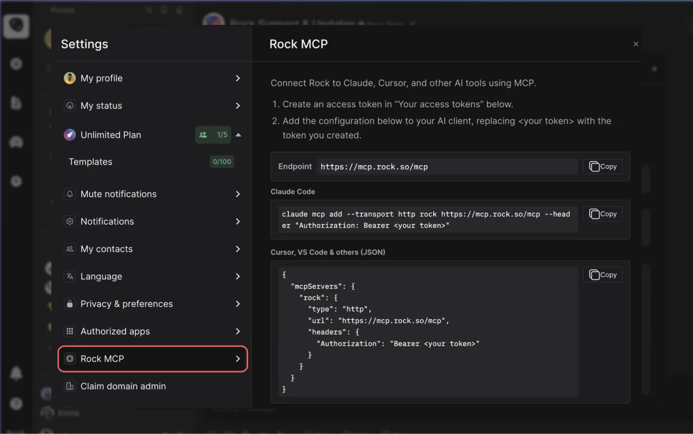


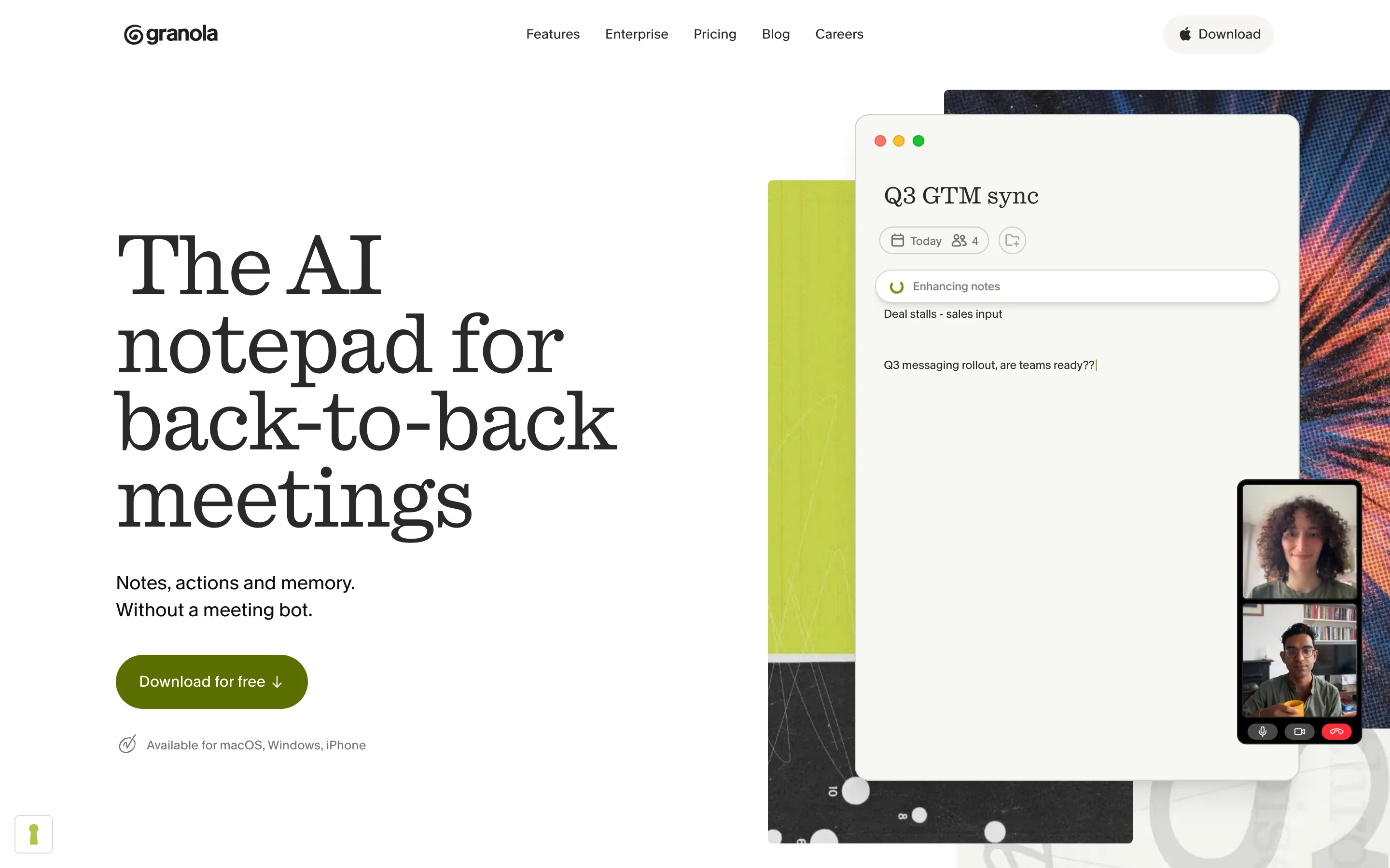
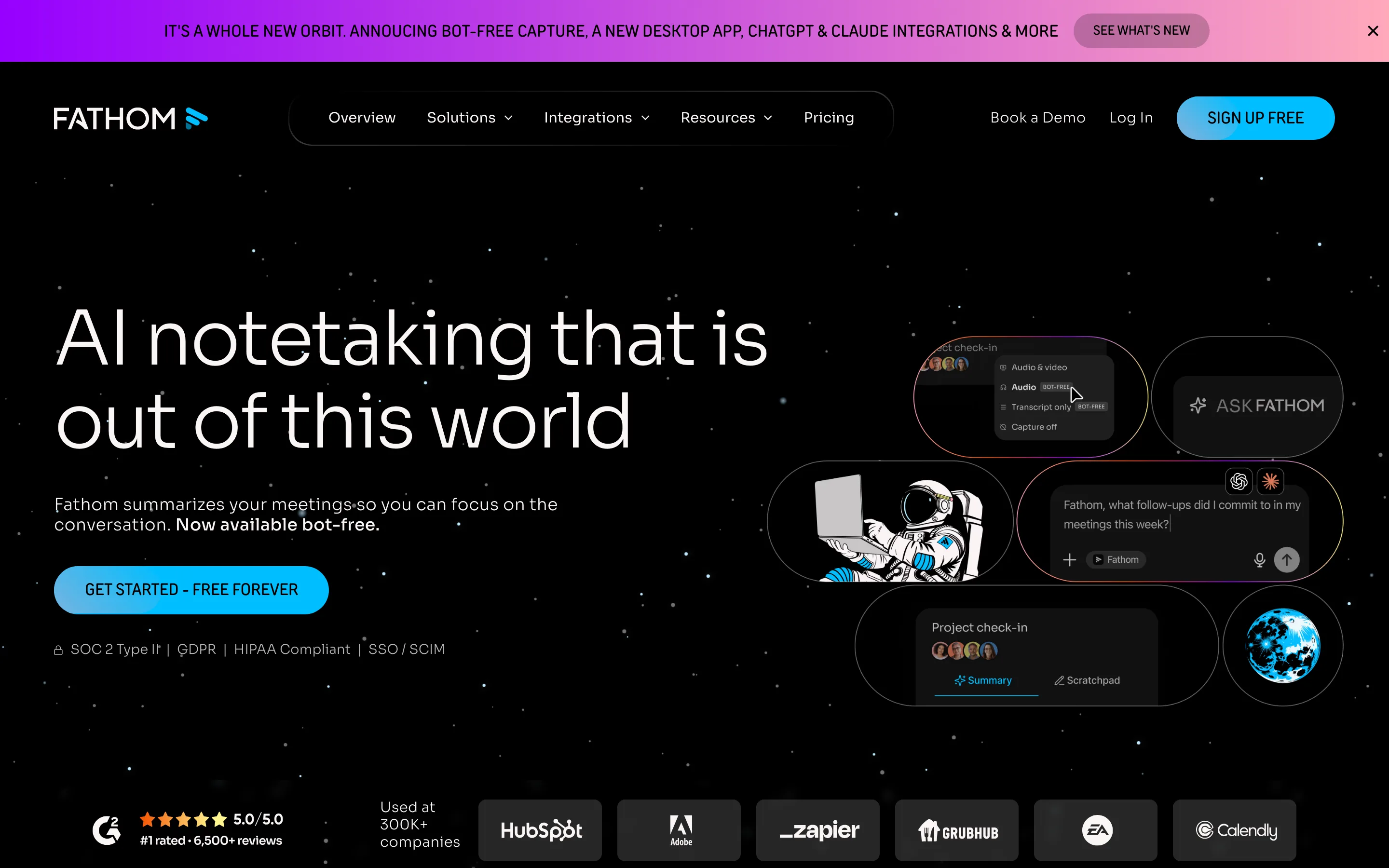
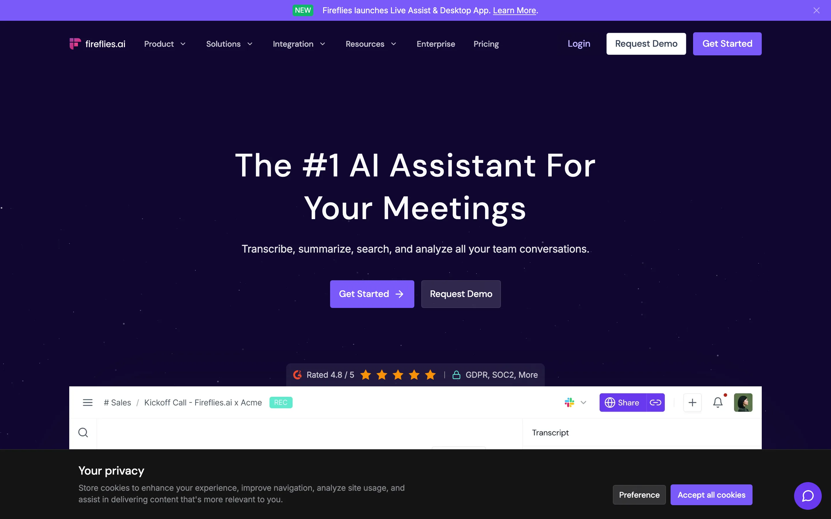
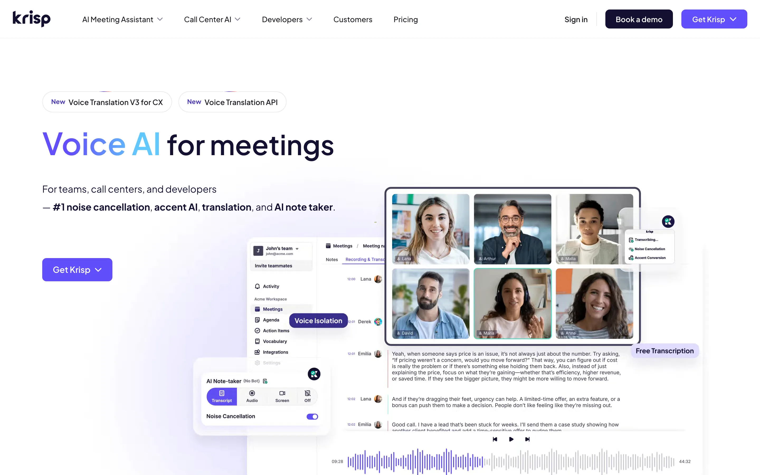
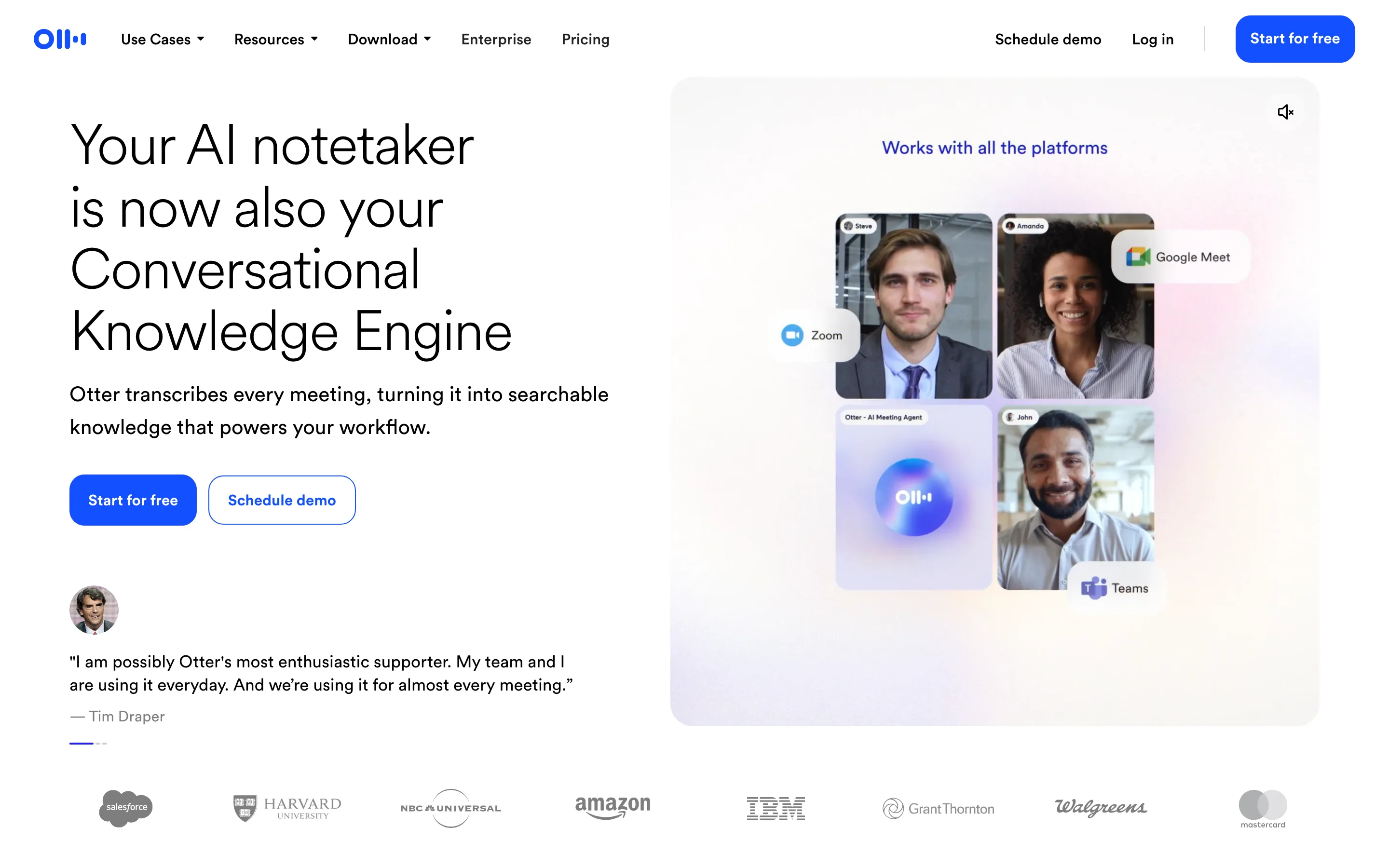
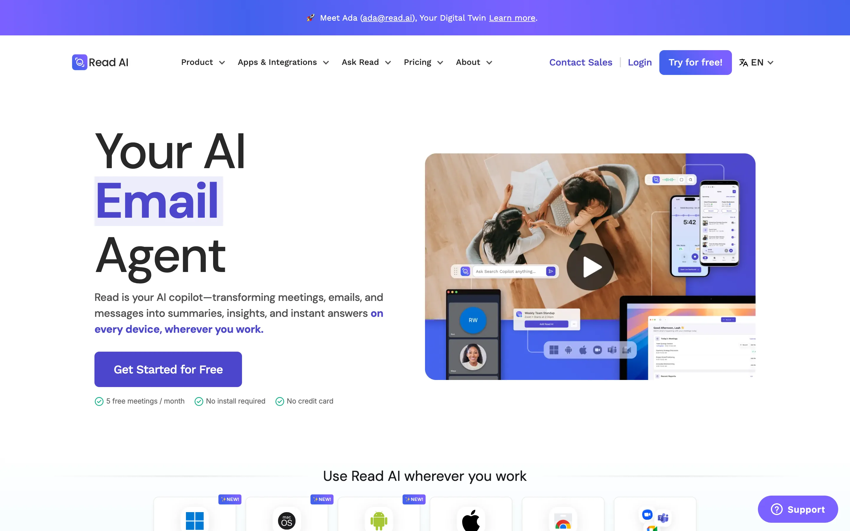
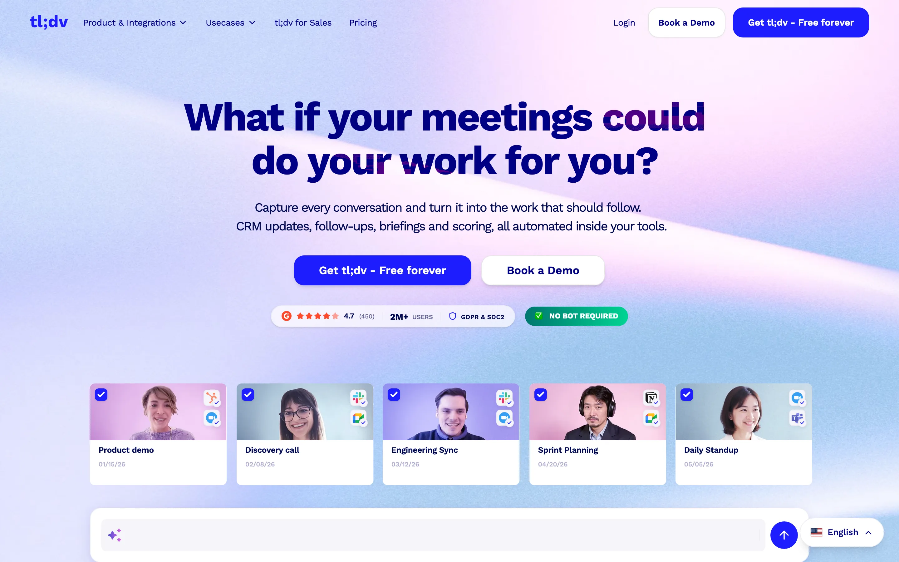
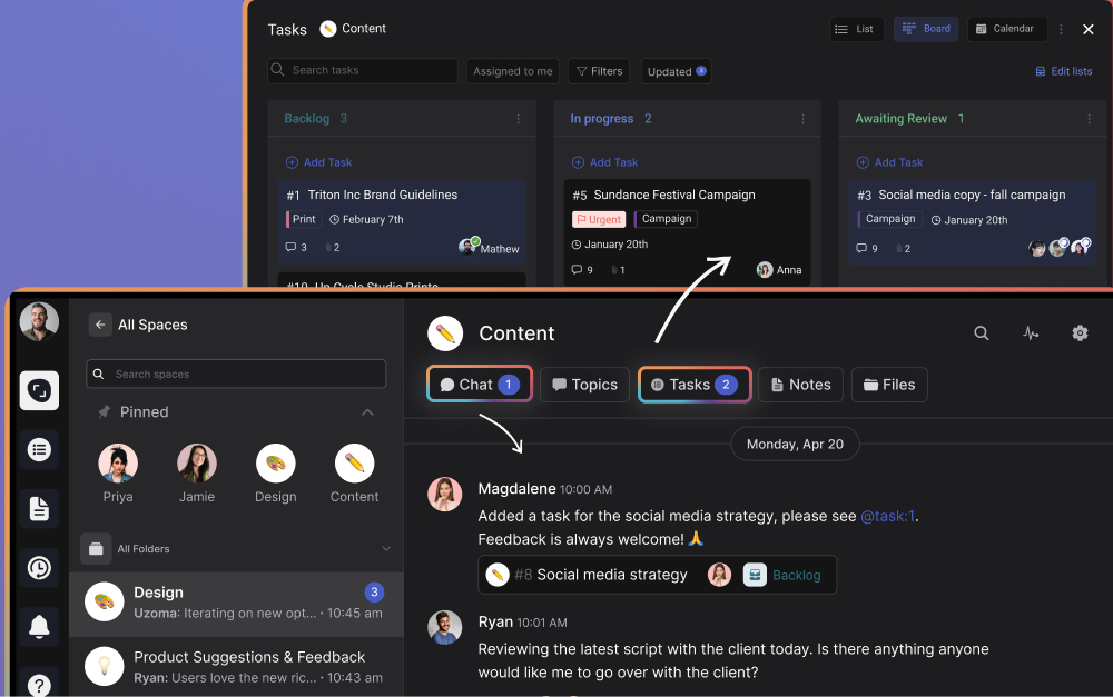
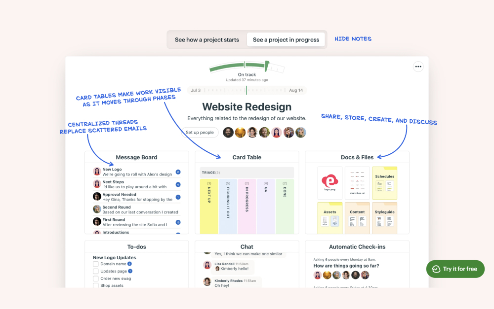


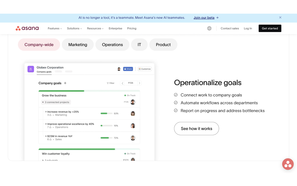
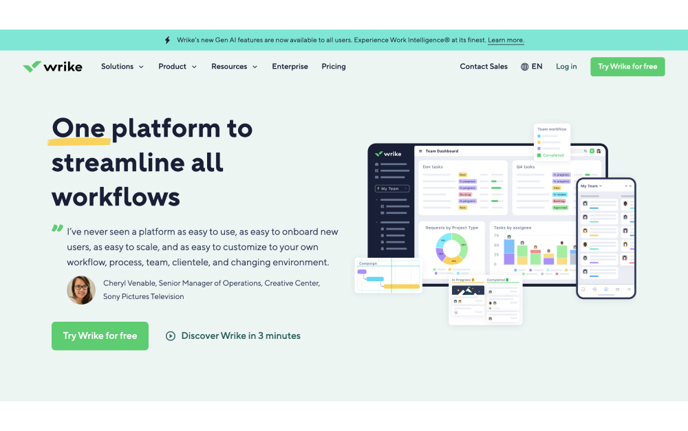
.jpg)