Burndown Charts in Agile: How to Read Them, When They Lie, and What to Use Instead (2026)
A burndown chart is a line graph that shows how much work remains in a sprint or release against time. The chart was invented by Ken Schwaber at Fidelity Investments in 2000 and became the default visibility artifact for Scrum teams. Two lines run across the chart. The ideal line slopes from the total points down to zero. The actual line tracks remaining points at the end of each day.
The artifact has one assumption: scope is fixed. Agencies rarely work with fixed scope. This guide explains how to read a burndown chart and walks through the anti-pattern shapes nobody else covers. It then shows where the chart lies when a client emails a new request on day five.
Quick answer: what a burndown chart is
A burndown chart is a line graph that plots remaining work, measured in story points or hours, against time. The ideal line slopes from the total down to zero across the sprint. The actual line tracks what is really left at the end of each day. The chart is a visibility tool, not a planning tool. The team uses it to spot drift early.
Three variants matter. The sprint burndown covers one sprint and is the most common. The release burndown spans multiple sprints toward a release date. The product burndown looks across the whole product backlog and is the rarest in practice. All three follow the same shape and have the same blind spot.
See it lie: burndown vs burnup, live
The widget below shows a 10-day sprint with 40 story points. Toggle between burndown view and burnup view, then click the red button to add five points of scope on day five. Watch what each chart does. The burndown line stalls and bumps. The burnup chart shows the ceiling rising, which is the conversation the team actually needs to have.
Burndown vs Burnup, live
Set the sprint length and total points. Toggle between burndown and burnup. Click the scope-change button to add work mid-sprint and watch which chart tells the truth.

Track the sprint where the team works.
Rock pairs chat with a task board, so the sprint plan, the daily updates, and the scope conversations stay in one space. One flat price, unlimited users.
How to read a burndown chart
Two axes, two lines. The x-axis is time, usually in days. The y-axis is remaining work, usually in story points but sometimes in hours. The dashed ideal line is the goal. The solid actual line is reality. Where the two diverge is where the team is drifting.
The art is in reading the gap rather than the absolute numbers. Above the ideal line means work is piling up. Below the ideal line is on track, sometimes too far ahead if the team underestimated. A line that stays flat for several days is a stall, which is usually invisible work or a hidden blocker. A line that cliffs down on the final day means the team marks work done at demo, not when it ships.
- Set the y-axis unit before the sprint starts Story points or hours. Pick one and use it for every item in the sprint. Mixing units gives the chart math but breaks the visual comparison. Most agile teams settle on story points because they are relative, not absolute. Teams in early calibration often size in t-shirts first and convert to points after a few sprints of data.
- Draw the ideal line from total to zero Total points at day zero, zero points at the last day of the sprint. The slope is the team's required burn rate. If your sprint is two weeks and the backlog is 40 points, the team needs to close roughly four points per day to stay on the ideal line.
- Update the actual line at the end of each day The Scrum master or the developer who closes the last task updates the chart. Daily is the right cadence. Sub-daily is overhead. Weekly is too late because you cannot react inside the same sprint.
- Read the gap, not the dot A single day above or below the line means little. Three consecutive days above means the team is committed to too much work, has a hidden blocker, or the estimates were optimistic. That is the signal to act on.
The Scrum Guide 2020 update removed burndown charts as a required artifact. The current guide refers to "trends" without mandating any specific chart. Teams that still use burndown do so by choice, which is the right way to use any visibility tool.
The five anti-pattern shapes
A healthy burndown follows the ideal line, with the actual a few points above or below at any given day. Real burndowns rarely look like that. Five shapes show up over and over, each pointing at a specific failure mode. Pattern-matching them is the fastest way to know what to ask in the next standup.
- The Cliff: flat for days, then a sharp drop at the end The actual line stays high and flat for most of the sprint, then plummets in the last two days. Work was finishing all along but the team only marked items done at the demo. The fix is mid-sprint reviews, not end-of-sprint heroics. Stefan Wolpers calls this the most common shape in his anti-pattern survey.
- The Hockey Stick: ideal pace, then a vertical drop on the last day A close cousin of the Cliff. The team tracks well through day eight, then everything closes on day ten. Usually this means stories are too large to complete inside the sprint, so they sit at 99 percent done. Split the stories smaller, not just into smaller subtasks.
- The Wave: line goes up before it goes down The actual line bumps upward mid-sprint, then resumes its descent. New work was added inside the sprint. The chart shape is the only place anyone notices because the conversation about the scope change happened in chat, not in the planning ceremony.
- The Flatline: actual stays parallel to the start Nothing burns down. The team is busy, the standup is full of updates, but no item meets the definition of done. Usually a single oversized story is consuming all capacity. Pull the team off it and split it, or accept it will not ship this sprint and pick a smaller item.
- The Bounce: actual dips below ideal early, then climbs back up A few easy items close in the first two days, the chart looks great, then the rest of the work hits friction and the gap widens. Usually points are awarded too generously on small items and too stingily on integration-heavy ones. Recalibrate during the next refinement, not mid-sprint.
The shapes are diagnostic, not directives. A Wave on a single sprint is noise. A Wave across three consecutive sprints is a signal about how the team accepts mid-sprint requests.
Where the burndown lies
Four assumptions inside the chart, each of which fails often enough to matter. The chart's strength is also its limit: it compresses sprint reality into one line.
Scope is the biggest lie. The burndown assumes the backlog is fixed at day zero. When a client emails a new request on day five and the team adds five points, the actual line stalls or bumps up. The chart tells you the team is behind. It does not tell you why. Burnup charts solve this by showing scope and completion as two separate lines, which is what the widget above demonstrates.
Quality is the second lie. A story closed with a critical bug counts the same as one that ships clean. The chart treats "done with debt" identically to "done." Mike Cohn, who codified release burndown variants at Mountain Goat Software, makes the point that the artifact needs an honest companion.
"The ScrumMaster should update the release burndown chart at the end of each sprint." - Mike Cohn, Mountain Goat Software
Estimation is the third lie. Story points are subjective. A team that quietly inflates points to make the chart look good ships the same amount of work but reads the chart wrong. The Agile Alliance glossary captures this directly.
"Burndown charts only show completed story points, not scope changes in the backlog." - Agile Alliance Glossary
Definition of done is the fourth lie. A team that marks items done at "code merged" produces a different chart than a team that marks done at "deployed to production." Neither definition is wrong. Comparing two teams' charts without knowing each definition is meaningless.
Burndown vs burnup vs Gantt
Three artifacts compete for sprint visibility. The honest choice depends on what the team needs to see.
| Artifact | Shows | Best for |
|---|---|---|
| Burndown | Remaining work over time, against an ideal line. | Single-sprint visibility with fixed scope. Daily standup talking point. |
| Burnup | Completed work and total scope as two separate lines. | Multi-sprint releases, agency work with shifting scope, any team that wants scope changes legible. |
| Gantt | Tasks over time with dependencies and durations. | Waterfall projects, fixed milestones, multi-team coordination. Wrong tool for sprint-level agile. |
| Cumulative flow | Work in each state (todo, doing, done) over time. | Kanban teams that care about flow bottlenecks more than commitment. |
For sprint-level visibility inside a Scrum cadence, burndown and burnup are direct competitors. The burnup wins anywhere scope is not stable, which is most agency work. The burndown wins where the team needs a single number for the daily standup and the backlog is genuinely locked at sprint planning.
Burndown charts for agency teams
Most burndown content assumes a single in-house product team scoring its own backlog against its own goals. Agencies break that frame in three ways. The work spans clients, each with their own definition of done. The backlog is not the team's to set; the client edits it. The sprint is rarely a clean two-week container because retainer work flows around fixed monthly commitments.
The chart still works inside a single client's sprint backlog, with one adjustment: assume scope will change and pick the chart that makes that visible. Burnup makes scope a co-protagonist. When the client adds five points on day five, the burnup ceiling rises in plain sight. That is the right conversation to have with the client in the next check-in. The burndown shows a stall, which the client reads as the team being behind, and the conversation turns adversarial.
Across clients, neither chart is meaningful. A 40-point sprint at Client A is not comparable to a 40-point sprint at Client B. The points were estimated by different teams against different stories. Track each client's sprint chart inside that client's space, and use a separate dashboard for cross-client capacity, usually based on hours rather than points.
The operational rule that compounds: share the chart with the client at the end of each sprint. Most agencies hide the chart, treating it as an internal tool. Sharing it surfaces scope conversations before the next sprint, when they are still cheap. Hiding it pushes those conversations to the end of the engagement, when they are not.
What we recommend at Rock
Rock is not a dedicated agile tool, but most of our customers run sprints inside the same workspace they use for chat. The pattern that works is small: keep the chart, the daily standup, and the work in one place. A burndown image pasted into a Notion doc that nobody opens between standups is a burndown that does not exist.
Practical setup: each sprint has a Rock space. The task board holds the stories with their point estimates in the description. The chart lives as a pinned message in the space chat, refreshed daily by the Scrum master. The standup happens in a thread off that message, which means anyone reading the chat sees the chart and the conversation about it together. When a scope change comes in from the client, it gets logged as a task and tagged so the chart update at end-of-day catches it.
For agency teams running multiple client sprints, each client gets its own space with its own chart and standup thread. The chart format is identical across spaces, so a project lead moving between three clients reads three charts that look the same. This is the practical reason the chart format matters more than the choice between burndown and burnup. Consistency across boards is what lets the team scale beyond two clients.
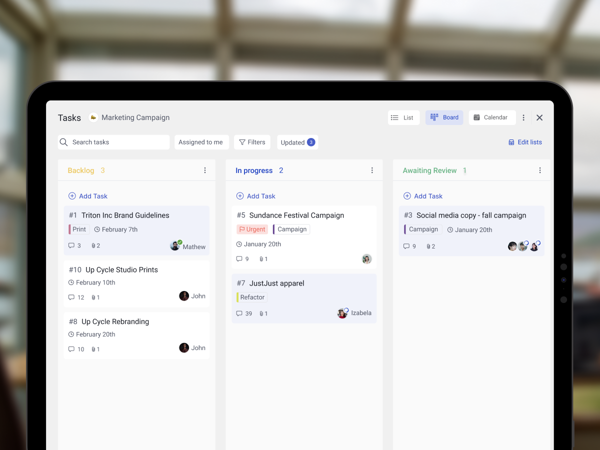
Free resource: the Agile Sprint Planning template ships with backlog, sprint, and review columns ready for stories.
One last move: re-read the past three sprints' charts together at the start of every quarter. Patterns repeat. Teams that hockey-stick once usually hockey-stick three sprints in a row. Spotting the shape across multiple sprints is what turns the chart from a daily reminder into a planning input for the next quarter.
Frequently asked questions
What is a burndown chart used for?
A burndown chart shows how much work is left in a sprint or release, plotted against time. Teams use it to spot when work is piling up faster than expected. It is a visibility tool for the team and stakeholders, not a planning tool.
What is the difference between a burndown and a burnup chart?
A burndown chart shows remaining work descending toward zero against a fixed scope assumption. A burnup chart shows completed work climbing while plotting total scope as a separate line. When scope changes mid-sprint, the burndown line stalls without explanation; the burnup line shows the scope ceiling rising, which makes scope changes visible rather than hidden.
Who creates the burndown chart?
The Scrum master typically owns the update cadence. The team supplies the data by closing tasks and updating remaining estimates. The chart is a shared artifact, not a manager's tool. The Scrum Guide 2020 removed burndown as a required artifact, so the choice to maintain one is the team's.
How do you read a burndown chart?
Read the gap between the dashed ideal line and the solid actual line. Above ideal means work is piling up. Below ideal means the team is ahead. Pay more attention to the shape across days than to any single data point. Three consecutive days above the ideal line is the action signal, not a single bad day.
What is a sprint burndown chart?
A sprint burndown is a burndown chart scoped to a single sprint, usually one to four weeks. The x-axis is sprint days; the y-axis is remaining story points or hours for the sprint backlog. It is the most common variant and the one used as the daily standup talking point.
Is the burndown chart still used in Agile?
Yes, but as an optional tool. The Scrum Guide 2020 removed burndown charts as a required artifact, referring instead to "trends" generically. Teams that use them now do so by choice. Many modern teams substitute or pair burndown with burnup, cumulative flow, or velocity charts.
What are the disadvantages of a burndown chart?
The chart assumes fixed scope, treats all completed work as equal regardless of quality, and depends on honest story-point estimates. It also rewards "marking done" at the right moment rather than actual delivery. Burnup charts address the scope-creep blindness; the other limits are inherent to any single-line visibility artifact.
Can I make a burndown chart in Excel?
Yes. Two columns: day number and remaining points. Plot as a line chart, then add a second series for the ideal line (linear from total to zero). The interactive widget above is the same idea without the spreadsheet. Excel is still useful when the team wants a static record at end of sprint.
A burndown chart is a single line that should not be read alone. Pair it with a burnup when scope shifts, and treat the shape as the message rather than any one day's dot. Rock combines chat, tasks, and notes in one workspace, so the sprint chart lives where the team already works. One flat price, unlimited users. Get started for free.