By clicking Accept, you agree to the storing of cookies on your device to enhance site navigation, analyze site usage, and assist in our marketing efforts. View our Privacy Policy or manage preferences.
Oops! Something went wrong while submitting the form.
or continue with
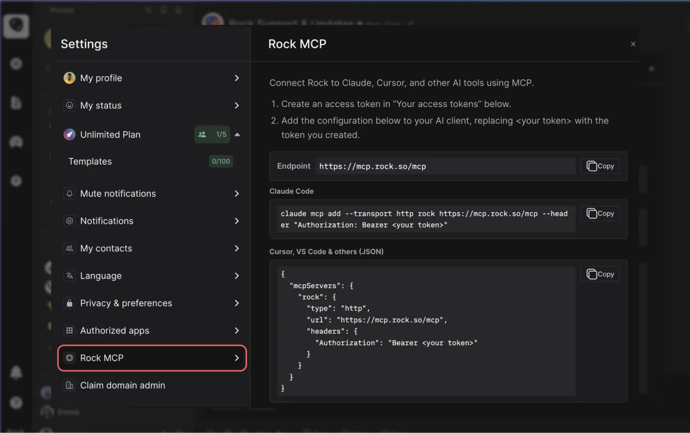
Rock MCP is here. You can now connect Rock to the AI tools you already use. Create a token in Rock, paste it into Claude, Cursor, or another client, and the assistant works inside your spaces as you, across all of them at once.
From earlier calls this month we learned that a lot of our active teams live in tools like Claude and Cursor now, and you would rather they reach into Rock than have you copy things back and forth. We work the same way.
Rock MCP is that connection: your AI assistant reads and updates your spaces directly, making it easier to stay up to date and manage projects across team members.
A few things worth knowing:
It works today with Claude Desktop, Claude Code, Codex, Cursor, VS Code, and Claude Cowork. A one-click connector for Claude on the web and mobile is coming next.
The token acts as you, read and write, across all your spaces. Treat it like a password, and revoke it any time.
It is on every plan, including Free.
Easiest setup: just ask Cowork
Claude Cowork can help you end-to-end with the setup. Share the prompt below and generate a new token, Claude will guide you through all steps.
Keep your token safe, never share in chat.
zsh
Works in coding environments
Add Rock MCP to Claude Code, Codex, Cursor, VS Code, or right from the terminal.
You will find it under your avatar, in a settings panel called Rock MCP. Full setup for every client is in the help guide.
What we use it for
A few of the things we ask it every day:
Search across your whole account. One question searches tasks, notes, and chat messages in every space you belong to. Try "where did we land on the Q3 pricing change?" or "find the onboarding brief and summarize it."
Turn a transcript or doc into tasks. Paste a meeting transcript or point it at a document, and ask it to create the tasks, with owners, due dates, and descriptions already filled in.
Push updates in. Drop your latest growth numbers, funnel metrics, or a status note straight into the right space, so the team sees it where they already work.
Run your to-do list from the chat. Ask "what is my most urgent task?", work on it together, then mark it done or update it without opening the app.
Plus, recent fixes
Since our last update, we also shipped:
Cleaner notifications and unread counts. Unread dots clear correctly for archived spaces and after "Mark all as read," and counts update the moment you open an item.
DMs in custom folders no longer disappear from your sidebar.
Chat threads stay in the right space now, with no more cross-space mix-up when you open one.
Add Spaces picker now targets the correct workspace inside embeds.
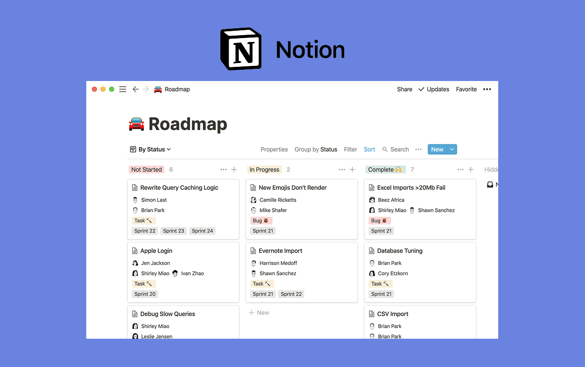
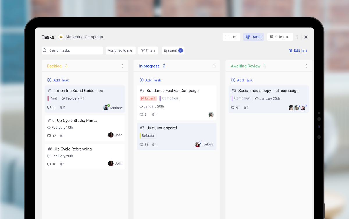
Notion and Trello often end up on the same shortlist, but they are not the same kind of product. Notion is a workspace built around the page. Trello is a task tracker built around the card. Picking between them is less about feature parity and more about which way your team naturally works.
This guide compares them honestly, axis by axis, then looks at the cost at 5, 15, and 30 seats. The verdict is not a single winner. Some teams should pick Trello. Some should pick Notion. Some should run both. And some should pick neither because the real gap is communication, not docs or boards. Run the recommender below for a starting point.
Notion treats every screen as a page. Trello treats every screen as a board. That single difference shapes everything else.
Quick answer. Trello is a visual Kanban board built around the card. Notion is a workspace built around the page. Pick Trello if you want a board running today and your work fits a simple flow. Pick Notion if you want to build a real knowledge base and tasks are a side benefit. Use both, or neither, if your bigger problem is splitting work across docs, boards, and a separate chat tool.
Need chat in the same workspace?
Rock pairs messaging with tasks and notes — built around team conversations.
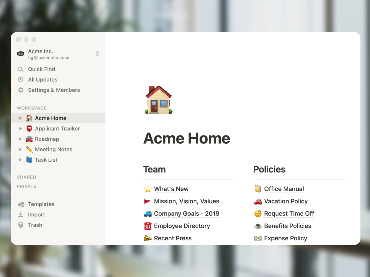
Notion started as a notes app and grew into a workspace for knowledge work. The core unit is a flexible block-based page. Any page can become a database, and tables, kanban boards, calendars, and galleries are all views over the same data. The model is built for teams that lead with writing.
Product specs, engineering wikis, content calendars, OKR trackers, customer research, meeting notes, and onboarding handbooks fit Notion well. The free plan is generous for individuals and small teams. Notion AI was bundled into the Business plan in May 2025, which turned long-running workspaces into searchable knowledge bases for teams paying $18 per user per month or more.
"Your mind is for having ideas, not holding them." - David Allen, Author of Getting Things Done
That quote is the spirit of Notion. The tool exists to take what is in your head and put it somewhere you and your team can find it later. The trade-off is real. The flexibility that makes Notion powerful also makes it slow to set up and easy to over-engineer. Many teams build elaborate Notion systems that nobody but the original architect knows how to use.
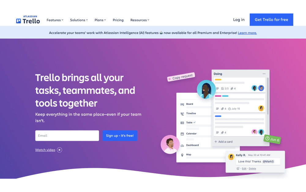
Trello started as a digital Kanban board and has stayed close to that idea. The core unit is the card. Cards live in lists, lists live on boards, and boards live in workspaces. You drag cards across columns to move work forward. The model traces back to Kanban, which Toyota engineers developed for production lines in the 1940s. New team members figure it out in minutes without training.
That simplicity is the point. Marketing campaigns, editorial calendars, sales pipelines, sprint backlogs, and personal to-do lists all fit comfortably on a Trello board. Atlassian acquired Trello in 2017 and has invested in it through 2026, including the visual refresh shipped in 2025 and Atlassian Intelligence rolled into Standard and above tiers since 2024. Atlassian Intelligence handles writing assistance, summaries, and action-item extraction inside Trello cards.
"Design is not just what it looks like and feels like. Design is how it works." - Steve Jobs, Co-founder of Apple
Trello clears that bar in one direction: the board model is so clear that almost anyone can use it. The trade-off is range. Trello does not pretend to be a wiki, a doc tool, or a database. Card descriptions handle short notes, and Power-Ups extend the board with calendar, timeline, dashboard, and map views on the Premium tier. But if your work needs a real knowledge base, Trello will frustrate you fast.
Trello strips work to a single Kanban board. The simplest visual model in the comparison.
Notion vs Trello side-by-side
Five axes matter when picking between these tools. Cards versus pages, views and depth, AI features, automation, and pricing. Here is how each one stacks up.
Feature
Notion
Trello
Built around
The page (docs and databases)
The card (Kanban board)
Best for
Knowledge bases, wikis, docs that do tasks
Visual task tracking, simple workflows
Setup time
Hours to days for a real system
Minutes
Views
Page, table, board, calendar, gallery, timeline
Board (free), plus timeline, calendar, dashboard, map (Premium)
Docs and wiki
Best in class for nested pages
Card descriptions only
AI in 2026
Notion AI bundled in Business (May 2025)
Atlassian Intelligence on Standard+ (since 2024)
Automations
Database actions, basic builder
Butler (rule-based, no-code, deep)
Free plan
Unlimited blocks, 7-day history
10 boards/workspace, 1 Power-Up/board
Paid from
$10/user/mo (Plus, annual)
$5/user/mo (Standard, annual)
Mobile
Functional, slower than desktop
Strong, near feature parity
Learning curve
Steep
Minimal
Cards versus pages
This is the spine of the Notion vs Trello comparison. Trello is built around the card. Each card is a self-contained unit with a title, description, checklist, attachments, and comments. Cards move across lists. The board is the universe.
Notion is built around the page. Each page is a flexible canvas for any combination of text, embedded databases, sub-pages, and views. Pages nest into a hierarchy. The workspace is the universe.
The Notion vs Trello choice often comes down to which model fits how your team thinks. Visual workflows where work moves through stages fit cards. Knowledge-heavy workflows where context lives in writing fit pages. Most teams have both kinds of work, which is why a real number of them end up running both tools.
Views and depth
Trello started with one view (the board) and added more on paid tiers. Premium unlocks Timeline, Calendar, Dashboard, and Map views. The view set is small and focused. The simplicity is intentional.
Notion ships with Table, Board, Calendar, Gallery, Timeline, and List views over a database, plus the page itself as the default writing surface. Linked databases let you pull the same data into multiple pages with different filters. The depth is real for teams that build out the system.
If you are leaving a tool because it felt cluttered, Trello goes the opposite direction from Notion. If you are leaving a tool because it felt thin, Notion goes the opposite direction from Trello.
AI in 2026
Notion AI is doc-effective. Writing assistance, summarization, action-item extraction, and Q&A across your workspace. Notion AI has been bundled into the Business plan since May 2025, which means teams paying $18 per user per month get AI included.
Trello also has AI in 2026, despite what most older comparison articles still say. Atlassian Intelligence rolled into Trello Standard and above in 2024 and includes writing assistance, summarization, and smart capture inside cards. Atlassian shipped a New Year's Resolution Board Builder feature in early 2026 and has more AI features queued on the public Cloud Roadmap. The "Trello has no AI" line that floats around the SERP is now stale.
Notion AI is stronger for content work. Atlassian Intelligence is closer to what you would expect from a project tool. Both are worth using on the right tier.
Automation
Trello wins here. Butler is the built-in no-code automation engine, and it is one of the deepest in the category. Move cards on schedule, trigger checklist creation, fire emails on status change, post to Slack when a card moves into Done. Butler runs on every paid tier, including Standard.
Notion automations are lighter. Database actions and a more recent automation builder cover basic flows. Most Notion teams that need cross-tool automation pair it with Zapier or Make, which adds another tool and another bill.
For teams whose daily work depends on automated reminders, status changes, and notifications, Trello with Butler removes a layer. For teams whose automations are simple, Notion plus a Zapier free plan is fine.
Pricing tiers
Trello starts cheaper. Standard is $5 per user per month on annual billing, Premium is $10 (per Trello pricing). The free plan covers 10 boards per workspace with one Power-Up per board, which is enough for many small teams.
Notion starts at $10 per user per month on the Plus plan. Business is $18 (with Notion AI included). The free plan is generous for individual use but caps team features.
The headline math favors Trello, but the real cost depends on your team size. We model that next.
Real cost at 5, 15, and 30 seats
Most comparison articles model 10 seats and stop. Below is the verified annual cost at 5, 15, 30, and 50 seats using 2026 list prices on annual plans. Rock is included as a flat-rate reference because the math gets interesting at the larger sizes.
Team size
Trello Standard
Trello Premium
Notion Plus
Notion Business (incl. AI)
Rock Unlimited
5 people
$300
$600
$600
$1,080
$899
15 people
$900
$1,800
$1,800
$3,240
$899
30 people
$1,800
$3,600
$3,600
$6,480
$899
50 people
$3,000
$6,000
$6,000
$10,800
$899
Three things stand out. First, Trello Standard is consistently the cheapest paid option, half the price of Notion Plus per user. Second, both Notion and Trello scale linearly with team size while Rock stays flat at $899 per year on annual billing. Third, the gap between Trello Standard and Trello Premium doubles your bill, so the Power-Ups you actually need decide whether the upgrade is worth it.
The breakeven math: at 5 people, both Trello Standard and Notion Plus beat Rock. At 18 people, Trello Standard and Rock cost about the same. Past 18 on Standard or 9 on Notion Plus, Rock costs less than the per-seat option for the same team. None of this matters if Notion or Trello is the right tool for the work, but at agency scale the math is part of the decision.
Pricing also assumes annual billing. Monthly pricing for both Notion and Trello adds 20 to 25 percent. See our Notion vs ClickUp breakdown for the same cost-modeling against ClickUp, which is closer in feature scope to Notion.
Or pick the third option
Rock keeps chat, tasks, and notes together. One flat price, unlimited users.
Notion is the right pick for teams that lead with writing. Some specific cases.
Doc-heavy product and content teams. Product specs, engineering wikis, editorial calendars, content briefs, and customer research libraries fit Notion's flexibility. The page-and-database model handles these out of the box.
Knowledge bases that get heavy daily use. Customer support docs, internal HR handbooks, onboarding wikis, and policy libraries earn back the setup time within weeks.
Solo founders and small teams that want one tool. Notion can be a personal CRM, a project tracker, a journal, and a wiki at the same time. Few tools can.
Skip Notion if. You want a tool running today. You manage simple visual workflows that map cleanly to a board. Or your team will not invest the time to build a system before using it.
When to pick Trello
Trello is the right pick for teams that want a board running today and a workflow that fits one. Some specific cases.
Small teams with linear workflows. Editorial calendars with stages, sales pipelines with steps, support queues with status. The card-on-a-board model is the right shape.
Marketing teams and creative shops. Campaign trackers, asset reviews, and content production lines work well as boards. Power-Ups for proofing and approvals fill the gaps.
Teams already in the Atlassian ecosystem. Trello integrates with Jira, Confluence, and the rest of the Atlassian stack. If you use those tools, Trello slots in cleanly.
Cross-functional teams that want a fast shared view. A board everyone can read at a glance beats a Notion workspace nobody opens. See our breakdown of task management apps if Trello feels too narrow for your needs.
Skip Trello if. Your work depends on long-form documentation. You need cross-project portfolio views. You manage 30+ people across multiple boards and need workload balancing. Or your team writes more than it ships.
When you should use both, or neither
The Notion vs Trello question often hides a third question: what happens to communication while these tools run? Both are quiet by design. Notion has comments and mentions. Trello has card discussions. Neither replaces the back-and-forth chat that runs most teams' day. Most teams using either pair it with Slack, Microsoft Teams, or WhatsApp groups, which is where the real cost shows up.
The Harvard Business Review study on app toggling found that knowledge workers switch apps up to 1,200 times per day, losing roughly four hours a week to context switching. Each tool added to the stack makes that number worse, not better. So the honest read is: Notion or Trello plus Slack is three products, three bills, and three places where information lives.
For some teams, that stack is fine. For agencies and growing teams that pull clients and freelancers into the work, the per-seat math on guest access bites quickly. Trello and Notion both charge for guests on most paid plans, or restrict what they see.
The chat-first option closes that gap. Rock combines messaging, tasks, and notes in one workspace. Every project space includes its own chat, task board, notes, and file storage. Clients and freelancers join spaces directly without per-seat fees. Pricing is flat at $89 a month for unlimited users, or $74.92 a month on the annual plan. That works out to under $6 per user at 15 people and under $3 per user at 30. Compared against the typical Trello plus Slack-tier chat tool stack, the consolidation pays back fast.
"What is important is seldom urgent, and what is urgent is seldom important." - Dwight D. Eisenhower, 34th US President
Rock is not the right tool for everyone. If your work depends on Notion-style relational databases or deeply nested wiki pages, Rock notes will feel limited compared to Notion. If your work depends on Power-Up-driven Trello automations like Butler, Rock task automations are simpler. The honest read is that Rock fits chat-first agency or growing teams better than the doc-first or board-first specialist team.
If you want to test the chat-first model on real work, the free plan covers 3 group spaces with 5 members each. That is enough to run a project end to end with the team. Compare against your current Notion plus Slack or Trello plus Slack monthly cost. The math at 15 or more people is hard to argue with. See our instant messaging apps guide and our communication strategies piece for the wider context on chat-first work.
FAQ
Is Notion better than Trello? Neither is universally better. They are built for different jobs. Notion is the stronger pick for teams that lead with writing, building knowledge bases, and structured information. Trello is the stronger pick for teams that move work across visual stages and want fast setup. Picking the wrong one costs setup time and team buy-in.
Can Notion replace Trello? Notion has a Board view that mimics Trello's Kanban model, and small teams can run a basic Trello-style flow inside Notion. The trade-off is performance and ease of use. Notion's board feels heavier than Trello's, and the drag-and-drop is slower. For teams that mostly need a board, Trello stays simpler. For teams that need a board plus a wiki plus task databases, Notion is one tool instead of two.
Which is easier, Notion or Trello? Trello is easier to start. You can have a working board in minutes with no template knowledge required. Notion is easier to scale. Once a team builds a workspace structure, the same workspace can hold years of growth without forcing a tool migration. Easy-to-start and easy-to-scale are different problems with different right answers.
Is Trello still being updated? Yes. Atlassian shipped a visual refresh in 2025, rolled Atlassian Intelligence into Standard and above tiers in 2024, and shipped a New Year's Resolution Board Builder in early 2026. The public Atlassian Cloud Roadmap shows Trello features queued for later in 2026. The "is Trello dying" search query is older than the roadmap.
Does Trello have AI? Yes. Atlassian Intelligence is included on Standard and above plans since 2024. It handles writing assistance, summarization, and smart capture inside Trello cards. Most older comparison articles still claim Trello has no AI, which is no longer accurate.
Want one workspace where chat, tasks, and notes live together? Rock combines all three with flat pricing for unlimited users. Get started for free.
Vanity metrics are the numbers that look great in a board deck and rarely change a single decision. Followers, page views, total signups, app downloads, hours logged, calls made: all classic examples. They move easily, they go up over time even when the underlying business is flat, and they tend to dominate dashboards precisely because they make everyone feel good.
This guide goes deep on what counts as a vanity metric and why teams keep tracking them anyway. It includes the actionable replacements by channel and the cases where a "vanity" number is actually doing useful work. For the broader framework around what qualifies as a real KPI, see the KPI framework guide; this is the deep dive on the most common failure mode.
A vanity metric is a number that looks meaningful but does not drive a decision. The term was coined by Eric Ries in The Lean Startup (2011). He used it to describe metrics that "make us feel good but offer no clear guidance for what to do." The classic test: if the metric improved 50% next quarter, would the business demonstrably grow? If the answer is "not necessarily," the metric is vanity.
"Vanity metrics... numbers that make us feel good but offer no clear guidance for what to do." - Eric Ries, The Lean Startup (2011)
Real KPIs answer "what should we do next?" Vanity metrics answer "are we still growing?" The first runs the business; the second decorates the dashboard. The classifier widget in our KPI framework guide tests this directly: paste in your metric and the four-check rubric returns a verdict.
Why Teams Keep Tracking Them Anyway
If vanity metrics are so well-known, why do they keep ending up on dashboards? The answer is mostly psychological and political, not analytical.
They are easy to gather. Follower counts, page views, and impressions come free with the platform. Real KPIs (cohort retention, conversion by source, gross margin per project) require setting up the measurement and choosing what counts. Easy beats useful in most reporting cycles.
They are emotionally safe. A vanity metric that goes up tells the team they are succeeding without testing whether they actually are. A real KPI can go down, which forces a hard conversation. Teams that are tired or under pressure tend to gravitate to metrics that do not threaten their narrative of progress.
They impress executives and investors. "We hit 100,000 users" is easier to sell upstairs than "monthly retention dropped from 38% to 34%." A board member who sees a hockey-stick chart on followers feels reassured even when nothing meaningful is happening underneath. The pressure flows downward. Teams track the vanity number because that is what the boss wants to see, not because it answers a real question.
They confuse correlation with causation. Vanity metrics correlate with real outcomes during good periods, which is why teams keep them. Followers and revenue both grew last year, so followers must matter. The link breaks during stress: a competitor launches, the algorithm changes, and followers stay flat while revenue collapses. By then it is too late to switch.
Knowing why vanity metrics persist is half the work. The other half is replacing them.
Vanity Metrics by Channel: Swap This for That
The fastest way to clean up a dashboard is to walk it channel by channel and swap the vanity number for the actionable replacement. The table below shows the swaps we see most often across teams, including the agency angle most public lists skip.
Channel
Vanity Metric
Actionable Replacement
Social media
Followers, likes, impressions
Engaged followers who clicked through and converted; reply-to-impression ratio on key posts
Content / SEO
Page views, total traffic, time on page
Page views from organic search that produced an MQL; conversion rate of top-3 landing pages
Email
Open rate, total subscribers
Click-through to revenue-driving page; signup-to-paid conversion within 30 days
Paid ads
Impressions, total ad spend, clicks
Cost per acquired customer; return on ad spend (ROAS); LTV-to-CAC ratio
Product / SaaS
Total signups, app downloads, MAU
Activation rate (users who hit "aha" milestone); week-4 retention; product-qualified leads
Sales
Calls made, demos booked, leads in CRM
Win rate by segment; pipeline coverage to quota; average deal size by channel
Customer support
Tickets closed, agent volume
First-contact resolution rate; CSAT after resolution; ticket reopens within 7 days
Agency / services
Total clients, hours logged, projects in flight
Project gross margin; billable utilization; net revenue retention; client NPS
The pattern is consistent: vanity metrics measure exposure or activity, actionable metrics measure outcome. Likes become engaged-followers-who-converted. Page views become MQLs from organic search. Calls made become win rate by segment. Each swap forces the question "what is this work supposed to produce?" and tracks the answer instead of the activity.
"The single metric that best captures the core value that your product delivers to customers and is the key to driving sustainable growth." - Sean Ellis, on the North Star Metric
Sean Ellis's framing of the North Star Metric is the cleanest replacement test. Pick the one number that, if it kept rising, would mean the business is genuinely working. At Airbnb the answer is nights booked. At Facebook it was daily active users. At an agency, it might be project gross margin or net revenue retention. Whatever it is, the surrounding metrics either feed it or are vanity.
How to Spot a Vanity Metric in 30 Seconds
You do not need a long audit to identify vanity. Three quick tests usually do it.
The 50% test. Imagine the metric improved 50% next quarter. Would the business definitely be in better shape, or could it improve while revenue, retention, and margin all stayed flat? If the answer is "could go either way," it is vanity.
The next-step test. If the number drops 30% next month, does the team know what to do? A real KPI has a clear playbook attached. A vanity metric leaves people shrugging or scrambling for spin.
The aggregate-vs-cohort test. Most vanity metrics are aggregates that hide what is happening to specific groups. "10,000 active users" sounds healthy until you split it: 9,000 are last month's free trials cooling off, 1,000 are paying. The cohort view exposes the truth; the aggregate hides it.
Run any candidate metric through those three tests before adding it to a dashboard. Most candidate metrics fail at least one.
The reason these tests work is they expose the gap between what a metric describes and what the team actually controls. Vanity metrics describe a state; actionable metrics describe an outcome the team is responsible for. Page views describe a state. MQLs from organic search describe an outcome marketing owns. Demos booked describe a state. Win rate by segment describes an outcome sales owns. The shift in language is small but the shift in accountability is large, which is exactly why the cleanup is uncomfortable.
When Vanity Metrics Are Actually Useful
The argument so far has been one-sided. The honest counter is that vanity metrics earn their place in two specific situations, and pretending otherwise reads as preachy.
"Vanity metrics aren't the ultimate measure of your success... at the beginning of a new product, process, or activity they do provide insight." - Jeff Gothelf, In Defense of Vanity Metrics
Early-stage signal. When you launch something new, you do not have conversion or retention data yet because no one has had time to convert or churn. Page views, signups, demo bookings, and downloads tell you whether the offer is even resonating. Once you have a real cohort to measure, those numbers should drop off the dashboard.
Brand-awareness phases. Some campaigns are explicitly about being seen, not converting this quarter. PR pushes, conference launches, and category-creation efforts use reach metrics (impressions, mentions, share of voice) as legitimate KPIs because awareness is the outcome. The trap is letting "awareness" stay on the board after the campaign ends.
The shared rule: a vanity metric is appropriate when no actionable alternative exists yet, and only until one does. The moment you have real data on what those impressions or signups produce, the vanity number gets retired.
Common Mistakes
The patterns below show up across teams that intend to do better on metrics and slowly drift back to vanity. Most of them come from social pressure rather than analytical confusion.
Adding a vanity metric "just for the report"A metric on the dashboard "because the board likes to see it" is a problem the team will pay for later. It crowds out attention from the metrics that matter and trains everyone to expect feel-good numbers. Either the metric drives a decision or it gets cut.
Confusing engagement metrics with conversionLikes, comments, time on page, and shares are engagement; they describe how people interact with content. Conversion describes whether that interaction produced an outcome the business wanted. Most "engagement KPIs" are vanity until they are paired with the conversion metric they are supposed to predict.
Tracking growth without a denominator"We grew 40% this month" sounds great until you remember the base was 10. Always pair growth percentages with the absolute number, the cohort size, and the baseline before declaring victory. A growth rate without a denominator is the most common vanity dressed in respectable language.
Defending a vanity metric with "it correlates sometimes"Most vanity metrics correlate weakly with real outcomes during good periods, which is why teams keep them. The test is whether the team would change behavior if the metric moved. If a 30% drop in followers next quarter would not change a single decision, the metric is not predictive enough to track.
Replacing one vanity metric with anotherSwapping monthly active users for daily active users is a smaller vanity metric, not a real KPI. Both still tell you "people opened the app." A real replacement is something like "weekly users who completed the core action" (a billable transaction, a saved file, a sent message), not a smaller version of the same volume metric.
Letting compensation ride on a vanity metricTying bonuses, OKRs, or performance reviews to vanity metrics is the fastest way to corrupt the team's behavior. People will optimize for what is rewarded; if you reward followers, you get followers, often at the expense of the underlying business. Reward the actionable replacement, not the headline number.
The mistake that does the most damage is letting compensation ride on a vanity metric. As soon as a bonus depends on follower growth or signup volume, the team will manufacture follower growth or signup volume, often at the cost of the underlying business. Tie compensation to the actionable replacement and the dashboard cleans itself up.
What We Recommend
At Rock we run an annual exercise we call the vanity sweep. Every team takes its current dashboard and runs each metric through the 50% test, the next-step test, and the cohort test. Anything that fails gets cut, or demoted to a "context" panel that nobody is graded on. The point of the sweep is not deletion. It is redirecting attention.
The cleanup creates room for two or three actionable KPIs the team will actually try to move that quarter. From there, every task on the board has to connect to one of those metrics. Activity that does not link to a real KPI is either work that should be killed or work the team has not learned to measure yet. The board below shows what that looks like for one quarter: two KPIs picked, six real tasks tagged by which metric each task moves.
Two KPIs, Six Real Tasks
Two KPIs the team is moving this quarter: MQLs from organic search (blue) and Project gross margin (green). Every task on the board moves one of them. Drag to Done as the team ships, or add your own.
0 of 6 done
Drag tasks between columns or add your own
Tap a task, then tap a column header
That task moved a real metric. Bring this board to your team and ship the rest.Try Rock for free
The shape of that board is the deliverable. Two KPIs the team has agreed are real. Six (or more) activities that connect to one of those KPIs by name. No task on the board is housekeeping or "we should track this." Every card is work that, when shipped, will move one of the two numbers the team has committed to. That is the whole game once vanity is cleared away.
Pair this with the broader strategy stack and the measurement layer becomes coherent. SWOT, Strategic Choice Cascade, and PESTEL set the strategic direction. The OKR framework drives the change you are committing to this quarter. The KPI framework defines the standards you hold day to day. The OKR vs KPI guide covers the operational handoff. For function-specific application, see marketing KPIs, sales KPIs, and agency KPIs; the billable hours guide covers the operational input below all of them. This article is the discipline that keeps any of those measurements honest.
Run the vanity sweep with your team. Rock combines chat, tasks, and notes in one workspace. One flat price, unlimited users. Get started for free.
KPIs are the most common performance-management tool in modern teams, and the most commonly misused. Most metrics teams call KPIs are not actually KPIs at all. They are result indicators, vanity metrics, or process measures dressed up in performance-management language. The KPIs that survive are anchored to a goal in the broader marketing plan or business plan; metrics without that link tend to drift.
This guide explains what genuinely qualifies as a KPI and how to choose a set that actually drives decisions. It includes examples by function (including agencies) and the mistakes that turn KPI dashboards into wallpaper. Use the classifier below to test whether the metric you have in mind is a real KPI before you build a scorecard for it.
Type a metric you are considering, then check the boxes that apply. The widget classifies it as a real KPI, a vanity metric, or a process measure, and gives you a starting scorecard if it qualifies.
0 of 4 checks selected
Looks like a real KPI. Drop the scorecard into your team workspace and assign an owner.
A Key Performance Indicator (KPI) is a quantitative measure of performance against a specific business outcome. A real KPI has four properties. It is tied to a business outcome (revenue, retention, quality, cost). It is actionable (a deviation triggers a clear next step). It is measurable continuously (daily or weekly, not annually). And it has a single named owner. KPIs are most useful when capped at five to seven per team and reviewed on a fixed cadence.
The framework was popularized through Kaplan and Norton's Balanced Scorecard in the early 1990s and refined by David Parmenter into the modern "winning KPIs" methodology. Both authorities agree on the same point: a small number of well-chosen KPIs beats a 30-tile dashboard every time.
Every KPI is a metric, but not every metric is a KPI. A metric is any quantitative measurement (page views, hours billed, ticket count). A KPI is a metric that is explicitly tied to a strategic outcome and used to drive decisions. The distinction matters because tracking everything as a "KPI" dilutes attention away from the metrics that actually move the business.
"An organization operating without its critical success factors, known by all staff, is aimless." - David Parmenter, Key Performance Indicators (4th ed., Wiley)
Parmenter's central insight is that KPIs flow from critical success factors. If the team cannot articulate what it must do well to win in its market, no amount of measurement will fix the problem. The work is upstream: identify the two or three things this team must execute on, then pick the metrics that prove those things are happening. KPIs without that grounding become vanity dressed in dashboards.
Types of KPIs
KPIs come in several overlapping categories. Knowing which category a given KPI sits in helps you decide how often to review it, who should own it, and what kind of action a deviation should trigger.
Type
What it tracks
Example
Leading
Predicts future performance; can be acted on early to change the outcome
Number of qualified opportunities in pipeline this week
Lagging
Confirms what already happened; reflects past results, harder to influence
Closed-won revenue last month
Input
Resources put into a process (time, budget, people, raw materials)
Hours billed per consultant this week
Process
Activity executed during the work itself
Average time to respond to support ticket
Output
What the process produces (volume or quality)
Number of features shipped this sprint
Outcome
Impact in the world (the result you actually care about)
Net revenue retention; customer satisfaction
Strategic
Top-level: tracks progress against organizational goals (executive view)
Annual revenue; market share; gross margin
Operational
Day-to-day: tracks process health for a function or team
Cost per acquisition; first-contact resolution rate
The most useful distinction in practice is leading vs lagging. Leading indicators (pipeline coverage, ticket queue depth, response time) move first; the team can act on them this week. Lagging indicators (closed revenue, churn, gross margin) confirm what already happened and are harder to influence after the fact. Healthy KPI sets mix both: leading metrics for daily action, lagging metrics for monthly accountability.
How to Choose KPIs That Drive Decisions
The hardest part of working with KPIs is not building dashboards. It is deciding which five to seven metrics deserve the team's attention. The process below is the one we use, refined across teams that have ended up with bloated 30-metric dashboards and worked their way back to a useful set.
Start with the outcome the team is responsible forA KPI exists to track an outcome the team owns. Skip "what is easy to measure" and ask "what would make this team's work clearly successful?" Revenue, retention, gross margin, response time, quality scores all qualify. Followers, page views, hours spent typically do not.
Pick the metric, not the activityFor each outcome, pick one quantitative measure. "Average response time" not "we will respond faster." Numbers can be percentages, ratios, dollar values, time durations, or NPS scores. They cannot be feelings, alignment, or "improved."
Set a target band, not just a targetA KPI needs both a target (where we want it to be) and a threshold (what triggers attention). "Project gross margin above 35%" is a target; "alert if any project drops under 30%" is the threshold. Without the threshold, the metric becomes wallpaper.
Assign one owner, not a committeeEach KPI needs a single named owner whose phone goes off when the metric leaves its band. Shared ownership across three people usually means none of them owns it on the day it slips. The owner is not the executor; the owner is the person accountable for the trend.
Cap the set and review on a fixed cadenceCap each team at five to seven KPIs. Review weekly for fast-moving metrics (response time, lead flow), monthly for slower ones (margin, retention). Once a quarter, recalibrate: drop the ones the team has stopped acting on, and replace them with metrics that match what the team is actually working on now.
The discipline that makes this work is the willingness to drop metrics. Most teams add KPIs over time and never remove them; the dashboard quietly bloats from 7 to 12 to 25 over a year. Run a quarterly cull: any KPI the team has not acted on in 90 days gets demoted to a process measure or removed entirely.
KPI Examples by Function
Examples make the concept concrete. The table below shows the KPIs we see most often by function, written to the rules above (outcome-focused, measurable continuously, single-owner, with a target band rather than a vague aspiration). Treat them as starting points; the right set for your team depends on what specifically you are responsible for moving this year.
Function
Common KPIs
Marketing
Marketing-qualified leads (MQLs) per monthCost per acquisition (CPA) by channelConversion rate, signup to paidReturn on ad spend (ROAS)
Sales
Pipeline coverage (4x quota target)Average deal size and sales cycle lengthWin rate by segmentQuota attainment per rep
Customer Success
Net revenue retention (NRR) above 100%Customer satisfaction (CSAT) above 4.5/5Net Promoter Score (NPS)Time to first value, under 7 minutes
Product
Day-30 retention rateActive users (weekly or monthly)Feature adoption for shipped featuresTime-to-first-action for new accounts
Engineering
PR-to-production cycle timeBug rate per shipped featureProduction uptime above 99.9%Mean time to recovery (MTTR)
Agency
Project gross margin above 35%Billable utilization 65 to 75%Average response time on client tickets, under 30 minutesScope creep rate (variance vs original SOW)
Finance
Gross profit margin and operating marginWorking capital ratioDays sales outstanding (DSO)Cash runway in months
The agency row deserves a closer look because most public KPI lists skip this audience. Service businesses live and die on three numbers: project gross margin, billable utilization, and client retention (often expressed as NRR or NPS). Add a response-time KPI for client communication and a scope-creep rate for delivery discipline, and a ten-person agency has a complete operational dashboard. The temptation is to add another fifteen metrics; the discipline is to leave them off.
Vanity Metrics: KPIs You Should Ignore
The term "vanity metric" was coined by Eric Ries in The Lean Startup. A vanity metric moves easily, looks impressive in reports, and almost never tells the team what to do next. Followers, page views, app downloads, total signups, hours logged, total customer count: these all qualify in most contexts. They go up over time even when nothing is working, and they go down when something temporary changes that is unrelated to the underlying business.
"The only metrics that entrepreneurs should invest energy in collecting are those that help them make decisions." - Eric Ries, The Lean Startup (2011)
The fix is not to track fewer metrics in absolute terms. The fix is to replace each vanity metric with the underlying outcome it should drive. Total signups becomes "signup-to-paid conversion within 30 days." Followers becomes "engaged followers who clicked through and converted." Page views becomes "page views from organic search that produced a marketing-qualified lead." Each replacement turns a wall-decoration metric into a number the team can debate and act on.
Ries's broader argument in The Lean Startup is that the wrong metric is worse than no metric. A vanity number creates the appearance of progress and discourages the harder conversation about whether the underlying business is actually working. The same logic applies inside established companies: a KPI dashboard full of vanity metrics is comforting, but it is also a slow path to surprise.
How to Review and Recalibrate KPIs
A KPI dashboard that is built once and never revisited becomes wallpaper. The cadence that delivers results has three layers, mirroring the rhythm we recommend for OKRs in the OKR vs KPI guide.
Weekly: a 15-minute team scan of the KPI board. Anything outside its band gets a comment from the owner with a planned action. Most weeks, this is a 5-minute conversation.
Monthly: a deeper review of the trend lines. Look for KPIs that are drifting steadily even if they have not crossed the threshold yet. Adjust thresholds if the band no longer reflects realistic performance.
Quarterly: the full recalibration. Drop KPIs the team has not acted on in 90 days. Replace any that no longer match current priorities. Promote earned outcomes from the OKR layer if the new performance level should hold permanently.
Each layer takes proportional time. The weekly scan is fast because most weeks nothing is wrong. The quarterly recalibration is slower because it requires actually deciding what the team is and is not responsible for in the next quarter.
Common Mistakes
The patterns below show up repeatedly across teams that adopt KPIs and lose the value within two quarters. Most of them come from treating KPI tracking as a reporting exercise rather than a decision-making system.
Tracking everything you can measureA 30-tile dashboard is not five times better than a 6-tile dashboard. It is worse, because no one knows where to look. Cap the set at five to seven KPIs per team. The discipline of cutting is what makes the remaining ones matter.
Mistaking vanity metrics for KPIsFollowers, page views, app downloads, and total signups all move easily but rarely tell the team what to do next. Replace each one with the underlying outcome it should drive (revenue from those signups, conversion from those visitors, deals from those leads).
No threshold, no actionA KPI without a threshold becomes a number on a dashboard nobody opens. Each KPI needs a defined band where the metric is normal and a deviation rule that triggers a specific action. Without that, the team watches the trend without doing anything about it.
Shared ownership across three peopleWhen a KPI is "owned by the marketing team" instead of one named lead, no one is accountable on the day it slips. Each KPI needs a single owner whose reputation rides on the trend. The owner is the escalation path, not the executor.
Setting it once and never revisitingKPIs that worked last year are not automatically the right KPIs this year. As the business changes, the set should change with it. Review the full KPI roster every quarter; drop the ones the team has stopped acting on, and replace them with metrics that match current priorities.
Confusing financial result indicators with KPIsDavid Parmenter's distinction matters: most "KPIs" teams track are actually result indicators (monthly revenue, quarterly margin) measured too rarely to drive daily action. Real KPIs are non-financial, watched daily or weekly, and tied to the team activities that produce the financial outcomes.
The biggest of these, by some margin, is the vanity-metrics trap. If a team's headline KPI moves up steadily for six months while underlying business outcomes do not improve, the metric is wrong, not the business. The classifier widget at the top of this article exists specifically to test this before you commit a metric to the dashboard.
What We Recommend
At Rock we run KPIs on the same workspace pattern as the rest of the strategy stack. Each team space holds a pinned KPI note with four to six metrics, each with target, threshold, owner, and review cadence. The owner posts a one-line update on Mondays for any KPI outside its band. Once a quarter, the full set gets a recalibration review where stale metrics get retired and new ones get added based on what the team is actually working on.
The reason for keeping KPIs in the same workspace as the work is the failure mode we see otherwise. KPI dashboards built in separate BI tools become wallpaper because no one opens them between board meetings. KPI notes pinned next to the team's daily chat and tasks stay visible, get debated, and actually drive action.
Pair this with the broader strategy stack and the KPI layer becomes the operational floor underneath the rest. SWOT covers situation. Strategic Choice Cascade covers integrated choice. PESTEL covers macro context. Porter's Five Forces covers industry structure. OKRs drive the change you are committing to this quarter. KPIs hold the line on the standards you are not willing to give up while you push for change.
Frequently Asked Questions
How many KPIs should we track?
Five to seven per team is the practical cap. Fewer than three and the picture is incomplete; more than seven and no one knows where to look first. The same applies at company level: a healthy executive dashboard tracks five strategic KPIs, not 30.
How often should KPIs be reviewed?
Match the cadence to how fast the metric moves. Weekly review for fast-moving metrics (response time, lead flow, ticket volume). Monthly for slower ones (margin, retention, NPS). Recalibrate the full set quarterly, dropping any KPI the team has stopped acting on.
Can a KPI be qualitative?
Only if the qualitative judgment is converted into a number. NPS scores, CSAT ratings, and quality grades all start as opinions but become KPIs because they are scored on a fixed scale. A pure feeling like "improved customer happiness" is not a KPI; "average CSAT above 4.5/5" is.
Should KPIs be financial or operational?
Most teams need a mix. Financial KPIs (margin, revenue, cost) report results but are typically lagging and measured monthly. Operational KPIs (response time, utilization, defect rate) are leading indicators measured daily or weekly. The operational ones are what the team can actually move; the financial ones tell you whether it worked.
How do I know if a KPI should be dropped?
Two signals. First, the team has not acted on a deviation in the last quarter; the metric has become wallpaper. Second, the underlying outcome the KPI was supposed to track is no longer a priority for the business. Either way, replace it instead of keeping it on the dashboard out of habit.
Do small teams or agencies need KPIs?
Yes, but a smaller set. A 10-person agency can run its operation on three or four KPIs (project gross margin, billable utilization, average response time, client NPS). The framework scales down; what does not scale is tracking 20 metrics with five people who are already running everything.
Track KPIs alongside the work that moves them. Rock combines chat, tasks, and notes in one workspace. One flat price, unlimited users. Get started for free.
OKRs are the most widely used goal-setting framework in modern teams, alongside SMART goals at the individual level. The OKR vocabulary flips the standard goal vs objective hierarchy: the Objective in OKRs maps to a goal, and the Key Results map to objectives. They were popularized by Google in the late 1990s and are now standard at companies from Spotify to Airbnb. The structure looks simple: one Objective everyone can repeat, plus three to five Key Results that prove it. Writing good ones is harder than the structure suggests. OKRs work best when they ladder up to a documented marketing plan or company strategy; without that anchor, they tend to drift toward activity rather than outcome.
This guide walks through what an OKR actually is and how to write one that drives change rather than activity. It includes real examples by function (including agencies), how scoring and grading work, and the mistakes that derail most implementations. Use the builder below to draft your own as you read.
Type an Objective and 3 to 5 Key Results. The widget grades each in real time: number? outcome (not activity)? time-bound? bold? Live tags show what passes and what to fix.
Objective draft
Key Results 0 of 0 passing
Type your OKR. The overall grade updates as you write each line.
0 inputs filled
Solid OKR. Turn each Key Result into tracked tasks and assign an owner.
The OKR framework (Objectives and Key Results) is a goal-setting method with two parts. The Objective is a memorable, qualitative statement of what the team wants to achieve in a quarter. The Key Results are three to five measurable outcomes that prove the Objective is being met, each with a number. OKRs run on a quarterly cadence and are designed to drive change rather than monitor steady-state performance. The framework has been used at scale by Intel, Google, LinkedIn, Airbnb, and Spotify. It works because it forces a small number of priorities to the surface and resets every quarter. Cap each team at two to four OKRs.
Origin and Why It Works
OKRs were introduced at Intel in the 1970s by Andy Grove, who called the system iMBOs (Intel Management by Objectives). Grove documented the framework in his 1983 book High Output Management, devoting roughly five pages to the structure that would later spread across Silicon Valley. John Doerr learned the system as a young engineer at Intel, and in 1999 brought it to Google when he pitched it to Larry Page and Sergey Brin.
"A successful MBO system needs only to answer two questions: Where do I want to go? The answer provides the Objective. How will I pace myself to see if I'm getting there? The answer gives us milestones, or Key Results." - Andrew Grove, High Output Management (1983)
Doerr later popularized the framework in his 2018 book Measure What Matters, which catalogued OKR adoption at organizations from the Gates Foundation to Bono's ONE campaign. The reason it works is mechanical, not philosophical: writing one Objective forces ruthless prioritization, and writing measurable Key Results forces honesty about whether the work moved the number.
"OKRs have helped lead us to 10x growth, many times over." - Larry Page, Alphabet CEO
How to Write an OKR
Strong OKRs share four properties. Memorable: the team can repeat the Objective from memory. Measurable: every Key Result has a number. Outcome-oriented: Key Results describe results, not work. Time-bound: every Key Result has a deadline within the quarter. The widget at the top of this article checks each of these in real time as you draft.
The most common failure mode is writing activity instead of outcome. "Run 4 marketing campaigns this quarter" is an activity; the team can run all four and still end the quarter with the same conversion rate they started with. "Lift trial-to-paid conversion from 12% to 18% by September 30" is an outcome; either the number moved or it did not. Watch for verbs like consult, help, analyze, participate, support, and review. They are signals you have written work, not impact.
"It's not a key result unless it has a number." - Marissa Mayer, formerly Google
Mayer's rule is the cleanest test there is. If you cannot append a number to a Key Result, rewrite it. Numbers can be percentages, ratios, dollar values, count of artifacts shipped, or NPS scores. They cannot be feelings, alignment, or "improved." A Key Result that ends in "improve customer satisfaction" is a draft. "Lift customer onboarding NPS from 42 to 60 by end of quarter" is finished.
OKR Examples by Function
Examples make the structure concrete. The table below shows one Objective and three Key Results per function, written to the rules above (numeric, time-bound, outcome-focused). Use them as starting points, not copy-paste templates; the right Objective for your team depends on what specifically needs to change this quarter.
Function
Sample Objective + Key Results
Marketing
Become the highest-converting acquisition channel by end of Q3Lift trial-to-paid conversion from 12% to 18%Publish 8 SEO-optimized comparison articles ranking on page 1Hit 1,200 monthly product-qualified signups by September
Sales
Open the mid-market segment as a reliable growth laneClose 12 mid-market deals (50-200 FTE) by end of quarterAverage deal size from $8K to $14K ARRPipeline coverage of 4x quota by week 8
Product
Make onboarding the reason customers stay past day 30Day-30 retention from 58% to 72% by end of quarterTime-to-first-value under 7 minutes for 80% of new usersShip the redesigned welcome flow to 100% of new accounts by July 15
Engineering
Cut friction in the critical-path release cycleReduce average PR-to-prod time from 3 days to under 24 hoursBug rate per shipped feature from 4 to 1.5Deploy automated rollback for 90% of production services by August
Agency
Become the agency our SaaS clients call first when onboarding gets complexShip a productized onboarding audit, sold to 4 existing clients by end of Q3Publish 3 client onboarding case studies on the agency blog by September 30Average client onboarding NPS of 60 across the quarter
HR / People
Build a hiring engine that does not stall as we scaleTime-to-hire under 30 days for 90% of rolesOffer-acceptance rate above 80% across the quarterShip a structured-interview rubric for all 5 priority roles by August 31
The agency row deserves a closer look because most public OKR examples skip this audience. Service businesses face a unique challenge: a lot of the metric you would track (client retention, expansion revenue, NPS) depends on client decisions you do not fully control. The cleanest pattern is to write Objectives about capabilities the agency builds (productized service launches, case-study output, internal tools) and let the client-facing outcomes follow as Key Results. The agency controls whether it ships the audit; the client controls whether they buy. Both still belong in the same OKR.
How OKRs Cascade Across the Company
At company scale, OKRs need to align across levels without becoming top-down theatre. Company-level OKRs set the strategic direction. Team OKRs translate that direction into specific outcomes the team can credibly commit to. Individual OKRs (when used at all) translate the team's outcomes into personal contributions.
The principle Google's playbook returns to is roughly 50/50. About half of any team's OKRs should come from the company OKRs above them. The other half should come from the team itself, based on what it sees on the ground. Pure top-down cascade kills the framework. When team OKRs are just restated company OKRs, no one owns them and the quarter ends with everyone pointing at someone else.
The cleanest cascade has the team OKR addressing the how of the company OKR, not the what. Example: a company OKR is "lift gross margin by 4 points by Q4." The product team's supporting OKR is not "lift gross margin by 4 points." It is "ship the new pricing tier to 80% of accounts by Q4 and reduce support cost per ticket by 30%." The product team owns levers that move the company number; the company OKR sets the direction.
For most teams under 50 people, two levels (company plus team) is plenty. Adding individual OKRs on top tends to produce paperwork without changing behavior. Reserve the individual layer for organizations large enough that team OKRs are not specific enough to drive a single person's quarter.
Committed vs Aspirational OKRs
Not every OKR carries the same weight. Google's published playbook draws an explicit line between two types. Committed OKRs are commitments the team must hit at 1.0 (100%). They cover work that is non-negotiable for the quarter, like a dated launch or a regulatory deadline. Aspirational OKRs are stretch goals where 0.6 to 0.7 (60-70%) is success. They cover bold targets the team is reaching for, where the discipline of trying creates progress even if the full number is not hit.
The discipline that makes this work is tagging the type when you write the Objective, not at the end of the quarter. Marking an aspirational OKR as committed creates panic at 70% and hides what is actually working. Marking a committed OKR as aspirational invites the team to miss it. Be explicit about which kind each OKR is and the team's behavior follows.
How to Score and Review OKRs
OKRs are scored on a 0.0 to 1.0 scale, where each Key Result gets a decimal grade based on how much of the target was achieved. The Objective's score is typically the average of its Key Result scores. Google's published guidance says a healthy team should average around 0.7 across its aspirational OKRs over the year. Consistently scoring 1.0 is a sign of sandbagging (the goals were not bold enough); consistently scoring under 0.4 is a sign of overcommitment.
The cadence that works in practice has three layers. Weekly: a 15-minute check-in on each Key Result with the owner. Mid-quarter: a calibration meeting where the team reallocates effort to OKRs at risk and rescopes anything stalled. End of quarter: a grading session where each Key Result gets a 0.0 to 1.0 score and the team agrees what to learn from misses.
The mid-quarter calibration is the step most teams skip. It is also the step that delivers most of the framework's value. By week 6 or 7, you usually know which OKRs are tracking and which are not. Acting on that information instead of waiting for the end of the quarter is the difference between OKRs as a goal-setting ritual and OKRs as an operating system.
Common Mistakes
The patterns below show up across teams that adopt OKRs and lose the value within two quarters. Most of them come from the same root cause: treating OKRs as a planning artifact rather than a live operating system.
Writing activities, not outcomes"Run 4 marketing campaigns" is an activity. "Hit 1,200 product-qualified signups by September" is an outcome. Activity-language Key Results turn the OKR into a to-do list and remove the accountability for whether the work actually moves the number.
Setting too many OKRsTeams that adopt 6 to 8 OKRs end up sprinting nowhere. The whole point of the framework is focus. Cap each team at 2 to 4 OKRs per quarter, with 3 to 5 Key Results per Objective. More than that, and the team is back to a wish list.
Confusing committed and aspirationalCommitted OKRs are commitments the team must hit; aspirational OKRs are stretch goals where 70% completion is success. Tagging an aspirational OKR as committed creates panic at 70% and hides what is working. Set the type when you write the Objective, not at end of quarter.
Tying OKRs to performance reviewsGoogle's playbook is explicit on this: OKRs are a strategic tool, not a performance evaluation. The moment compensation rides on OKR completion, teams sandbag the targets and the framework loses its bite. Keep OKR scoring and HR reviews in separate systems.
Setting it in January, ignoring it until OctoberOKRs that get written at the start of the quarter and reviewed only at the end are wallpaper. The cadence that delivers results is weekly check-ins, mid-quarter calibration, and an end-of-quarter grading session. The midpoint review is where most teams skip steps and lose the year.
Disconnecting OKRs from the daily workflowAn OKR that lives in a slide deck or quarterly memo drifts away from the work. The teams that get value pull the Objective and Key Results into the same workspace as their tasks and chat, so weekly check-ins happen against the metric, not against a separate dashboard the team forgets to open.
The biggest of these is the activity-vs-outcome trap. If you take one rule from this guide, take that one. Every Key Result must describe an outcome with a number, not a piece of work the team plans to do. The widget at the top flags activity verbs in real time. That live feedback is the fastest way to learn the muscle, especially when the team is new to OKRs.
What We Recommend
At Rock we run OKRs on a four-rhythm cadence in the same workspace where the work happens. Each team space holds a pinned OKR note (one Objective, three to four Key Results, plus type and owner per result). The KR owners post a one-line update in chat each Monday. A 30-minute mid-quarter calibration sits on the calendar by default in week 6. End of quarter, the team scores each KR, writes a short reflection, and the new quarter's Objectives go up.
The reason for keeping OKRs in the same workspace as tasks and chat is the failure mode otherwise. The OKR lives in a slide deck, the work lives in a different tool, and the two drift apart by week 4. Pair this with the broader strategy stack and the OKR is the operational layer underneath, whether you are running a 5-person small business or a 50-person team. SWOT covers situation. Strategic Choice Cascade covers integrated choice. PESTEL covers macro context. Porter's Five Forces covers industry structure. OKRs translate those choices into the specific outcomes the team commits to this quarter. For ongoing performance metrics that sit alongside OKRs, the OKR vs KPI guide covers when to use each and how they hand off; the KPI framework covers the discipline of what counts as a KPI, and the vanity metrics deep dive covers what to cut. For function-specific applications, see marketing KPIs, sales KPIs, and agency KPIs.
Set OKRs alongside the tasks that move them. Rock combines chat, tasks, and notes in one workspace. One flat price, unlimited users. Get started for free.
OKRs and KPIs sound similar, get used interchangeably in meetings, and confuse most teams that try to adopt them. The short answer: KPIs measure how the business is performing today, while OKRs are a framework for changing how it performs. Most teams need both, but in clearly different roles.
This guide explains the difference in plain language, shows where each fits, and gives you a quick decision tool. Run the four-question quiz below if you have a specific metric in mind and want a recommendation before reading the rest.
An OKR (Objective and Key Results) is a goal-setting framework, sitting one altitude above individual SMART goals. (Note: the OKR Objective maps to a goal in the standard planning hierarchy; the Key Results map to objectives.) One memorable Objective ("become the top-rated agency in our niche") plus three to five measurable Key Results that prove progress. OKRs run on a quarterly or half-year cadence and are designed to drive change.
A KPI (Key Performance Indicator) is a single metric. One number with a target, a threshold, and an owner ("average ticket response time under 30 minutes"). KPIs run continuously and are designed to monitor steady-state performance. The two are not alternatives; mature teams use OKRs for the change they want and KPIs for the standards they hold.
What Is an OKR?
OKRs were introduced by Andy Grove at Intel in the 1970s, originally called iMBOs (Intel Management by Objectives). Grove documented the framework in his 1983 book High Output Management. John Doerr learned the system at Intel, brought it to Google in 1999, and later popularized it through his 2018 book Measure What Matters. The structure is simple: one Objective the team can repeat from memory, plus three to five Key Results that prove the Objective is being met. The full framework is covered in our OKR framework guide.
"The one thing an MBO system would provide par excellence is focus." - Andrew Grove, High Output Management (1983)
An agency-relevant OKR for a quarter might look like this. Objective: become the agency our SaaS clients call first when they have a complex onboarding problem. Key Results: ship a productized onboarding audit (sold to four existing clients), publish three case studies on onboarding wins, achieve average client onboarding NPS of 60. The Objective is qualitative and easy to remember; the Key Results are specific, measurable, and tied to a quarter. At the end of the quarter, the team scores each Key Result, the Objective is retired, and a new one replaces it.
What Is a KPI?
KPIs are a much older idea, formalized through performance-management literature and consultancy practice over decades. The clearest modern authority is David Parmenter, whose book Key Performance Indicators: Developing, Implementing, and Using Winning KPIs sets the standard for what counts as a real KPI. Parmenter's central distinction is that most metrics teams call KPIs are not KPIs at all. They are result indicators: lagging measures of past collective effort, dressed up in performance-management language.
"Most measures are not, in fact, KPIs. They are result indicators." - David Parmenter, Key Performance Indicators (4th ed.)
A genuine KPI has a few non-negotiable properties: it is measurable continuously, it is tied to a single owner, and it has a defined band where the metric is normal. When the metric leaves the band, someone gets a notification and the team takes action. An agency-relevant KPI set might be: project gross margin above 35%, average ticket response time under 30 minutes, net revenue retention above 100%, billable utilization between 65% and 75%. None of these change quarterly. They are the operational health signals the team watches all the time. The deeper treatment of what counts as a real KPI (versus a vanity metric) lives in our KPI framework guide.
OKR vs KPI: Side-by-Side
The cleanest way to remember the difference is to look at the two systems on the dimensions that matter most: purpose, time horizon, structure, and tolerance.
Dimension
OKR
KPI
Purpose
Drive a new outcome or change
Monitor ongoing performance against a standard
Time horizon
Quarter or half (set, sprint, reset)
Always-on (daily, weekly, monthly review)
Indicator type
Leading (predicts future change)
Often lagging (reflects past performance)
Structure
One Objective plus 3 to 5 Key Results
One metric with target, threshold, and owner
Tolerance
Stretch goals; 70 to 80% completion is success
Steady-state; deviation triggers action
Ownership
Team or individual commits to the change
Function or process owner watches the trend
Best for
Strategic shifts, ambitious goals, alignment
Operational health, quality, risk monitoring
The most important row in that table is "Tolerance." OKRs are written as stretch goals; hitting 70 to 80% of an aspirational OKR is success. KPIs are written as standards; deviation from the band is a problem to investigate. Treating them with each other's tolerance is where teams get into trouble.
When to Use OKRs vs KPIs
The decision rule is straightforward once you separate "drive change" from "monitor performance." Use OKRs when the team is trying to push toward an outcome it does not have yet (entering a new market segment, launching a productized service, lifting a stuck conversion rate). Use KPIs when the team is responsible for maintaining a standard that already exists (response times, margin, retention, quality scores).
"Ideas are easy. Execution is everything." - John Doerr, Measure What Matters (2018)
Two practical tests sharpen the call. First, can you imagine retiring this metric in 90 days? If yes, it is an OKR Key Result, not a KPI. KPIs persist. Second, is this metric mostly within the team's direct control? If yes, an OKR fits. If the number depends on macro forces, other teams, or customer behavior at scale, a KPI is more honest. The team cannot commit to moving it on a quarterly cadence.
For agencies specifically, the dividing line tends to fall along the client-vs-internal axis. Outcomes that depend on client decisions (expansion revenue, retention, NPS) often work better as KPIs because they are influenced by factors outside the team's day-to-day control. Outcomes that depend on the agency's own choices (service launches, productization, internal capability builds) work better as OKRs because the team can credibly commit to moving them.
How OKRs and KPIs Work Together
The honest answer most articles dance around is that OKRs and KPIs do not compete; they live in different parts of the operational rhythm. KPIs run the daily and weekly cadence. OKRs run the quarterly cadence. The two systems intersect at three points worth knowing.
KPI as Key Result. If a team's quarterly Objective involves moving a metric the company already tracks as a KPI, the same number can serve as a Key Result for that quarter. After the quarter, if the new level holds, the metric returns to its KPI role at the new band. This is the cleanest way OKRs and KPIs hand off to each other.
KPI deviation triggers an OKR. A KPI sliding out of its band for two consecutive months is a strong signal that next quarter's OKR should be about restoring it. The KPI is the early warning; the OKR is the focused response.
OKR completion creates a KPI. When an OKR succeeds and the new outcome should be permanent, the relevant Key Result graduates into a KPI with a threshold to defend. Examples: a higher conversion rate, a faster onboarding cycle, a tighter response-time band. This stops one-time wins from drifting back to baseline.
The operational cadence we see at teams that get this right looks like this. Weekly: scan the KPI board, flag anything outside its band, take action. Monthly: review KPI trends, decide if any threshold needs adjusting. Quarterly: review OKR progress, set next quarter's OKRs, promote any earned outcomes from OKR to KPI. Once that loop is running, the systems stop competing for attention and start reinforcing each other.
Common Mistakes
Most failed implementations come from blurring the line between the two systems or applying one's tolerance to the other. The patterns below show up repeatedly across teams that adopt OKRs and KPIs without distinguishing them clearly.
Treating an OKR like a KPIThe most common mistake. A team writes "increase trial-to-paid conversion to 18%" as an OKR but tracks it as a permanent monthly dashboard tile. The whole point of an OKR is the 90-day reset. If the metric stays in place quarter after quarter without a fresh objective, it is a KPI, not an OKR.
Treating a KPI like an OKRThe reverse failure. A team turns a stable health metric (say, support response time under 30 minutes) into a quarterly OKR every quarter. If the standard is already being met, the team is just performing theatre. Convert it to a KPI with a threshold and an alert, free up the OKR slot for actual change.
Marking aspirational OKRs as committedAspirational OKRs are stretch goals where 70% completion is success. Committed OKRs are commitments the team must hit. Tagging an aspirational OKR as committed creates panic at 70% and hides what is actually working. Set the type when you write the objective, not at the end of the quarter.
Too many KPIs, too many OKRsTeams that watch 30 KPIs end up watching none. Teams that set 8 OKRs end up sprinting nowhere. Cap each: 5 to 7 KPIs per team for steady state, 2 to 4 OKRs per team for the quarter. Anything more dilutes attention and makes the review meeting useless.
No owner on either sideGoals without a single named owner drift. Every KPI needs a person whose phone goes off when it deviates. Every OKR needs a person whose Q3 reputation is tied to it. Shared ownership across three people usually means none of them owns it on the day it slips.
Disconnecting OKRs from the daily workflowOKRs that live in a quarterly slide deck and KPIs that live in a separate dashboard tool tend to drift apart from execution. The teams that get value pull both into the same workspace as the day-to-day tasks, so the goal and the work that moves it are visible together.
Two of these (treating an OKR like a KPI, treating a KPI like an OKR) account for most of the trouble teams get into. Both come from the same root cause: not deciding upfront whether the metric is meant to drive change or maintain a standard. Spend the five minutes to make the call when you write the goal; the rest of the quarter gets easier.
What We Recommend
At Rock we run a small, deliberate version of this pattern. Each team space has a pinned KPI note with four to six metrics, each with a threshold, owner, and review cadence. Alongside it sits a pinned OKR note: one Objective and three to four Key Results for the quarter. Both notes live in the same workspace as the team's tasks and chat. KPIs go on the weekly review agenda; OKRs go on the quarterly review agenda.
The reason for keeping them in the same workspace as execution is the failure mode most teams hit. OKRs that live in slide decks drift away from the work. KPIs that live in separate dashboard tools become wallpaper. When both are pinned next to the task list, owners cannot avoid them. The conversation about whether the team is on track happens in the same place as the conversation about how to move the metric.
For function-specific guides, see marketing KPIs, sales KPIs, and agency KPIs; the operational input layer (billable hours) sits below those for service businesses. Pair this with the broader strategy stack and the measurement layer becomes the bottom of a coherent system. SWOT covers situation. Strategic Choice Cascade covers integrated choice. PESTEL covers macro context. Porter's Five Forces covers industry structure. Ansoff covers growth direction. OKRs and KPIs sit underneath all of them as the operational measurement layer that turns strategy into actual performance.
Set OKRs and track KPIs alongside the work. Rock combines chat, tasks, and notes in one workspace. One flat price, unlimited users. Get started for free.
If your inbox feels like a second job, you are not imagining it. The average office worker now receives around 120 emails a day and spends about 28% of the workweek reading and answering email, according to McKinsey research. That is more than a full day every week, and most of it is not action. It is sorting.
This guide covers the four folder systems worth knowing, the eight strategies that actually move the needle, and the daily rhythm that makes any system stick. We also call out when to stop using email for certain conversations. No amount of folders fixes a thread that should not be in email in the first place.
Email organization is less about the inbox and more about the decisions you make in front of it.
How much email is too much?
Email volume has crept up year after year, and the cost has crept up with it. Knowledge workers handle around 120 messages a day, with executives and account managers often pushing past 200. The result is what Cal Newport calls a workflow built on accumulation: every new message becomes a small obligation, and the pile only grows.
"Email is making us miserable. Humans are simply not wired for constant digital communication." - Cal Newport, Author of A World Without Email
The good news is that you can claw back that lost time without changing your job. Most people are losing it not because they get too much email, but because they lack a system. Once you have one folder structure you trust, a daily processing rhythm, and a few automation rules, the inbox stops running you. You start running it.
The four folder systems compared
Most articles push one folder system as the answer. The honest version is that four systems work, each for a different kind of person and a different kind of work. Pick the one that matches how you already think.
System
Folders you create
Best for
Skip if
Four-Folder
Inbox, Action, Follow-up, Archive
Most knowledge workers with a steady, predictable workload
You juggle eight or more active client projects with separate threads
GTD
Inbox, @Action, @Waiting, Reference
Heavy delegators and project managers tracking other people's replies
You handle most replies yourself in under two minutes
PARA-style
Projects, Areas, Resources, Archive
Researchers, writers, and anyone re-finding old emails often
Most of your email is action, not reference material
Project-Based
One folder per active client or project
Agencies, consultants, and account managers with discrete projects
Projects under two weeks long create churn faster than value
The Four-Folder system is the simplest. Inbox is for what just arrived. Action is for what needs your reply. Follow-up is for what you sent and are waiting on. Archive is for everything else. Most knowledge workers do not need anything more complex than this.
The GTD setup, drawn from David Allen's Getting Things Done, splits Action into two: things you do (@Action) and things others owe you (@Waiting). It is built for people who delegate often or coordinate work across teams.
PARA (Projects, Areas, Resources, Archive), popularized by Tiago Forte, is built for reference. If you spend a lot of time re-finding old emails for context, PARA gives them a place to live where you can actually find them again.
Project-Based folders are agency life. One folder per active client or project, archived when the project ends. Clean for discrete work, messy when projects start blurring or running shorter than two weeks.
How to pick your folder system
Three questions get you to the right answer.
How many active workstreams do you juggle? One to two means Four-Folder is fine. Three to seven means GTD or PARA. Eight or more discrete clients usually means Project-Based.
Do you re-find old emails often? If yes, lean PARA or Project-Based. The folder hierarchy doubles as a reference library. If no, lean Four-Folder or GTD. Search will do the work, and a flat structure is faster to maintain.
How much of your work is waiting on other people? If a meaningful share of your day is "waiting for so-and-so to reply," GTD's @Waiting folder is the only setup that surfaces those threads before they fall through the cracks.
Whatever you pick, give it two weeks before deciding it is wrong. New systems feel awkward for the first 50 emails. After that, they either click or they do not.
Eight strategies that actually work
The folder structure is the skeleton. These eight strategies are the muscles. None of them are revolutionary on their own, but together they cut the time you spend on email by at least a third for most people who try them.
1. Set up filters before you set up folders
A folder you sort into manually is a folder you will eventually abandon. Filters do the sorting for you. Pick the three highest-volume sender types you get (newsletters, automated alerts, calendar invites) and write rules that move them straight into a labeled folder, marked as read.
You should never see a Mailchimp newsletter or a "build #4321 succeeded" alert in your main inbox. They are reference, not action, and you can scan them in batch when you choose.
2. Process email in two or three batches a day
The instinct to check email constantly is the single biggest productivity killer in modern work. Pick two or three windows: one mid-morning, one after lunch, one late afternoon. Outside those windows, close the inbox tab. Turn off notifications. The world will survive.
If your role genuinely requires faster response (sales, support, account management), shorten the windows but keep the structure. Three 30-minute blocks beats checking every six minutes for both responsiveness and focus.
3. Touch each email once
The five-action rule: when you open an email, you immediately decide one of these. Reply now (if it takes under two minutes). Delegate (forward with a clear ask). Defer (move to a folder with a deadline on your calendar). Delete. Archive (no action needed, may need to find later). For the deferred items, an Eisenhower-style sort on urgency and importance helps you order the calendar blocks.
The mistake people make is opening, reading, then closing the email and leaving it in the inbox. Now you have to read it again. You have done the same work twice.
"Your mind is for having ideas, not holding them." - David Allen, Author of Getting Things Done
4. Unsubscribe aggressively
If you have opened a newsletter twice in six months and not acted on it, hit unsubscribe. Two seconds now saves the same two seconds every week for the next two years. Do it on the spot, not later. Later does not happen.
For senders that ignore unsubscribe (or send from rotating addresses), use a filter that auto-archives or deletes them. The filter wins where the unsubscribe link does not.
5. Keep templates for repeat replies
Look at your sent folder for a week. Most of you are writing the same five or six emails over and over. Project kickoff replies. Status updates. Onboarding intros. "Sorry I missed your note, here is what you need." Each of these can be a template you adapt in 30 seconds instead of writing from scratch.
Store reply templates somewhere you can copy from in two seconds, like a notes app or your email client's native templates.
6. Schedule reply windows on your calendar
If an email needs more than two minutes to handle, do not handle it in the moment. Move it to a Defer folder and put a calendar block on a specific day to deal with it. The block is the commitment. Without one, the deferred email becomes a permanent shelf-sitter.
This is also how you stop email from leaking into evenings. If a reply needs an hour of thinking, that hour belongs in a calendar block, not a 9pm guilt session. Combine this with a clear daily priority list and email stops competing with real work for the same minutes.
7. Use search, not folder hierarchy, to find things
The reason your folder system breaks down is that you are trying to make it function as a search index. It cannot. Search engines (Gmail, Outlook, anything modern) are far better at finding old emails than your memory of which folder you put them in.
The folder system exists to manage what is active. Search finds what is archived. Use the right tool for each job, and you can keep the folder structure flat.
8. Move ongoing conversations off email
The fastest way to reduce email volume is to stop having conversations in email that should not be there. Long back-and-forth threads with the same teammate, weekly client check-ins, cross-team coordination, file sharing with feedback loops. None of these belong in an inbox. We come back to this in the closing section.
The daily inbox-zero workflow
A folder system without a habit is just a shelf. Here is the four-step rhythm that makes any system actually work.
Step 1. Open the inbox at a set time. Pick two or three windows in your day. Late morning, after lunch, mid-afternoon is a common pattern. Open the tab, work through it, close the tab. The window is finite.
Step 2. Process top-down, one email at a time. Do not skim. Open the first unread email. Decide one of the five actions: reply, delegate, defer, delete, archive. Execute. Move to the next. The whole point is not to leave decisions on the table.
Step 3. Two-minute rule for replies. If a reply takes under two minutes, write it now. If it takes more, move the email to your Action or Defer folder and put a calendar block on it. Do not pretend you will write it after lunch. Block the time.
Step 4. End the session at zero (or close to it). The goal is not literal inbox zero every day. The goal is cognitive zero: at the end of the session, every email in your inbox has either been processed or scheduled. Nothing is sitting there as an open decision.
"It is not about how many emails you have. It is about how much of your own brain is in that inbox." - Merlin Mann, Originator of Inbox Zero
Treat the rhythm as the actual product, not the folder system. People who keep simple folders and process daily beat people who build elegant taxonomies and check whenever a notification fires. The system is downstream of the habit.
Common mistakes to avoid
Most email systems do not fail because the folders are wrong. They fail because of one of these five patterns. If you recognize yourself in any of them, fix that one thing first before changing anything else.
Building the perfect folder tree before processing emailSpending three hours nesting folders by client, year, and project, then never opening the inbox to actually use them. Most people need four to six folders, not forty. Start small. Add folders only when the same kind of email lands twice in a row with nowhere to go.
No daily processing rhythmA folder system without a habit is just shelves to ignore. Pick two or three windows a day to triage email. An empty system that gets touched once a week is worse than a messy one that gets touched daily, because the backlog rebuilds the moment you fall behind.
Archiving as procrastinationMoving an email to a Follow-up folder is not the same as deciding what to do with it. The folder becomes the new inbox: another place to ignore. Decide on the spot. Reply, delegate, defer with a date, or delete. Touch each email once.
Subscribing instead of unsubscribingNewsletters compound. If you opened it twice in six months and never acted on it, hit unsubscribe instead of deleting again next week. The two seconds you spend now save the same two seconds every week for the next two years.
Using email as a chat toolLong back-and-forth threads with the same person on the same topic should not live in email. People answer late, miss context, and lose the thread. For ongoing conversations with a teammate or a client, switch to a chat tool with shared spaces. Reserve email for one-shot updates, broadcasts, and external strangers.
The bias toward deleting and unsubscribing beats the bias toward filing and saving. Most email is not worth keeping.
When to ditch email entirely
The hardest part of email organization is recognizing which conversations should not be in email at all. Email was built for one-shot, asynchronous, archival messages. It is bad at three things: ongoing back-and-forth, shared team context, and threads that track decisions or files alongside the conversation.
For client work, internal team discussion, and project coordination, a shared workspace beats email almost every time. Cross-org tools like Rock let you invite a client into a single space where chat, files, and tasks live together. The thread does not split across ten emails. The relevant document is not buried in someone's attachments. Decisions are visible to everyone in the space. Pair that with a clear communication strategy and most of what used to need email simply stops being email.
The simplest test: if you are about to send the same person their fifth email this week on the same topic, that thread does not belong in email. Move it.
Live demo · click aroundEmail → Rock
Here is what it looks like in practice. Instead of a two-week email thread, the client lands in a space where the brief is pinned and the open questions are on a board. A quick chat reply replaces the next four emails. We use this internally at Rock for every client and partner conversation, and the volume reduction is the part people notice first.
Cross-org spaces let a client or freelancer join a shared workspace without an extra license, replacing weeks of email back-and-forth.
Email is still useful, but it is one tool among several. Treat it that way and the inbox stops being a daily emergency. For more on which conversations belong where, see our notes on communicating with clients and running async work. The goal is not zero email. The goal is email in its right place: short, archival, and few.
If you spend more time reading email than doing the work behind it, the fix is rarely better folders. Rock combines chat, tasks, and notes in one workspace. One flat price, unlimited users. Get started for free.
Notion and ClickUp end up on the same shortlist for a reason. Both promise one workspace for docs, tasks, and team knowledge. Both have free plans. Both ship AI now. So the Notion vs ClickUp choice comes down to which job you actually need the tool to do, and that answer is not the same for every team.
This guide goes feature by feature, then runs the real cost at 5, 15, and 30 seats. The verdict is segmented, not universal. Some teams should pick Notion. Some should pick ClickUp. And some should pick neither because the right answer is a chat-first workspace where docs and tasks live next to the conversation. Run the recommender below for a starting point.
Notion and ClickUp solve different jobs. Picking the wrong one costs setup time, money, and team momentum.
Quick answer. Notion is a knowledge tool that does tasks. ClickUp is a project management tool that does docs. Pick Notion if your team writes more than it ships and wants flexible pages and databases. Pick ClickUp if you run multiple projects with deadlines, dependencies, and assignees. Pick neither if you want chat, docs, and tasks in one place without paying for both Notion and Slack.
Need chat in the same workspace?
Rock pairs messaging with tasks and notes. One flat price, unlimited users.
Notion started as a notes app and grew into a workspace for knowledge work. The core idea is simple: every page is a flexible block-based document, and any page can become a database. Tables, kanban boards, calendars, and galleries are all views over the same data.
That model fits teams whose work is mostly writing, planning, and structured information. Product specs, engineering wikis, content calendars, OKR trackers, meeting notes, and customer research live well in Notion. The free plan is generous for individuals and small teams. The AI features added in 2024 and 2025 turned the workspace into a searchable knowledge base for those on the Business plan.
The community around Notion is also a real asset. Templates from creators, agencies, and product teams cover most use cases. New hires often arrive already familiar with the basics. Microsoft's Work Trend Index shows that workers spend a large share of the week searching for information and context, and a well-organized Notion workspace cuts directly into that.
Where Notion struggles is delivery work. Multi-project portfolios, formal Gantt charts with dependencies, workload balancing across assignees, and time tracking are not native. Teams use Notion templates to mimic these features, but mimicry is the right word. The structure is built every time, and falls apart when the team grows or pivots.
What ClickUp is built for
ClickUp started as a task and project tool and grew toward an "everything app." The core unit is the task, and tasks live inside lists, folders, and spaces. Multiple views (List, Board, Gantt, Calendar, Mind Map, Timeline) work over the same tasks. Custom fields, dependencies, automations, and time tracking are built in.
That model fits teams that run real projects. Marketing campaigns, sprint deliveries, agency client work, software releases, and operations workflows benefit from ClickUp's depth. The 2026 release (ClickUp 4.0, with version 3.0 deprecated in March) added converged chat, AI Project Manager, and Super Agents, pushing the platform deeper into the consolidation narrative.
Where ClickUp struggles is docs. ClickUp Docs exist, and they handle structured pages well, but the editing experience and information architecture are not at Notion's level. Teams that pick ClickUp for projects often keep Notion or Confluence for the wiki side. See our full ClickUp breakdown for the deeper feature picture.
ClickUp packs project management features into one platform. The trade-off is a steeper learning curve than Notion.
Notion vs ClickUp side-by-side
Six axes matter when picking between these tools. Tasks and views, docs and wiki, AI features, automations, mobile, and pricing. The Notion vs ClickUp comparison gets answered differently on each one. Here is how each axis stacks up.
Feature
Notion
ClickUp
Built for
Knowledge and docs that do tasks
Project management that does docs
Tasks and PM depth
Light: tables and kanban only
Deep: Gantt, workload, dependencies
Docs and wiki
Best in class for nested pages
Functional, less polished
Views
Table, board, calendar, gallery
List, board, Gantt, calendar, mind map, timeline
AI
Notion AI bundled in Business plan (May 2025)
ClickUp Brain $7-9/user/mo add-on
Built-in chat
Comments only
Yes, since ClickUp 4.0 (2026)
Free plan
Unlimited blocks, 7-day history
100MB storage, unlimited members
Paid from
$10/user/mo (Plus, annual)
$7/user/mo (Unlimited, annual)
Best for
Doc-heavy teams that build their own systems
Project teams that want PM features out of the box
Tasks and project views
ClickUp wins on depth. List view, Board view, Gantt, Calendar, Timeline, Mind Map, and Workload all work over the same task data. Dependencies link tasks across lists. Subtasks nest cleanly. Custom fields can be configured per list. The 2026 update added a My Tasks Hub and a Teams Hub for capacity views, plus a Calendar with an AI Notetaker that captures meeting action items.
Notion offers Table, Board, Calendar, Gallery, Timeline, and List views over a database. The views are clean but lighter. There is no native Gantt with cross-task dependencies in the way ClickUp delivers it. Teams that need dependency management end up using a Notion template that approximates Gantt with date fields. That approximation breaks the moment a deadline shifts and twenty downstream tasks need to recalculate.
The Notion vs ClickUp gap on this axis is the largest of any axis. ClickUp built its product around the task. Notion built its product around the page. Tasks live inside pages in Notion, and that hierarchy works fine until you need to look across projects or run a sprint review.
For straight task management on a small team, both work. For multi-project delivery work or sprint planning where dependencies matter, ClickUp is built for the job and Notion is not.
Docs, wiki, and information architecture
Notion wins on docs, and it wins decisively. The block-based editor, nested page hierarchy, linked databases, and synced blocks make Notion the strongest knowledge tool in this comparison. Teams that build wikis, product specs, and meeting note systems in Notion rarely consider migrating away because the doc experience itself is the product.
ClickUp Docs cover the basics. Pages, formatting, embeds, and cross-references work. But the editing experience feels less polished, the page tree is less intuitive, and information density is lower per screen than Notion. Teams that lead with docs default to Notion almost without exception.
For a doc-heavy team, this single axis often decides the comparison. Tasks can move tools later. Years of accumulated docs are harder to migrate. A workspace with 500 interlinked Notion pages is not something you re-create in ClickUp Docs over a weekend.
AI in 2026
"Efficiency is doing things right; effectiveness is doing the right things." - Peter Drucker, Management Consultant
Drucker's split is useful here because the two tools handle AI differently. Notion AI is doc-effective: writing assistance, summarization, action-item extraction, and Q&A across your workspace. ClickUp Brain is project-efficient: task descriptions from a goal, subtask breakdowns, AI standup summaries, and the AI Project Manager that flags at-risk work. Both have their place. Neither is a clear winner on its own.
Pricing diverges in 2026. Notion AI was bundled into the Business plan (and above) in May 2025. So if you pay $20 per user per month for Notion Business, AI is included at no extra cost. ClickUp Brain is a separate add-on. Brain costs $7 to $9 per user per month on top of your base plan, applied to every paid Member of the workspace. ClickUp also offers Everything AI at $22 to $28 per user per month for the full agent suite. Several ranking Notion vs ClickUp comparison articles claim ClickUp AI is included in Business; that is factually incorrect for 2026.
For teams that will use AI heavily, the AI cost gap is real. A 15-person team paying ClickUp Business plus Brain is paying $19 per user per month all-in. That is the $12 base plus $7 AI, which lands close to Notion Business at $20 per user. Once Brain is on, the ClickUp price advantage at the Business tier mostly evaporates.
For teams that will use AI lightly or not at all, ClickUp Unlimited at $7 per user per month is significantly cheaper than Notion Plus at $10. The Notion vs ClickUp pricing answer depends entirely on the AI question.
Automations and integrations
ClickUp wins on native automation. Triggers fire on status changes, due dates, custom field updates, and external webhooks. The automation builder is visual and does not require code. Native integrations cover Slack, Microsoft Teams, GitHub, GitLab, Figma, Loom, Zoom, and the standard CRM tools.
Notion automations exist but are lighter. Database actions and a more recent automation builder cover basic flows. Most Notion teams use Zapier or Make for cross-tool automations, which adds another tool and another bill.
For teams that need workflow automation as part of the daily job, ClickUp removes a layer. For teams whose automations are simple, Notion plus a Zapier free plan is fine.
Mobile and offline
Both apps work on mobile. Both have offline gaps. Notion's mobile app is functional but slower than the desktop and web versions, and offline editing is limited to recently viewed pages. ClickUp's mobile is task-focused and works for status updates, comments, and quick edits, less so for deep planning work.
If your team works heavily offline (planes, transit, low-connectivity regions), neither tool is the right pick. Local-first tools like Obsidian outperform both for offline knowledge work.
Real cost at 5, 15, and 30 seats
Top comparison articles model 10 seats and stop. The numbers get more interesting at the larger sizes Rock targets. Below is the verified annual cost at 5, 15, 30, and 50 seats, using 2026 list prices on annual plans.
Team size
Notion Plus
Notion Business (incl. AI)
ClickUp Unlimited
ClickUp Business (no AI)
Rock Unlimited
5 people
$600
$1,200
$420
$720
$899
15 people
$1,800
$3,600
$1,260
$2,160
$899
30 people
$3,600
$7,200
$2,520
$4,320
$899
50 people
$6,000
$12,000
$4,200
$7,200
$899
Three things stand out. First, ClickUp is consistently 30 to 40 percent cheaper than Notion at equivalent tiers, mostly because the per-user list price is lower. Second, the gap widens on the Business tier because Notion Business is $20 per user while ClickUp Business is $12. Third, both tools climb linearly with team size while Rock stays flat at $899 per year on the annual plan, regardless of headcount.
The breakeven math: at 5 people, both Notion and ClickUp beat Rock. At 12 to 13 people, ClickUp Unlimited and Rock are within a few hundred dollars per year. Past 15 people, Rock costs less than every paid option in this comparison. Past 30 people, the gap is large enough to fund a part-time role with the savings.
The numbers also assume an annual commitment. Monthly pricing for both Notion and ClickUp adds 20 to 25 percent. Teams that want flexibility on the contract pay for it, and that flexibility itself becomes part of the Notion vs ClickUp question for some buyers.
None of this matters if Notion or ClickUp is the right tool for the work. Pricing alone is a bad reason to switch. But pricing combined with a chat tool you already pay for (Slack, Microsoft Teams) shifts the math, which is why we revisit the consolidation question below.
When to pick Notion
Notion is the right pick for teams whose primary work is writing, planning, and structured information. Some specific cases.
Doc-heavy product teams. If you build product specs, engineering wikis, customer research libraries, or design documentation, Notion's nested pages and linked databases will outperform anything in ClickUp.
Content and editorial teams. Editorial calendars, author handbooks, content briefs, and SEO trackers fit Notion's flexibility. Notion AI handles drafting and summarization in-place.
Small teams under 10 people. The free plan covers a lot, the Plus plan is reasonable, and the per-seat math has not bitten yet. The flexibility outweighs the lighter project management.
Knowledge bases that get heavy use. Customer support docs, internal HR pages, onboarding wikis, and policy libraries do well in Notion's information architecture.
Skip Notion if. Your work is multi-project delivery with dependencies. You need formal Gantt charts. You manage 20+ people doing similar tasks and need workload views. Or you want chat, docs, and tasks in one place without paying for two tools.
When to pick ClickUp
ClickUp is the right pick for teams that run projects with deadlines, dependencies, and assignees. Some specific cases.
Operations and PM-led teams. If a project manager owns the workflow and the team executes, ClickUp's depth pays back the setup time. Custom fields, automations, and dashboards reduce the manual update burden.
Agencies running multiple client projects. Cross-project portfolio views, time tracking, and template-based project setup fit agency work. Each client gets a folder, each project a list.
Teams that need automation. Status changes triggering Slack notifications, due dates triggering reminder emails, and recurring task creation work natively. No Zapier required.
Software and engineering teams without Jira. ClickUp covers sprints, points, dependencies, and release tracking well enough for teams not committed to the Atlassian stack. See our breakdown of ClickUp alternatives if ClickUp itself feels too heavy. For the Notion side against the other big PM tool, see Asana vs Notion.
Skip ClickUp if. Your team writes more than it ships. You want simple. You are a team of 3 to 5 people who do not need formal project management. Or you want a clean wiki experience as the primary use case.
That third option, simply.
Rock keeps chat, tasks, and notes together. Free for small teams.
This is the segment top comparison articles skip. There are real cases where neither Notion nor ClickUp is the right pick. Three of them.
You will pair the choice with Slack or Microsoft Teams. Most teams using Notion or ClickUp also pay for a chat tool. Slack starts at $7.25 per user per month, Microsoft Teams Essentials at $4. For a 15-person team, that is another $1,300 to $700 per year on top of the project tool. Two bills, two products, two places where information lives.
If you are looking at Notion or ClickUp because you want to consolidate tools, pairing either with Slack defeats half the goal. The Harvard Business Review study on app toggling found that knowledge workers switch apps up to 1,200 times per day. Each tool added makes that number worse, not better.
"In a hypothetical 10,000-employee company that spends $1 billion on payroll, 50% to 60% of the average employee's time is spent on communication. So you're spending $600 million." - Stewart Butterfield, Co-founder of Slack
Your team works with clients inside the workspace. Both Notion and ClickUp support guest access, but both charge per seat or limit features. A 15-person agency working with 20 client contacts pays for those guest seats or restricts what clients can see. Tools built for cross-organization work, like Rock and Basecamp, treat external users as first-class members of a space at no extra cost.
Chat is the spine, not a feature. ClickUp 4.0 added built-in chat in 2026, which is a real change. But ClickUp Chat is bolted onto a project tool. Conversation lives next to tasks; tasks do not live inside conversation. For teams whose actual work happens in chat (status updates, decisions, informal coordination, client back-and-forth), a chat-first workspace handles this differently. Messages, tasks, and notes share the same space, and tasks can be created from any message in two clicks.
Rock falls into this last category. Every project space includes its own chat, task board, notes, and file storage. The pricing is flat at $89 a month for unlimited users. That works out to under $6 per user at 15 people, and under $3 per user at 30. Clients and freelancers join spaces directly without per-seat fees, which solves the cross-organization tax that bites both Notion and ClickUp users.
Rock is not the right tool for everyone. If your work depends on Notion-style relational databases, deeply nested wiki pages, or formulas across linked tables, Rock notes will feel limited compared to Notion. If your work depends on multi-project Gantt charts with cross-task dependencies, Rock tasks will feel limited compared to ClickUp. The honest read is that Rock fits the chat-first agency or growing team better than the doc-first or PM-first specialist team.
"The ability to simplify means to eliminate the unnecessary so that the necessary may speak." - Hans Hofmann, Painter and Teacher
If you want to test the chat-first model on real work, start with Rock's free plan and run a project end to end. Compare against your current Notion plus Slack or ClickUp plus Slack monthly cost. The math at 15 or more people is hard to argue with. See our broader Notion alternatives breakdown for the wider option set, including Coda, Obsidian, Slite, and others.
FAQ
Which is better for agencies, Notion or ClickUp? ClickUp is built for delivery work and handles client projects with dependencies, time tracking, and dashboards better than Notion. The view depth alone (Gantt, workload, calendar) makes weekly client reviews easier in ClickUp. Notion is the stronger pick for agencies whose work is more strategic and document-led (brand strategy, content, research, audits) where the deliverable itself is a written document. For agencies that need tasks plus client collaboration in one place, neither is ideal because both charge per seat for client guests.
Is ClickUp cheaper than Notion? At equivalent tiers in 2026, yes. ClickUp Unlimited is $7 per user per month versus Notion Plus at $10. ClickUp Business is $12 versus Notion Business at $20. The exception is when AI is part of the requirement. Notion AI is bundled into Business at no extra cost since May 2025. ClickUp Brain costs $7 to $9 per user per month on top of the base plan, which closes the gap considerably. For teams that need workspace-wide AI, the all-in costs end up close.
Can Notion replace ClickUp for project management? For small teams running simple projects, yes. A team of 5 to 10 people running 2 or 3 projects in parallel can run them in Notion using templates. For teams managing multiple projects with dependencies, Gantt charts, and workload balancing across many assignees, Notion templates approximate the features but require manual setup and ongoing maintenance. The maintenance burden is what eventually pushes those teams to ClickUp or another dedicated PM tool. ClickUp is built for the job.
Does ClickUp have built-in chat? Yes, since ClickUp 4.0 launched in early 2026 (with version 3.0 deprecated in March 2026). Chat lives alongside tasks in the same workspace, and conversations can be linked to specific tasks. The implementation is functional but newer than dedicated chat tools, and the conversation is task-adjacent rather than the spine of the work. For teams whose actual work happens in chat (decisions, status updates, client back-and-forth), the difference matters. Compare against the way tasks and chat interact in team communication tools built chat-first.
What about Notion vs ClickUp for solo founders and freelancers? Both have free plans that work well for solo use. Notion's free plan is more generous for individuals (unlimited blocks, 7-day version history). ClickUp's free plan focuses on tasks but caps storage at 100 MB. Solo doc-heavy users default to Notion. Solo project-heavy users have more options, including lighter tools like Todoist or Trello.
Want one workspace where chat, tasks, and notes live together? Rock combines all three with flat pricing for unlimited users. Get started for free.
We are the team behind Rock, a chat and tasks app for teams, so we test these tools constantly. Rock is on this list, but if what you love about Notion is the docs and databases, some of the options below fit better, and we say so. We set each one up and used it for real work to see who it actually suits.
Notion is one of the most flexible workspaces ever shipped. It is also one of the easiest to outgrow. Teams hit the same wall at different speeds. Pricing climbs as you add seats, the page-and-database flexibility turns into a maintenance project, and performance lags on heavy workspaces. There is still no built-in chat, so you keep paying for Slack or one of its alternatives on top.
If you are shopping for Notion alternatives, the good news is that the market has matured. There are tools built for chat-first teams, for visual project management, for offline knowledge bases, and for agencies that need clients in the same workspace. This guide covers 15 worth testing in 2026, organized by the job each one does best. Run the recommender below to see which one fits your team.
Quick comparison of 15 alternatives
Here is the full lineup at a glance. The full breakdown for each tool is below.
Quick answer. A Notion alternative is a tool that replaces some or all of what teams use Notion for: notes, wikis, databases, tasks, or light project management. The right choice depends on which Notion feature your team relies on most. Chat-first teams pick Rock. Project-heavy teams pick ClickUp or Monday.com. Database-heavy teams pick Coda or Airtable. Personal note-takers pick Obsidian or Capacities.
Why teams leave Notion in 2026
Notion solves a real problem at small scale. One workspace for docs, tasks, and team knowledge feels lighter than running a separate wiki, project tool, and shared drive. Once a team grows past 15 or 20 people, the trade-offs add up.
The most common complaint is pricing. The Plus plan starts at $10 per user per month, and unlocking Notion AI requires moving up to Business at $20 per user per month. A 25-person team pays $250 a month for the base plan alone, more than the flat-rate options on this list. The second issue is the learning curve. Page templates, linked databases, and relations require setup time that smaller teams do not always have.
Performance is the third pain point. Workspaces slow down as the page tree grows, and offline access remains limited compared to local-first tools. Search across long-running spaces becomes harder to trust. None of this is a deal-breaker on its own, but together they push teams to look elsewhere.
The last issue is communication. Notion has comments and mentions, but no real chat. Most teams pair it with Slack, Microsoft Teams, or WhatsApp. That stack works, but it splits team knowledge across two products. Harvard Business Review found that workers switch apps up to 1,200 times per day, losing roughly four hours a week to context switching.
"The tools that have been around for a long time just don't work the way teams work anymore. Business moves so quickly and the tools can't keep up with that pace of change." - Liz Pearce, former CEO, LiquidPlanner
Want docs, tasks, and chat together?
Rock combines notes, task boards, and team chat in one workspace. Flat price, unlimited users.
Most Notion alternatives swap one doc tool for another. Rock takes a different angle. Every project space includes its own chat, task board, notes, and file storage in one place. There is no separate messenger to bolt on.
Skip Rock if what you need is Notion-style docs, wikis, or databases. For a knowledge base or a custom database workspace, Coda, Slite, or Obsidian below will fit better.
Rock also connects to AI assistants like Claude and Cursor through a native MCP integration, plus an open API, so you can drive Rock from your AI tools and automate routine work. It is available on the free plan, not gated behind an upgrade.
For agencies and growing teams, the client collaboration model stands out. External clients and freelancers join spaces directly at no extra cost. They see the same chat, tasks, and notes the team sees. No guest seat fees, no permission workarounds. What we do at Rock: we run our own go-to-market work in Rock spaces where partners and contractors collaborate side by side with the core team.
The pricing is flat. $89 per month for unlimited users, spaces, and tasks. For a team of 15, that works out to under $6 per user. For 30 people, under $3. Per-seat tools like Notion get more expensive as you grow. Rock gets cheaper per head.
Pricing. Free plan with 3 group spaces, 50 tasks per space, 5 members per space. Unlimited plan: $89/mo flat for unlimited users.
Best for. Teams that want to stop paying for Notion plus Slack separately and need chat and tasks in one workspace.
Skip Rock if. You need Notion-style relational databases, deeply nested wiki pages, or formulas. Rock notes are simpler than Notion by design.
Rock keeps task discussion inside the task. No jumping to Slack to find the context behind a status change.
Skip it ifYou need Notion-style flexible docs, wikis, or databases.
2. ClickUp - Best for deep project management
ClickUp is the closest answer to Notion's biggest weakness: real project management. Gantt charts, workload views, time tracking, dependencies, custom fields, and dashboards come built in. Notion can mimic some of this with templates, but ClickUp delivers it without the setup.
The trade-off is a steep learning curve. ClickUp tries to be everything: tasks, docs, whiteboards, goals, chat, and forms. Setting it up takes hours, not minutes. Teams that pick ClickUp for the depth often complain about the breadth.
For teams leaving Notion mainly because PM features are weak, ClickUp covers the gap well. For teams leaving Notion because it is too complex, ClickUp will feel worse.
Pricing. Free plan with 100MB storage. Unlimited: $7/user/mo. Business: $12/user/mo.
Best for. Operations and PM-heavy teams that want one tool for tasks, docs, and reporting. See what ClickUp does well for the full picture.
Skip ClickUp if. Notion already felt overwhelming. ClickUp packs more, not less, into the interface.
ClickUp packs deep project management into one platform, with the trade-off of a longer onboarding for the team.
Best forDeep project management
PricingFree (100MB) Paid: $7/user/mo
Skip it ifYou want something simple, not a feature-dense platform.
3. Coda - Best for keeping the database power
If you are leaving Notion but want to keep the page-and-database flexibility, Coda is the closest one-to-one match. Pages, tables, formulas, and a strong Pack ecosystem (its term for integrations) cover most of what makes Notion useful.
Coda goes further than Notion in two areas. Two-way sync with tools like Jira, Salesforce, and Google Calendar is built in. And formulas feel more powerful, with logic that mirrors spreadsheet thinking rather than database queries.
The downsides are familiar: Coda has its own learning curve, and pricing climbs with seats just like Notion. Teams using it tend to be ops-heavy, with one or two power users building docs that the rest of the team consumes.
Pricing. Free plan with limited Doc size. Pro: $10/user/mo. Team: $30/user/mo.
Best for. Teams that loved Notion's database flexibility and want a more polished version of the same idea, with strong external integrations.
Skip Coda if. You are leaving Notion because of complexity. Coda is not simpler.
Coda keeps the page-and-database model but adds Packs and stronger formulas. The closest one-to-one Notion swap on this list.
Best forKeeping the database power
PricingFree (limited docs) Paid: $10/user/mo
Skip it ifYou want lightweight docs without a learning curve.
4. Microsoft Loop - Best if you are already on Microsoft 365
Microsoft Loop is Microsoft's answer to Notion. Loop components live across Outlook, Teams, and Word, so a table or task list updates wherever it appears. For teams already paying for Microsoft 365, Loop is included with most Business plans at no extra cost.
The product is younger than Notion. Some templates and workspace features are still rolling out, and the offline experience is uneven. But for organizations standardizing on Microsoft, Loop avoids the licensing conversation.
The integration angle is the real value. Mentioning a teammate in a Loop component pings them in Teams. A task in Loop appears in their Microsoft To Do. The pieces work together by default.
Pricing. Included with Microsoft 365 Business Basic ($6/user/mo) and above.
Best for. Teams already on Microsoft 365 that want the Notion experience without paying for a second tool.
Skip Loop if. You are not on Microsoft 365 already, or you need a deep template ecosystem and large user community.
Best forMicrosoft 365 teams
PricingIncluded with M365 Paid: From $6/user/mo (M365)
Skip it ifYou are not on Microsoft 365.
5. Obsidian - Best for personal knowledge management
Obsidian is local-first by design. Your notes live as Markdown files on your machine, not on a vendor server. That makes Obsidian the strongest pick for users who want full ownership of their notes, offline access, and zero vendor lock-in.
The plugin ecosystem is huge. Graph view, daily notes, kanban boards, calendar integration, and AI assistants are all available as community plugins. Power users build elaborate personal knowledge systems with backlinks and graph visualizations.
Team collaboration is the weak spot. Obsidian Sync ($4/user/mo) adds shared vaults, but real-time co-editing is not the same as Notion or Google Docs. For solo work and pair-sized teams, it shines. For larger groups, it struggles.
Pricing. Free for personal use. Sync: $4/user/mo. Commercial use: $50/user/yr.
Best for. Researchers, writers, and individuals who want offline notes, full file ownership, and a deep plugin ecosystem.
Skip Obsidian if. Your team needs real-time collaboration, structured project management, or built-in chat.
Skip it ifYou need real-time team collaboration, not a personal vault.
6. Slite - Best for company wiki and async docs
Slite strips Notion down to its core wiki use case. Docs, channels, and a clean editor. No databases, no relations, no formulas. The lack of features is the point.
Where Slite earns its place is search and AI. Cross-doc search is fast and works well across long-running knowledge bases. The Ask AI feature pulls answers from your wiki and cites the source doc, which helps onboard new hires without sending them a list of links.
For teams whose Notion use was 80 percent docs and 20 percent everything else, Slite removes the noise. Teams that built complex Notion workflows will find it limiting.
Pricing. Free plan with limited members and docs. Standard: $8/user/mo. Premium: $12.50/user/mo.
Best for. Teams that want a focused company wiki with strong search and an AI assistant that cites internal docs.
Skip Slite if. You need databases, project tracking, or any structured data beyond plain pages.
Best forCompany wiki and async docs
PricingFree (limited) Paid: $8/user/mo
Skip it ifYou need task and project management, not just docs.
7. Nuclino - Best for fast lightweight team wiki
Nuclino looks like Slite's cousin. Both are wiki-first, both strip Notion down to docs. Where Nuclino stands out is speed. The interface is fast, the page tree is clean, and there is a graph view that mirrors Notion's relation feature without the setup.
Nuclino also includes a basic Kanban board view, which Slite does not. So small teams that want a wiki with light task tracking can run both inside one tool.
Pricing is the most aggressive in this category, starting at $5 per user per month. For a 10-person team that just wants a clean knowledge base, Nuclino delivers without the Notion overhead.
Pricing. Free plan with 50 items. Standard: $5/user/mo. Premium: $10/user/mo.
Best for. Small to mid-sized teams that want a fast company wiki at a low per-seat price.
Skip Nuclino if. You need real-time chat, formal project management, or external client collaboration.
Best forFast lightweight team wiki
PricingFree (50 items) Paid: $5/user/mo
Skip it ifYou need rich databases or heavy structure.
8. Monday.com - Best for visual project workflows
Monday.com is the strongest pick if Notion's tasks felt thin. Color-coded boards, timelines, Gantt charts, and an automation builder come built in. Templates cover marketing campaigns, sprint planning, CRM pipelines, and client portals.
The AI features added in 2025 (board automations, sentiment analysis on comments, workflow suggestions) keep the platform competitive with newer entrants. For visual thinkers, Monday clicks faster than Notion.
The cost is the catch. The $12 per user per month standard tier requires a minimum of three seats, and several useful features sit on the Pro tier at $20 per user. A 20-person team pays $240 per month before hitting any feature caps.
Pricing. Free plan with 2 seats. Standard: $12/user/mo. Pro: $20/user/mo.
Best for. Visual project teams that want boards, timelines, and automations without building them from scratch.
Skip Monday if. You are a small team watching costs, or you need built-in chat and document collaboration.
Monday.com leans on visual workflows. A clearer fit than Notion when projects need timelines and dashboards.
Best forVisual project workflows
PricingFree (2 seats) Paid: $12/user/mo
Skip it ifYou want docs and notes, not just visual boards.
9. Asana - Best for traditional task-focused PM
Asana is a structured task and project management tool, period. No databases, no docs the way Notion has them, no chat. If you are leaving Notion because you want a real PM tool with portfolio views and reporting, Asana fits.
Cross-project visibility is the standout feature. Portfolio views, workload management, and goal tracking sit at the top of the hierarchy. Useful when one person owns 5 projects and needs to see the whole picture.
The cost grows quickly. The Starter tier at $13.49 per user per month gates timelines and custom fields. A 20-person team on Starter pays $269 per month. Most growing teams end up on Advanced ($30.49 per user) within a year.
Pricing. Free plan with basic features. Starter: $13.49/user/mo. Advanced: $30.49/user/mo.
Best for. Teams that want focused project management with portfolio views and goal tracking. See our full Asana alternatives breakdown, or our head-to-head Asana vs Notion, if Asana itself is on your shortlist.
Skip Asana if. You need built-in docs, chat, or client-facing collaboration. Asana stops at tasks.
Best forTraditional task-focused PM
PricingFree (basic) Paid: $13.49/user/mo
Skip it ifYou need docs, wikis, or a flexible database.
10. Confluence - Best for engineering teams in the Atlassian stack
Confluence is the wiki half of the Atlassian stack. If your team already runs on Jira, Confluence is the path of least resistance for documentation. Pages, spaces, and templates cover most of what Notion offers without paying for a second platform.
The integration with Jira is the real reason teams stay. Linking a Confluence page to a Jira ticket is one click. Embedding Jira issue lists in a Confluence doc takes seconds. For software teams, this is hard to beat.
Outside engineering, Confluence feels heavy. The interface is dense, the editor is less polished than Notion or Slite, and standalone use (without Jira) makes less sense.
Pricing. Free plan for up to 10 users. Standard: $5.16/user/mo. Premium: $9.73/user/mo.
Best for. Software and engineering teams already on Jira that want their wiki next door.
Skip Confluence if. You are not in the Atlassian ecosystem. Confluence as a standalone wiki feels dated next to Slite or Nuclino.
Best forEngineering teams in Atlassian stack
PricingFree (10 users) Paid: $5.16/user/mo
Skip it ifYou are not in the Atlassian ecosystem.
11. Airtable - Best for database-heavy ops workflows
Airtable is a database that learned to act like a project tool. For teams whose Notion use centered on linked tables, content calendars, or CRM-style workflows, Airtable is more powerful and faster than Notion at the same job.
Views are the strength. Grid, Kanban, calendar, gallery, and timeline views work over the same data with one click. The automation builder triggers on record changes, time-based events, or external webhooks. The Interface Designer lets non-technical teammates use the data without seeing the raw tables.
Airtable is not a wiki, and it is not a doc tool. The learning curve is steeper than Notion for users who have never thought in databases. Pricing also climbs faster than expected on larger record sets.
Pricing. Free plan with limited records. Team: $20/user/mo. Business: $45/user/mo.
Best for. Operations and content teams that need real database tools with multiple views and automations.
Skip Airtable if. Your team writes more docs than tracks records. Airtable is a database first, doc tool second.
Best forDatabase-heavy ops workflows
PricingFree (limited) Paid: $10/user/mo
Skip it ifYou mainly need docs and notes, not databases.
12. Trello - Best for simple Kanban without setup
Trello goes the opposite direction from Notion. One concept, one view: cards on a board. Drag cards across columns, add checklists, attach files, set due dates. The interface is intuitive enough that new team members figure it out in minutes.
Power-Ups extend Trello with calendar views, voting, custom fields, and integrations. Free plans are limited to one Power-Up per board. Premium unlocks views like timeline and dashboard.
Trello is not trying to replace Notion's wiki side. It is the right pick for teams that built a Kanban inside Notion and never used the rest. Drop the doc baggage, keep the board.
Pricing. Free plan with unlimited boards and 1 Power-Up per board. Standard: $5/user/mo. Premium: $10/user/mo.
Best for. Small teams that want a simple visual task board without configuration. Compare to Trello alternatives if Trello itself comes up short.
Skip Trello if. You need formal project management, dependencies, or a wiki to go with the board.
Trello strips work to a single Kanban board. The right pick for teams that loved Notion's task views but ignored the wiki.
Best forSimple Kanban without setup
PricingFree plan Paid: $5/user/mo
Skip it ifYou need docs, databases, or reporting.
13. Evernote - Best for solo notes and light tasks
Evernote is the elder of this list. It predates Notion and most of the tools here. Web clipping, document scanning, and personal note search are still the strongest features. Tasks were added in 2021 and now include due dates and reminders.
For solo users and freelancers who want a reliable note app with a long file history, Evernote is hard to beat. The OCR (text recognition inside images and PDFs) is among the best in the category.
Where Evernote falls short is team collaboration. Shared notebooks exist, but real-time co-editing and team admin features lag behind Notion and Slite. Pricing also feels high for what you get on the team tier.
Pricing. Free plan with limited notes. Personal: $14.99/user/mo. Professional: $17.99/user/mo. Teams: $24.99/user/mo.
Best for. Individuals and freelancers who want strong web clipping, OCR, and personal note management.
Skip Evernote if. You need real team collaboration, databases, or modern shared workspaces.
Evernote remains a strong solo note app, particularly for web clipping and OCR. Less competitive on team features.
Best forSolo notes and light tasks
PricingFree (limited) Paid: $14.99/user/mo
Skip it ifYou need team collaboration or project management.
14. Capacities - Best for object-based modern PKM
Capacities is a newer entrant in the personal knowledge management category. Notes are tied to objects (people, projects, books, meetings) rather than free-form pages. The mental model is closer to a database than a doc tool, but lighter than Notion.
For users who tried Notion, gave up on managing nested pages, and want a more structured but still flexible system, Capacities is worth a look. Daily notes, calendar integration, and a clean editor make it a solid daily driver.
The trade-off is community size. Capacities has a smaller user base, fewer templates, and a smaller plugin ecosystem than Obsidian or Notion. Team features are still developing.
Pricing. Free plan with limited objects. Pro: $10/user/mo. Believer (annual prepay): $7.50/user/mo.
Best for. Solo PKM users who want object-based notes without building a full Notion system.
Skip Capacities if. You need team collaboration, established integrations, or a large template library.
Best forObject-based modern PKM
PricingFree (limited) Paid: $10/user/mo
Skip it ifYou need team features or a deep integration library.
15. Basecamp - Best for async PM with built-in messaging
Basecamp does what it has done since 2004: project management for async-first teams. Each project gets a message board, to-do lists, a schedule, a chat room, and file storage. That is it. No custom fields, no automations, no AI features.
The simplicity is the value. The message board format encourages thoughtful updates instead of rapid-fire chat. Hill Charts give a visual sense of progress without daily status updates. Clients can be added to projects with limited visibility.
Basecamp's flat pricing matters at scale. $299 per month for unlimited users (Pro tier) becomes cheaper than per-seat alternatives at around 20 people. Smaller teams pay $15 per user per month on the standard tier.
Pricing. Free plan with 1 project. Plus: $15/user/mo. Pro Unlimited: $299/mo flat.
Best for. Async-first teams that want simple project management with built-in messaging and flat pricing at larger sizes.
Skip Basecamp if. You need Kanban boards, automations, or detailed reporting across projects.
Best forAsync PM with built-in messaging
PricingFree (1 project) Paid: $15/user/mo or $299/mo flat
Skip it ifYou need flexible docs and databases.
Tools we did not include (and why)
A few categories of Notion alternatives intentionally did not make this list. Each is fine for the right user, but pulls readers away from what most teams searching for an alternative actually need.
Open-source and self-hosted tools. AppFlowy, AFFiNE, Logseq, and Anytype are popular among privacy-focused users and developers. They require setup, self-hosting, or a steeper technical learning curve. If you are evaluating SaaS Notion alternatives, these are not direct swaps.
Niche PKM tools. Tana, Mem, Heptabase, and Scrintal each have strong followings inside the personal knowledge management community. They are powerful, but small user bases mean fewer integrations, slower updates, and limited support if your team adopts one.
SharePoint and OneNote. Microsoft's older doc tools serve different jobs. SharePoint is enterprise file management with a wiki layer. OneNote is a personal note app inside Office. Neither competes with Notion the way Microsoft Loop does.
Quip. Salesforce acquired Quip in 2016. The product still exists, but new development is slow, and Quip works best inside the Salesforce ecosystem. Outside it, the better option is one of the tools above.
Simpler than building it in Notion
Rock gives you tasks, notes, and chat out of the box. No setup project required.
Start with why you are leaving Notion. The four most common reasons line up with different tools.
Pricing at scale. If your bill grew with the team, run the math at your current size. Flat-rate options like Rock and Basecamp Pro Unlimited overtake per-seat tools somewhere between 12 and 20 people. Below that size, per-seat pricing usually wins.
Complexity and setup time. If your team gave up because the workspace got messy, lean toward simpler tools. Slite, Trello, and Nuclino strip the feature surface back. Coda and ClickUp will feel as heavy as Notion.
Missing project management. If your team built tasks inside Notion and ran out of room, the answer is a real PM tool. ClickUp, Monday, and Asana cover this well. Each has a different angle: ClickUp for depth, Monday for visual workflows, Asana for portfolio reporting.
Want chat in the same place. If your team pairs Notion with Slack, Microsoft Teams, or WhatsApp, that stack costs money and time. Rock and Basecamp combine docs or tasks with built-in messaging. The consolidation argument matters more as the team grows.
Then think about who needs access. Agencies that bring clients into projects need tools built for external collaboration without per-seat fees. Internal-only teams have more flexibility on tool choice. Either way, picking the right setup also depends on your team's communication style.
"The ability to perform deep work is becoming increasingly rare at exactly the same time it is becoming increasingly valuable in our economy." - Cal Newport, Georgetown Professor, Author of Deep Work
The best Notion alternative is the one your team will actually use. Most of these tools offer a free plan or trial. Pick two or three from this list, run a real project through each for a week, and let the team vote. The recommender at the top of this page can narrow the starting point.
Which Notion alternative fits you
If you want...
Best pick
Why
Chat-first team collaboration
Rock
chat and tasks in one, no setup project, flat pricing
Deep project management
ClickUp
deep project management with many views
Keeping the database power
Coda
Notion-style docs and databases with more power
Microsoft 365 teams
Microsoft Loop
lightweight co-creation inside Microsoft 365
Personal knowledge management
Obsidian
local-first personal knowledge management
Company wiki and async docs
Slite
clean company wiki and async docs
Fast lightweight team wiki
Nuclino
fast, lightweight team wiki
Visual project workflows
Monday.com
visual, colorful project workflows
Traditional task-focused PM
Asana
structured task and project management
Engineering teams in Atlassian stack
Confluence
team wiki for the Atlassian stack
Database-heavy ops workflows
Airtable
database-first ops workflows
Simple Kanban without setup
Trello
Simple Kanban without setup
Solo notes and light tasks
Evernote
Solo notes and light tasks
Object-based modern PKM
Capacities
Object-based modern PKM
Async PM with built-in messaging
Basecamp
Async PM with built-in messaging
What we recommend at Rock
We are not neutral about Rock. We use it every day to run our marketing, support, and product teams across time zones. So our perspective on Notion alternatives is shaped by what we have seen work and not work.
For most teams of 5 to 50 people that are leaving Notion because it does not include chat, Rock is the simplest swap. One workspace, one bill, no extra Slack tab. Clients and freelancers join spaces directly without a per-seat charge, which matters more for agencies than the headline pricing suggests.
Rock is not the right choice for everyone. If your work depends on Notion-style relational databases, formulas across linked tables, or wiki-grade nested pages, Rock notes will feel limited. Coda and Airtable handle that better. If you are a solo PKM user who wants offline-first Markdown, Obsidian is the clear pick.
"The key is not to prioritize what is on your schedule, but to schedule your priorities." - Stephen Covey, Author of The 7 Habits of Highly Effective People
If you want to test the chat-first model on real work, the free plan covers 3 group spaces with 5 members each. That is enough to run a project end to end with the team. Compare against your current Notion plus Slack monthly cost before deciding.
Want one workspace where chat, tasks, and notes live together? Rock combines all three with flat pricing for unlimited users. Get started for free.
Most teams do not have a productivity problem. They have a focus problem dressed up as one.
According to Microsoft's 2025 Work Trend Index, the average employee gets interrupted every two minutes by a meeting, message, or notification. Communication consumes roughly 60% of the workday. The actual work that drives results gets squeezed into whatever is left.
"In the absence of clear indicators of what it means to be productive and valuable in their jobs, many knowledge workers turn back toward an industrial indicator of productivity: doing lots of stuff in a visible manner." - Cal Newport, Author of Deep Work
That visible-busyness reflex is what most "productivity" advice misses. The 11 strategies below focus on what actually moves output. Clear goals, protected focus, fewer tools, and a culture that recognizes shipped work over hours logged.
A shared view of who owns what makes goals visible and accountability automatic.
11 Ways to Improve Productivity in Your Organization
Each strategy below addresses a specific failure mode. Pick the two that match where your team breaks down most often, and start there.
Strategy
What it does
1
Set clear goals with owners and dates
Every priority gets one accountable name and one deadline. Confusion drops sharply.
2
Trust the team, stop micromanaging
Set the outcome and the deadline, then step back. Hovering kills autonomy and retention.
3
Lean into asynchronous communication
Reserve real-time meetings for real debate. Send written updates for everything else.
4
Document the work, not just the outcome
SOPs and project notes pay back every time a freelancer or new hire ramps up.
5
Cut meetings ruthlessly
Require an agenda, a decision, or a deliverable for every meeting. Cancel the rest.
6
Adopt real task management
Every active task has an owner, a deadline, a status, and one place for context.
7
Protect time off as a productivity tool
Recovery is part of the operating system, not a perk. Managers set the example.
8
Build a culture of recognition
Notice shipped outcomes during the week, not just at year-end reviews.
9
Invest in training and skill development
Budget time, not just money. Skills compound when applied within 30 days.
10
Measure output, not hours
Define what "done" looks like. Hours-worked rewards being seen, not shipping.
11
Consolidate to one workspace
Fewer apps, fewer logins, less context-switching tax on every decision.
1. Set clear goals with owners and dates
A goal without a name and a deadline is a wish. Every priority your team holds should have one person accountable for it and one date that signals success or failure. Confusion drops sharply when both are visible to the whole team.
Quarterly themes work well as the wrapper: three to five outcomes you commit to in writing, broken into smaller milestones with weekly check-ins. The goal is not perfect planning. It is shared clarity on what wins look like.
2. Trust the team and stop micromanaging
Micromanagement is expensive. Gallup found that replacing an employee costs between half and two times their annual salary. Most exits are preceded by a long erosion of autonomy.
Trade hovering for accountability. Set the outcome, set the deadline, and ask for a brief written update on progress. Resist the urge to review every step. People grow into responsibility you give them, not responsibility you withhold.
3. Lean into asynchronous communication
Synchronous meetings make sense when a topic needs real-time debate or sensitive feedback. Most updates do not. Asynchronous work through written messages, recorded videos, and shared task boards lets people respond when they are at their best.
For agencies working across time zones, async is not a preference. It is the only way to make distributed teams genuinely productive without burning anyone out at the edges.
4. Document the work, not just the outcome
Documentation feels slow when you write it. It pays back every time a new hire or a freelancer joins a project. The questions you would have answered in a Slack thread instead live in one searchable place.
Start with the highest-friction processes: client onboarding, project handoffs, recurring deliverables. A simple file management system plus written SOPs cuts ramp-up time and prevents the same mistake from being made twice.
Tasks with clear owners, deadlines, and context replace the dozen status questions that interrupt deep work.
5. Cut meetings ruthlessly
Most teams hold roughly twice as many meetings as they need. The fix is not to outlaw meetings. It is to require an agenda, a decision, or a deliverable for every one. If none of those three exist, cancel the meeting and send a written update instead.
Recurring meetings are the worst offenders. Audit them every quarter. Anything that has become "just a check-in" can be replaced with a five-line async update.
6. Adopt real task management
Email and chat threads are not task management. They are reminders that someone might be working on something. Real task management means every active piece of work has an owner, a deadline, a status, and a single place where all related context lives.
This matters most for agencies juggling multiple clients. The cost of "I forgot about that" scales fast. A proper task system turns juggling into routine.
7. Protect time off as a productivity tool
Sustained output requires recovery. The Slack Workforce Index found that employees who log off at the end of the day register 20% higher productivity than those working after hours.
Treat vacation time and end-of-day boundaries as part of the operating system, not a perk. Managers set the example. If you message your team at 10 p.m., they will too, even when you say not to.
When chat, tasks, and context live in one workspace, stepping away gets easier. The team finds what they need without paging you.
8. Build a culture of recognition
People repeat what gets noticed. When recognition only shows up at year-end reviews, the daily work that compounds into great results goes unseen. Small, specific recognition during the week shapes behavior more than a single large gesture once a year.
Recognize outcomes, not effort. "You shipped the client portal two days early and saved us a $4k overage" lands harder than "great job this week."
9. Invest in training and skill development
Skill compounds. A team that sharpens its capabilities every quarter beats a team that does the same work the same way for three years. Budget time for learning, not just budget for courses. People need permission to step away from execution to grow.
Tie development to the work. The most useful skills are the ones the team will apply within 30 days, not abstract certifications collected for a resume.
10. Measure output, not hours
Hours-worked is a lazy proxy for productivity. It rewards being seen and punishes people who finish efficiently. Switch the conversation to outcomes: deliverables shipped, clients moved forward, decisions made.
This is harder than it sounds because it requires defining what "done" looks like for every kind of work. The investment is worth it. Once you measure outcomes, the right behaviors follow.
11. Consolidate to one workspace
Tool sprawl is the silent productivity killer. Each new tool sounds useful in isolation. Stacked together they create context-switching costs that Harvard Business Review measures at over 1,200 toggles per day for the average knowledge worker.
"Workers toggled between apps about 1,200 times each day. The average worker spent nearly four hours per week reorienting themselves after toggling to a new application." - Rohan Narayana Murty, Co-founder of Soroco and HBR Researcher
Consolidating chat, tasks, notes, and files into one place removes most of those toggles. The exact tool matters less than the principle: fewer apps, fewer logins, less friction between thinking and doing.
Chat, tasks, and notes in one workspace remove the context-switching tax on every decision.
Common Productivity Killers
Knowing what to do is half the work. Knowing what to stop doing is the other half. These are the patterns that quietly drain output even when teams look busy.
Treating activity as outputLong hours, full calendars, and constant Slack pings feel productive. They are not the same as moving real work forward. Measure what shipped, not what was busy.
Defaulting to live meetingsIf a topic does not need real-time debate, it does not need a meeting. Async updates in writing protect deep work and create a record everyone can search later.
Stacking tools without retiring anyEach new tool sounds useful in isolation. Stacked together they fragment information and force constant context-switching. Audit your stack twice a year and consolidate.
Optimizing the urgent at the cost of the importantQ1 fires always win attention. Without protected time for strategic work, the prevention layer disappears and tomorrow's fires get larger.
Ignoring rest and recoveryA team running at 100% has no buffer for the next surprise. Time off is not a productivity drain. It is the recovery layer that makes high-output weeks sustainable.
Productivity Drains vs Productivity Builders
The same week, two different teams. One leaves Friday with three things shipped. The other leaves with three days of "almost done." The difference rarely shows up on a calendar. It shows up in the small habits below.
Productivity drains
Productivity builders
Status meetings everyone attends
Async written updates with explicit owners and deadlines
"Just checking in" pings during deep work
Protected focus blocks visible on shared calendars
Five tools doing overlapping jobs
One workspace where chat, tasks, and docs live together
Vague goals like "improve the website"
SMART targets tied to a date and an owner
Reviewing every small decision before it ships
Clear delegation with a budget for mistakes
Saving time by skipping documentation
Lightweight SOPs that stop repeat questions
Praising long hours and weekend work
Recognizing shipped outcomes and protecting time off
"The biggest productivity gains in the next decade will come from better decisions about what not to do, not from working harder at the things we already do." - Antonio Nieto-Rodriguez, Author and Project Management Thought Leader
How We Improve Productivity at Rock
At Rock, we run our own work in the same workspace we sell. Every project is a space with chat, tasks, notes, and files together. There is no Slack window open next to a Trello board next to a Google Doc. The friction is gone.
Our team uses three habits that compound over time. Monday is for planning the week's three priorities. Wednesday is for protected deep-work blocks that everyone respects. Friday is for shipping and a brief written recap of what moved.
None of this is unique to Rock. The pattern is: clear goals, protected time, async updates, one workspace, and a manager who recognizes shipped work. If you replace any of those with their opposite, productivity quietly degrades.
Try it: move tasks across the board
Move cards between columns to update status. Add your own.
You do not need a new system to begin. Pick one strategy from the list above. Apply it for two weeks. Watch what changes.
The teams that improve productivity year after year do not run massive overhauls. They make small, deliberate changes and stop the things that no longer serve them. Productivity is not a destination. It is a posture you maintain.
Looking for tools that combine chat, tasks, and notes in one place? Rock gives you all three at a flat $89/month for unlimited users. Get started for free.
The first 90 days set the trajectory for everything that follows. A new hire who feels lost in week two often never catches up. A new hire who ships something real by day 30 builds momentum that compounds for years. BambooHR's 2025 Onboarding Benchmarking Report found 32% of new hires walked away from onboarding disappointed, climbing to 40% for Gen Z employees. A clear plan turns those numbers around.
That is what a 30-60-90 day plan is for. Not a checklist for HR or a document the manager owns. A shared playbook that takes the new hire from learning to contributing to owning their work.
This article walks through each phase with templates you can adapt, an interactive board to draft your own, and the common mistakes that turn good plans into paperwork.
"The actions you take during your first few months in a new role will largely determine whether you succeed or fail." - Michael D. Watkins, Author of The First 90 Days and Professor of Leadership at IMD Business School
What is a 30-60-90 Day Plan?
A 30-60-90 day plan is a written guide for a new hire's first three months. It breaks the role into three phases with distinct goals: learn the work, contribute meaningfully, then own an area of responsibility.
The framework comes from Michael Watkins' research on leadership transitions, originally developed during his time at Harvard Business School and refined at IMD. The version most companies use today applies the same logic to any role. Each phase has measurable milestones. The hire and manager review progress weekly, and the plan evolves as both sides learn what the role actually demands. Pair it with clear company goals and objectives so the new hire understands how their work ladders up.
Done well, a 30-60-90 plan does three things. It gives the new hire confidence about what success looks like. It gives the manager a structure for feedback. And it surfaces problems early, while there is still time to fix them.
A clear plan turns the first 90 days from a vague learning curve into a measurable rhythm.
The Three Phases at a Glance
Each phase has a distinct purpose. The new hire's job changes from absorbing context, to delivering work with support, to running their own corner of the business. The manager's job changes too: from teaching, to coaching, to stepping back.
Phase
Goal for the new hire
What the manager does
First 30 daysLearn
Understand the team, the work, the tools, and the customer. Ship one small thing.
Pair the hire with a buddy. Set up tools and access on day one. Schedule weekly 1:1s.
Days 31-60Contribute
Take ownership of recurring work. Build cross-team relationships. Run a small project end to end.
Hand off real work. Give honest feedback. Adjust scope based on what you have learned together.
Days 61-90Own
Drive an initiative without a safety net. Set the next quarter's goals. Identify a gap to fill.
Step back from daily review. Run a full performance check-in. Plan the next 90 days.
Role-Specific Examples
Generic plans rarely stick. Here are sample milestones for three common roles, mapped to each phase. Use them as a starting point and adapt to your team's reality.
Role
First 30 Days
Days 31-60
Days 61-90
Sales rep
Shadow 5 customer calls. Learn the product and ICP. Complete CRM training. Review last quarter's pipeline data.
Run 5 discovery calls solo. Close one small deal or progress two opportunities to demo. Master the objection-handling playbook.
Hit 50% of a full ramped quota. Identify one improvement to the sales process. Mentor or shadow a peer.
Marketing manager
Audit current channels and reporting. Meet with sales, product, and design. Read the last 4 quarters of campaign results.
Ship one campaign end-to-end. Document the weekly reporting rhythm. Propose a Q2 priority based on the audit.
Own a quarterly initiative. Set KPIs for the next 90 days. Identify one channel to test or sunset.
Team manager
1:1 with every direct report. Map team strengths, gaps, and morale. Review last quarter's goals and performance.
Run your first full team planning cycle. Make one explicit operating-rhythm change (standup cadence, review process). Give each report written feedback.
Set the next quarter's goals with the team. Document expectations and norms. Identify and address one top-priority gap.
First 30 Days: Learn
The first month is for absorption. The new hire is mapping the company: who does what, how decisions get made, what the customer actually cares about. Asking too much output in this window backfires. People who feel rushed in week two rarely recover.
Set goals that are specific and measurable, but small. By day 30 a new hire should have met everyone they will work with regularly, completed core training, shadowed a teammate on live work, and shipped at least one small thing end to end. Even a tiny shipped artifact creates momentum.
What the new hire should accomplish:
Meet 1:1 with manager, buddy, and direct teammates. Complete role-specific training and product walkthroughs. Read internal docs covering customers, competitors, and how the team operates. Shadow a teammate on at least one live project. Ship one small deliverable, no matter how minor.
What the manager should do:
Pair the new hire with a buddy who is not their manager. Get tools and access set up before day one (nothing kills momentum like waiting on IT in week one). Schedule weekly 1:1s and protect them. Provide written context on the role's priorities and how the team measures success.
Concrete goals beat vague ones. "Complete training modules 1-5 by day 14" is a plan; "learn the product" is a wish.
Days 31-60: Contribute
By day 31 the new hire knows enough to do real work. The next 30 days are about putting that knowledge to use. The manager stays close enough to help, but far enough to let the hire learn from real consequences.
This is the phase where most plans break. Managers either stay too involved (the hire never actually owns anything) or step back too far (the hire flounders). The right calibration: hand off work, give frequent feedback in writing, and resist the urge to "just do it yourself" when something stalls.
What the new hire should accomplish:
Take ownership of recurring work the manager used to do. Run a small project end to end (scope, plan, ship, review). Build relationships with two or three cross-team partners they will rely on long-term. Demonstrate proficiency with the core software the role requires.
What the manager should do:
Give honest, specific feedback. "You moved fast on the launch but missed the QA step" is more useful than "great job." Adjust scope based on what you have learned together. Stop reviewing every small decision. Trust grows when you give it room to.
"Research and conventional wisdom both suggest that employees get about 90 days to prove themselves in a new job. The faster new hires feel welcome and prepared for their jobs, the faster they will be able to successfully contribute to the firm's mission." - Talya Bauer, Cameron Professor of Management at Portland State University, in the SHRM Foundation report Onboarding New Employees
Belonging is not a perk. For remote teams, set up a casual space where the new hire can ask "stupid" questions without an audience.
Days 61-90: Own
By day 61 the new hire should be carrying their share of the load. The third phase is about ownership. Driving an initiative without a safety net. Setting their own next goals. Identifying gaps the team has not yet seen.
This is where good hires start to surprise you. They notice things the rest of the team has stopped seeing. They challenge assumptions. They propose changes. The plan should leave room for that, not constrain them to checklist items.
What the new hire should accomplish:
Own a quarterly initiative end to end. Set their own goals for the next 90 days, in writing, with the manager. Identify one gap on the team or in the work, and propose how to fix it. Run their own 1:1s with the manager (lead the agenda, surface their own blockers).
What the manager should do:
Step back from daily review. Run a full performance check-in around day 90, with documented feedback both ways. Plan the next 90 days together, treating the hire as a peer on their own development. Decide what continued support, training, or stretch assignments will move them forward.
Build Your Plan
The fastest way to make a 30-60-90 plan stick is to draft it as a board, not a document. Drag milestones between phases until the rhythm feels right. Then share it with the new hire on day one and edit it together every week.
Try it: build a 30-60-90 plan
Drag milestones between phases to plan your onboarding rhythm. Add your own.
The plan is the manager's tool. The questions below are the new hire's. Run through them at the end of each phase. If you cannot answer most of them honestly, the plan needs adjusting before moving on.
End of Day 30: Have I learned the work?
Can I name five people on this team and what they do? Have I shipped one small thing end-to-end? Do I know what "good work" looks like in this role? Am I clear on the team's top two or three priorities this quarter? Do I know who to ask when I am stuck?
End of Day 60: Am I contributing?
Have I taken ownership of recurring work that used to sit with my manager? Do I have two or three cross-team partners I rely on? Am I getting feedback I can act on, in writing? Have I run at least one project from scope to ship? Where am I still over-reliant on hand-holding, and what would close that gap?
End of Day 90: Am I ready to own?
Can I drive an initiative without daily check-ins? Have I identified one gap on the team or in the work I want to address? Have I set goals for the next 90 days, in writing, with my manager? Do I understand how my work connects to company outcomes? What is the one thing I would change about how this team operates?
If you are the manager, hand these questions to the new hire on day one. Ask them in your weekly 1:1 around each milestone. The answers tell you more than any progress report.
Common Mistakes
Most 30-60-90 plans fail in predictable ways. Gallup research found only 12% of employees strongly agree their organization does a great job of onboarding new hires. The patterns below are why.
Front-loading every milestone in the first 30 daysA new hire who is overwhelmed in week two will not catch up in week ten. The first 30 days are for absorbing context, not proving themselves.
Vague goals you cannot measure"Learn our products" is a wish. "Complete the onboarding tutorials and ship one fix to the homepage by day 21" is a plan. If you cannot tell whether the goal was met, it is not a goal.
No buddy, no rituals, no rhythmA great plan on paper falls apart without a weekly 1:1, a peer to ask "stupid questions," and a clear ritual for marking progress. Skip these and the plan becomes paperwork.
Treating the plan as the manager's documentIf the new hire cannot edit, comment on, or push back on the plan, it is not their plan. Ownership is what makes onboarding stick.
Forgetting day 90A 90-day plan that ends with no review or next-quarter handoff wastes the momentum it built. Day 90 is a checkpoint, not a finish line.
Tips for Remote Onboarding
Remote and distributed teams need extra structure. The casual context-building of an office does not happen automatically online, so you have to design for it. Remote work only succeeds when belonging is engineered, not assumed.
The fundamentals stay the same: clear goals, weekly 1:1s, a buddy, regular feedback. What changes is how you create belonging. A few things that help:
Use async video for context. Record short walkthroughs of the product, the team, and how decisions get made. New hires watch on their schedule and can re-watch as they ramp up. Async work reduces meeting load without losing context.
Build a low-stakes channel. A "watercooler" space where the new hire can ask casual questions without an audience makes a real difference. Teams that skip this step end up with new hires who are too shy to ask basic questions for months.
Schedule cross-team intros early. By day 30, the new hire should have spoken 1:1 with at least three people outside their immediate team. Online, those conversations rarely happen organically. Schedule them.
Document the plan in a shared workspace, not email. The plan should live where the work lives. Both manager and hire should be able to comment, update, and check off milestones in real time. Clear communication strategies matter more than ever during the first 90 days.
"In the absence of clear indicators of what it means to be productive and valuable in their jobs, many knowledge workers turn back toward an industrial indicator of productivity: doing lots of stuff in a visible manner." - Cal Newport, Author of Deep Work and Georgetown Professor
Get Started
The best 30-60-90 plan is the one your team actually uses. Start with the phase board above. Customize the milestones for the role. Share it with your new hire on day one and revisit it every week.
What gets reviewed gets refined. What gets refined gets shipped.
Want a workspace that combines chat, tasks, and notes for onboarding? Rock gives your team one place for the whole 90 days at a flat $89/month for unlimited users. Get started for free.
The Ansoff Matrix is a 2 by 2 grid for choosing how a business will grow. The two axes are deliberately simple: existing or new product, existing or new market. The four cells (Market Penetration, Product Development, Market Development, Diversification) are the four kinds of growth bet a firm can make, ordered roughly from lowest risk to highest. The framework's value is that it forces the team to name the bet explicitly instead of pursuing every growth idea that lands on the table.
This guide covers the four growth strategies, an agency worked example, when to use Ansoff alongside SWOT or Porter's, the 5-step process for running it, and the limitations Henry Mintzberg flagged in 1994 that still apply. Build your own matrix with the interactive widget below, copy the result, take it into your next planning session.
Anchor the matrix in your existing market and existing product, then write a candidate growth bet for each of the four cells. The widget seeds an example so you can see the shape; reset to clear and run yours. Each cell shows the inherent risk level so the trade-offs are visible at a glance.
Build your Ansoff matrix
Anchor the matrix in your existing market and product. Each cell asks for a candidate growth bet, with its inherent risk level. Write what you would actually try; copy when you are done.
Existing market
Existing product
Now write a growth bet for each quadrant
Markets
Market PenetrationLow risk
Existing market · Existing product
How would you sell more of your current product to your current market?
Product DevelopmentMedium risk
Existing market · New product
What new product could you sell to your existing customers?
Market DevelopmentMedium-high risk
New market · Existing product
What new market could you take your current product into?
DiversificationHigh risk
New market · New product
What entirely new product would you launch into a new market?
Products
0 of 4 bets written
Good matrix. Turn the lead bet into tasks and align the team.
Quick answer. The Ansoff Matrix is a strategic planning framework that maps potential growth strategies across two dimensions: products (existing or new) and markets (existing or new). The four resulting cells are Market Penetration, Product Development, Market Development, and Diversification, in increasing order of risk. It was introduced by H. Igor Ansoff in Harvard Business Review in 1957 and remains one of the most widely used growth-strategy tools.
"Product-market strategy is a joint statement of a product line and the corresponding set of missions which the products are designed to fulfill." - H. Igor Ansoff, Strategies for Diversification (Harvard Business Review, 1957)
The 4 Growth Strategies
Each cell is a different bet with a different risk profile. The framework's main contribution is the risk ordering: most teams gravitate toward the higher-risk cells (Diversification feels exciting) when the lower-risk cells often have more room than they realize.
Strategy
Risk
What it means
Real example
Market Penetration
Low
Sell more of your existing product to your existing market.
Coca-Cola running localized promotions to lift consumption in markets it already dominates.
Product Development
Medium
Sell a new product to your existing market.
Apple launching a new iPhone model annually to its existing customer base.
Market Development
Medium-high
Take your existing product into a new market.
IKEA expanding into new countries with the same flat-pack furniture playbook.
Diversification
High
Launch a new product into a new market simultaneously.
Amazon entering cloud computing with AWS, a new product for a new buyer group.
The risk ordering is a tendency, not a law. A "low risk" Market Penetration move can fail badly if the existing market is saturated or contracting. A "high risk" Diversification can succeed when the new product/market combination matches a genuine unmet need. The numbers are guidance, not destiny.
Worked Example: Agency Considering Adjacent Niches
Same scenario as our other strategic-frameworks worked examples: a 15-person B2B SaaS marketing agency. The team has run a SWOT and a Porter's Five Forces. The Ansoff matrix forces them to name the four candidate growth bets explicitly.
Market Penetration. Lift retention on the current 40-client retainer base from 80 percent to 90 percent by adding annual contract incentives, building a quarterly business review cadence, and offering loyalty pricing. Lowest risk; uses existing product, existing market, existing capability.
Product Development. Launch a productized SEO audit add-on for the same 40 retainers. Same buyer, same market, but a new offering. Medium risk because the productized format is new for the agency and pricing/delivery process needs to be built.
Market Development. Take the current SEO retainer offer to mid-market SaaS in the EU over the next 12 months. Same product, new market. Medium-high risk because EU buyer behavior, pricing, and contract norms differ from North America, and the firm has no EU sales presence.
Diversification. Build an AI-driven SEO automation tool for buyers outside the current segment (e.g., e-commerce SMBs). New product, new market. Highest risk because the firm has no existing capability in product engineering, no relationship with the new buyer segment, and the offering is far from current expertise.
The team's decision: lead with Market Penetration as the operational base (cash flow stability), invest in Product Development as the medium-term differentiation play, plan Market Development for year 2, and explicitly defer Diversification. That sequencing is the actual strategy. The Ansoff cells were the candidate menu.
Ansoff Matrix Visualization: Axis and results based on products and markets
When to Use Ansoff (vs Other Frameworks)
Ansoff answers a specific question: which growth direction should we commit to? Reach for it when growth is the question.
Annual or quarterly growth planning. When the leadership team needs to commit to a small number of growth bets, Ansoff structures the conversation. Each candidate idea sits in one of four cells; the team can compare across cells instead of debating ideas in isolation.
After a SWOT, before resource allocation. A SWOT tells you where you stand. Ansoff tells you which growth direction the SWOT signals support. The opportunities column of your SWOT often maps directly to specific Ansoff cells.
Before a major product or market expansion decision. If you are weighing whether to launch a new product OR enter a new geography, Ansoff names the trade-off cleanly. Most firms cannot do both simultaneously and survive; Ansoff makes the choice explicit.
Skip Ansoff when growth is not the question. If the issue is operational (margin compression, retention, capacity), Ansoff misclassifies it as a Penetration question and you waste time. Use a different lens.
How to Apply Ansoff in 5 Steps
Anchor your existing market and product clearlySpecifically. "B2B SaaS marketing teams in North America" not "marketers." "Custom SEO retainers" not "marketing services." The four cells only make sense relative to a precise anchor; vague anchors produce vague matrices.
Brainstorm 2 to 3 candidate bets per cellFor each of the four quadrants, list the realistic moves your firm could make. The same growth idea sometimes belongs in two cells; that is useful information about how the bet would actually be classified.
Score each bet on risk, time-to-revenue, and capability gapPenetration is lowest risk by definition; diversification is highest. Within each cell, rank your candidate bets by how much new capability they require versus how much existing capability they reuse.
Pick the sequence, not just the betMost growth strategies are sequences across cells, not single bets. Amazon went Penetration -> Product Development -> Market Development -> Diversification over years. Decide which cell to lead with and which follow on a 12 to 24 month horizon.
Convert the chosen bet into investment and milestonesAn Ansoff cell choice that does not get translated into specific investment, headcount, and 90-day milestones is a slide, not a strategy. Assign an owner, a budget, and a first-quarter target before closing the planning session.
Ansoff vs Other Strategic Frameworks
Ansoff is narrower than SWOT or Porter's; it answers only the growth-direction question. Knowing where it fits avoids the common mistake of running Ansoff when you actually need a different tool.
Framework
Job it does
Where it fits with Ansoff
Ansoff Matrix
Growth-vector choice: existing or new product, existing or new market.
Ansoff cell becomes the answer to Cascade Question 2 (Where to play) plus Question 3 (How to win).
The common chain in practice: SWOT for the situational view, Porter's Five Forces on any new market you might enter (Market Development or Diversification), Ansoff to choose the growth cell, VRIO to verify your firm has the resources to win in that cell, and Strategic Choice Cascade to commit the chosen cell into a connected set of strategic choices.
Common Mistakes and Limitations
Five patterns that produce an Ansoff matrix that feels structured but does not inform strategy, plus the broader critique the framework still faces.
Misclassifying the betThe most damaging mistake. A new product to existing customers (Product Development) is often pitched internally as Diversification (sounds bolder) or as Penetration (sounds safer). Misclassification leads to the wrong risk assumptions and the wrong investment calibration. Quaker's $1.7B acquisition of Snapple in 1994 is the textbook case. It looked like Market Penetration in the beverages category. But Snapple's distribution model was so different that the deal was effectively Diversification, and Quaker lost most of the investment.
Picking Diversification because it feels strategicDiversification has the highest failure rate by a wide margin. Most "we should diversify" conversations are really "we should pursue Market or Product Development with more conviction." Force the team to defend why a Diversification bet is not actually one of the lower-risk cells in disguise.
Ignoring sequenceAnsoff is a snapshot tool, not a roadmap. Most successful growth strategies are sequences across cells (Penetration first, then Development, then Diversification) rather than a single bet. Treating the matrix as "pick one cell" misses how growth actually compounds.
Skipping the existing-market refreshTeams often write down their existing market once and never revisit it. Markets shift; your "existing market" of 5 years ago may no longer be the same segment in size, behavior, or willingness to pay. Re-anchor the matrix annually.
Treating the four cells as equally availableMost firms can only credibly attempt 1 or 2 cells in any given year because each cell requires different capabilities. Listing four bets and committing to all four is how strategies fail without anyone noticing.
"Strategic planning is not strategic thinking. Indeed, strategic planning often spoils strategic thinking." - Henry Mintzberg, The Rise and Fall of Strategic Planning (1994)
The broader limitation. Mintzberg's critique applies to Ansoff as much as to any formal planning framework. The matrix encourages the team to act as if growth can be planned analytically. In practice, most growth is emergent and discovered through customer contact rather than quadrant analysis. Use Ansoff to structure the conversation; do not mistake the structure for the strategy itself. The team that treats the matrix as the answer ends up surprised when the actual growth comes from a cell they had ranked low priority.
What We Recommend
Run Ansoff at the closing of any growth-planning session, not the opening. The four cells only produce useful answers when the team has shared analytical inputs (SWOT, Porter's, customer signals) to draw from. In practice: open the session with the analytical work that defines your existing market and product position, then use the second half to fill the four cells with candidate bets, score them, and pick a sequence the firm can actually execute. Save the matrix as a living note in the shared planning space and reread it at the start of every quarter. The matrices that compound over years do so because each quarter the team revisits which cell they are actually operating in versus the one they planned to be in.
The comparison table above links to each strategic framework that pairs with Ansoff at a different layer of the strategy stack.
An Ansoff matrix is only as useful as the growth bets it triggers. Rock combines chat, tasks, notes, and files in one workspace so the matrix, the sequenced bets, and the work to deliver them all live together. One flat price, unlimited users. Get started for free.
The strategic choice cascade is a five-question framework for building a strategy that hangs together. SWOT, Porter's, and VRIO each answer a specific analytical question. The cascade sits above them as the integrative top of the stack, where situational analysis turns into a small set of explicit, connected choices the organization commits to.
This guide covers the five questions, how they connect, a worked example for an agency, when the cascade fits (and when it does not), and where it sits alongside the other frameworks. Build your own cascade with the interactive widget below, copy it, take it into your next strategy session.
Build Your Strategic Choice Cascade
The cascade reads top to bottom. Each choice constrains the next, and the connections are the strategy. Type your answer to each question; the widget seeds an example so you can see the shape, then reset to clear.
Build your strategic choice cascade
Answer each question in one or two sentences. The cascade reads top to bottom: each choice constrains the next. Iterate, copy, share with the team.
0 of 5 answered
Need a sharper situational picture before you pick where to play? Run a SWOT analysis → first, then come back to fill in the cascade.
Solid cascade. Now run it past your team in a shared space where each choice turns into the work that delivers it.
Quick answer. The strategic choice cascade is a strategy framework introduced by Roger Martin and A.G. Lafley in their 2013 book Playing to Win: How Strategy Really Works. It frames strategy as five connected choices. A winning aspiration. A deliberate choice of where to play. A clear way to win in that field. The capabilities required. And the management systems that build and sustain those capabilities.
"Hope is not a strategy." - A.G. Lafley, former CEO of Procter & Gamble
The 5 Questions of the Cascade
Each question sits at a specific level of the strategy. Skip any of them and the cascade breaks. The order matters because each later choice is constrained by the earlier ones; you cannot pick capabilities until you know how you intend to win.
Question
What it answers
Common failure
1Winning aspiration
The purpose. What does winning actually look like for this organization?
Treating it as a vision statement (vague platitudes) instead of a measurable outcome.
2Where to play
The deliberate slice of the world: geographies, segments, channels, products.
"Everywhere" or "everyone" answers. Cascade fails without explicit choice of NOT playing in some segments.
3How to win
The unique value or cost position that lets us win in the chosen field.
Vague differentiation (better service, higher quality) instead of a specific, defensible position.
4Capabilities
The 3 to 5 organizational strengths required for the chosen way of winning.
Listing every capability the firm has, instead of identifying which ones are non-negotiable for THIS strategy.
5Management systems
The structures, metrics, processes, and incentives that build and sustain those capabilities.
Skipping this question entirely. The cascade is most often abandoned at the systems step.
Martin emphasizes that the cascade is iterative, not linear. You toggle back and forth between the boxes as later questions reveal that earlier ones need refinement. Where to play often shifts after the team realizes the capabilities required would take three years to build. That is the cascade working as intended.
Worked Example: SaaS Agency Defining Its Strategy
Same scenario as our other strategic-frameworks worked examples: a 15-person B2B SaaS marketing agency. The team has run a SWOT, sized the industry with Porter's, and audited resources with VRIO. The cascade pulls those analyses into one connected set of choices.
Winning aspiration. "Be the SEO partner of choice for B2B SaaS marketing teams in the 50-500 employee range, in North America by 2027." Specific, measurable, contains a deliberate market boundary. Not "be a great agency" or "grow to $10M ARR"; those are not aspirations, they are vague targets.
Where to play. B2B SaaS only (not e-commerce, not enterprise services). North America first, EU second. Mid-market (Series B to public), not pre-PMF startups or Fortune 500 buyers. Direct to in-house marketing leaders, not procurement-led RFPs. Notice what is excluded: that is where most cascades fail.
How to win. Deepest niche expertise (publish more useful B2B SaaS SEO content than any direct competitor) plus a productized starter offer that proves results in 90 days. Not "differentiated by quality and service" (every agency claims that). A specific position no one else owns in this niche.
Capabilities required. Three: an editorial team that ships 4 expert pieces per month, a productized SEO delivery process that works for 5+ clients in parallel, and a hiring engine for SaaS-trained SEO specialists. Anything else is nice to have, not non-negotiable.
Management systems. Editorial calendar with a named owner. 90-day ROI scorecard per client. Quarterly hire review pegged to the growth plan. Monthly partner referral close-rate review. Each system enforces one of the capabilities.
Five connected answers. Read them in sequence and the strategy hangs together. Change any one and the others have to adjust.
When to Use the Cascade (vs Other Frameworks)
The cascade is a top-of-stack framework. Reach for it when the analytical work is already done and the team needs to commit to a connected set of choices.
After analysis, before commitment. If you have run a SWOT, sized the industry with Porter's Five Forces, and audited resources with VRIO, the team is now staring at a wall of insights. The cascade is the conversation that turns those insights into strategy.
When the team disagrees on direction. Forcing answers to the five questions surfaces disagreements that vague strategy talk hides. If two leaders disagree on Question 2 (where to play), Question 3 (how to win) cannot be answered until that disagreement is resolved.
When the strategy is too long. If your strategy document runs 40 slides, the cascade collapses it to one page. That single page reveals which choices are weak, contradictory, or missing.
Skip the cascade when the team has not done the analytical work. The cascade is a synthesis tool. Without inputs from SWOT, Porter's, customer research, or competitive intelligence, the answers will be confident-sounding guesses. Run the analysis first.
Cascade vs Other Frameworks
The cascade does not replace the analytical frameworks. It sits above them as the place where their findings get integrated into commitment.
Framework
Job it does
Where it fits with cascade
Strategic Choice Cascade
Integrative top: 5 connected choices that define the strategy.
The strategy itself. Other frameworks feed individual cascade questions.
Feeds Question 3 (How to Win): generates candidate strategies to choose from.
OKRs
Quarterly objectives with measurable outcomes.
Operationalizes Question 5 (Management Systems): the cadence that runs the strategy.
The full strategy stack: PEST and Porter's for the macro and industry environment, SWOT for the firm-level situation, VRIO on the strengths to verify which are durable, TOWS to generate strategic options, the strategic choice cascade to commit to a connected set of choices, and OKRs to operationalize them. The KPI framework covers the standards layer underneath, and the OKR vs KPI bridge covers how those two measurement systems hand off. Each tool answers one question. The cascade is the question of how it all fits together.
Common Mistakes
Five patterns that produce a cascade that looks complete but is not actually a strategy.
Vision instead of aspiration"Be the most innovative agency in the world" is a vision statement, not a winning aspiration. The aspiration must be measurable enough that you would know if you achieved it.
"Everywhere" answers to Where to PlayA choice of field requires explicit non-choices. If your Where to Play does not list segments and channels you are NOT pursuing, you have not answered the question.
Generic How to Win"Differentiated through service and quality" is what every competitor's strategy doc says. The cascade demands a specific, defensible position no one else can credibly claim in your chosen field.
Listing every capabilityQuestion 4 asks for the 3 to 5 capabilities required for THIS strategy, not the firm's full inventory. If your list runs to 15 items, the strategy has no focus.
Skipping management systemsMost cascades collapse at Question 5. Without explicit systems, the chosen capabilities never get built. The strategy becomes a document, not a thing the organization actually does.
Limitations
Two honest constraints worth naming.
Built for corporate scale. Lafley and Martin developed the cascade at P&G. For a 15-person agency, the management systems question can feel like overkill. You do not need a "system," you need the founder to commit to one weekly review. Adapt the rigor to the scale; do not abandon the question.
Iteration, not one-pass. The cascade looks like a top-down sequence on the page. In practice, answering Question 5 reveals that Question 2 was wrong, and you cycle back. Teams that treat the cascade as one-pass produce a tidy document that does not survive contact with execution.
"Strategy is an exercise of picking the choice that is most attractive from the universe of choices that are possible." - Roger Martin, former Dean, Rotman School of Management
What We Recommend
Run the cascade as the closing move of any strategy session, not the opening one. The five questions only produce useful answers when the team has shared analytical inputs to draw from. In practice: open the session with whichever analytical framework fits the question (Porter's for industry, SWOT for situation, VRIO for resources). Spend the second half answering the cascade as a team, with one person typing the answers in real time so disagreements surface immediately. Save the cascade as a living note in the shared planning space and reread it at the start of every quarterly review. The cascades that compound across years do so because each quarter the team revisits which answers still hold and which have shifted.
The comparison table above links to each analytical framework that feeds the cascade. For the growth-direction choice that often anchors Question 2 (Where to Play), see our Ansoff matrix guide. For Roger Martin's own deeper writing on the framework, his Medium essays are the canonical source.
A cascade is only as useful as the work it triggers. Rock combines chat, tasks, notes, and files in one workspace so the cascade, the analytical inputs, and the work to deliver the strategy all live together. One flat price, unlimited users. Get started for free.